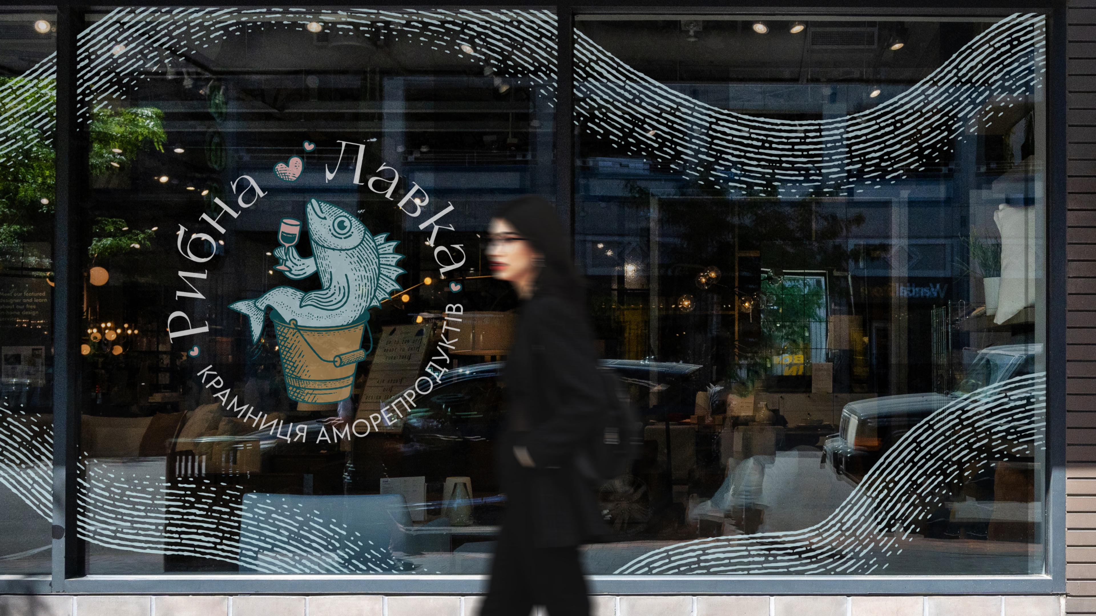
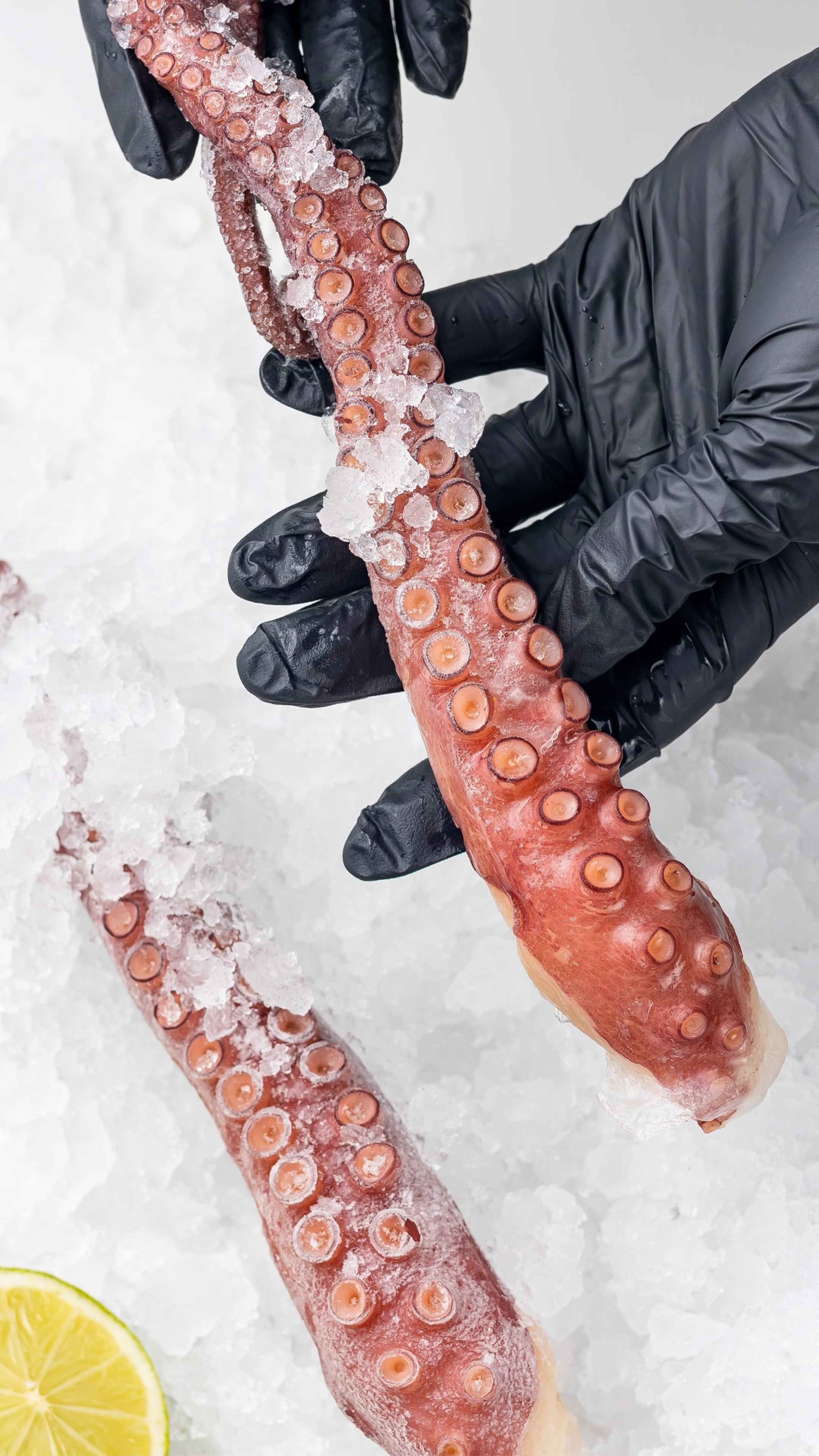
Rybna Lavka (The Fish Shop) is a family seafood shop where the product and the moment it creates come first. The branding and visual identity are built around a simple idea: a good dinner is one more reason to get together. That is why the identity talks about seafood lightly, with humor, and without the look of a gourmet boutique.

SERVICES
IDEA
Rybna Lavka
The shop of aMORE food
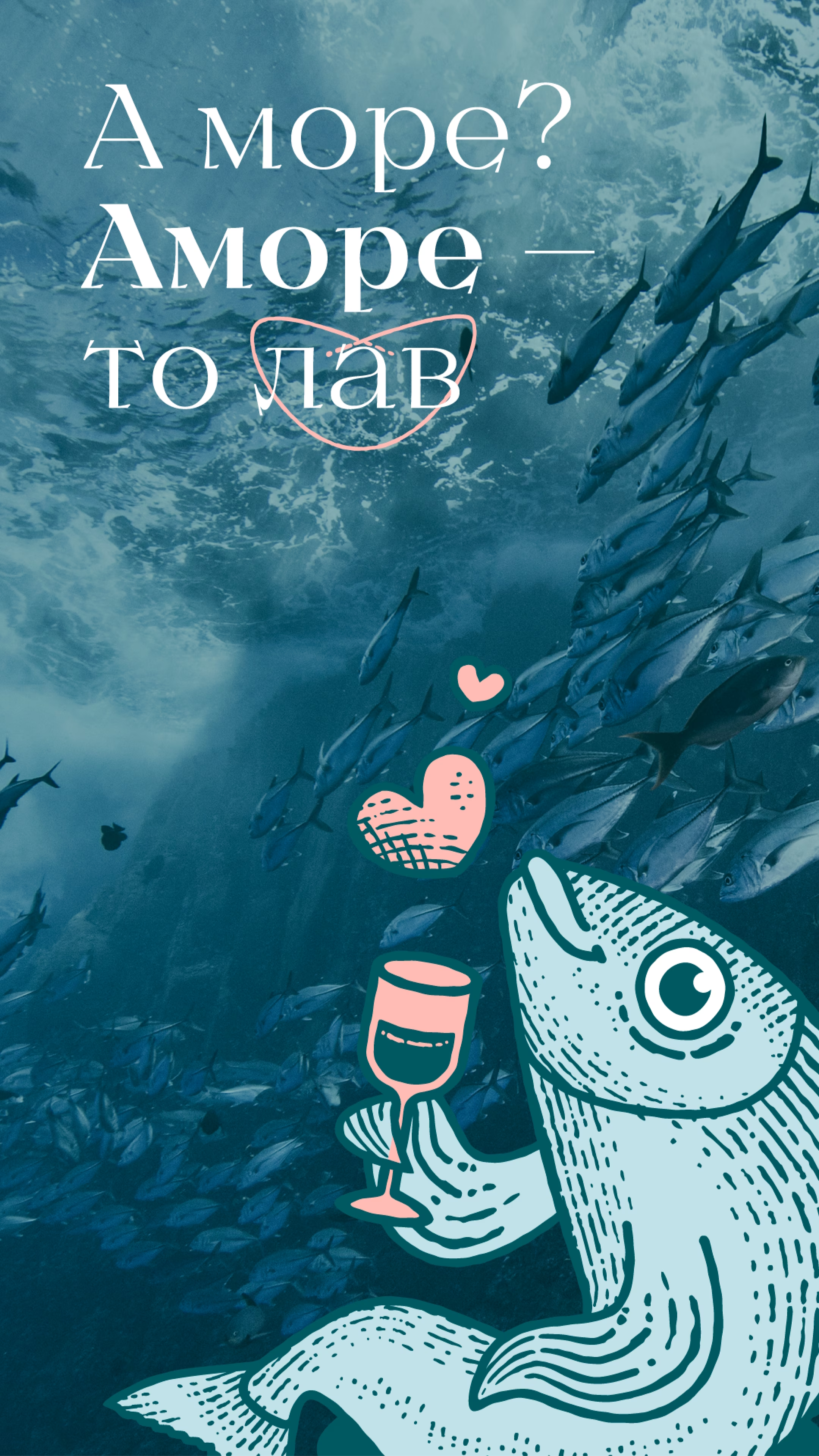
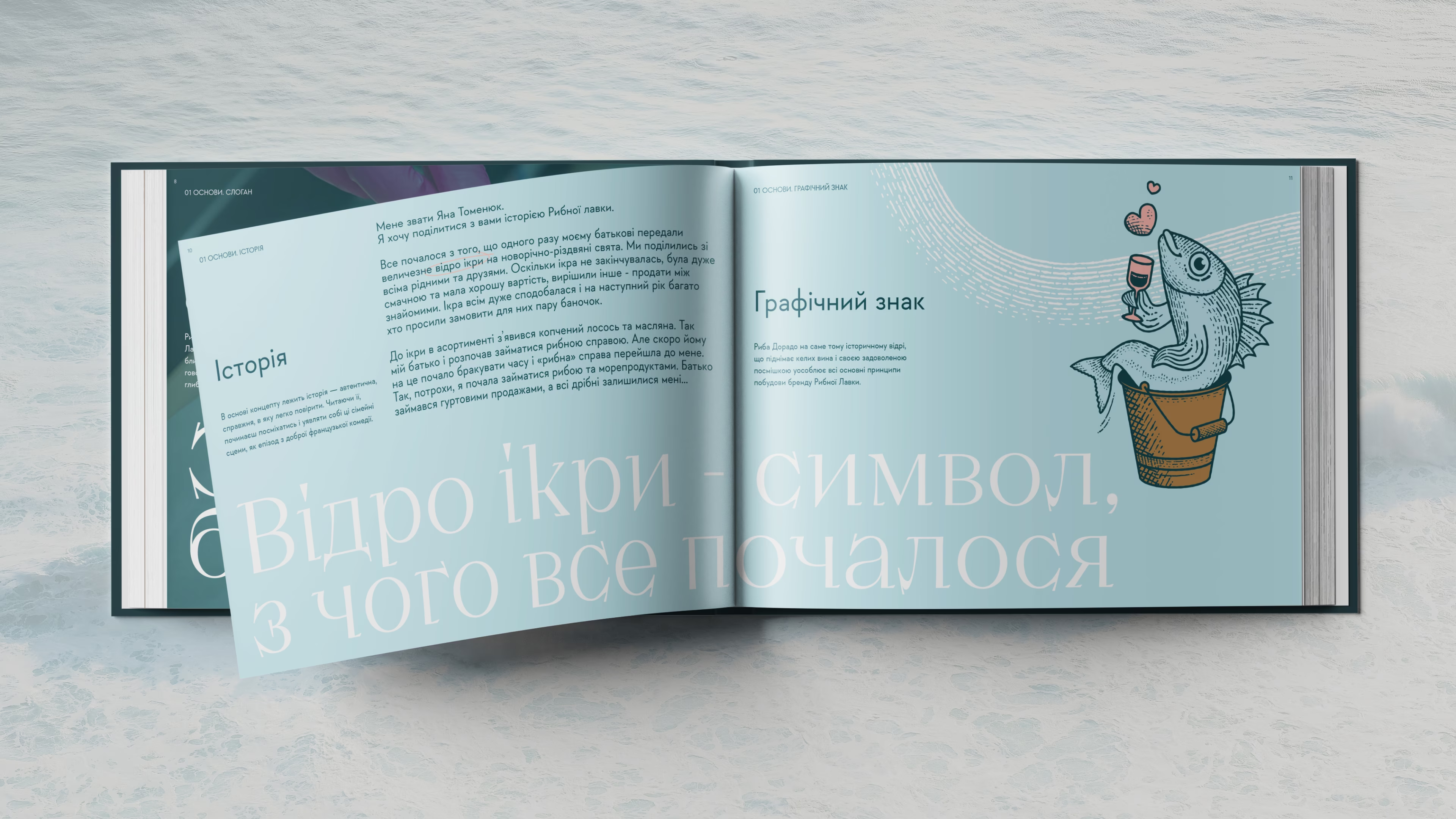
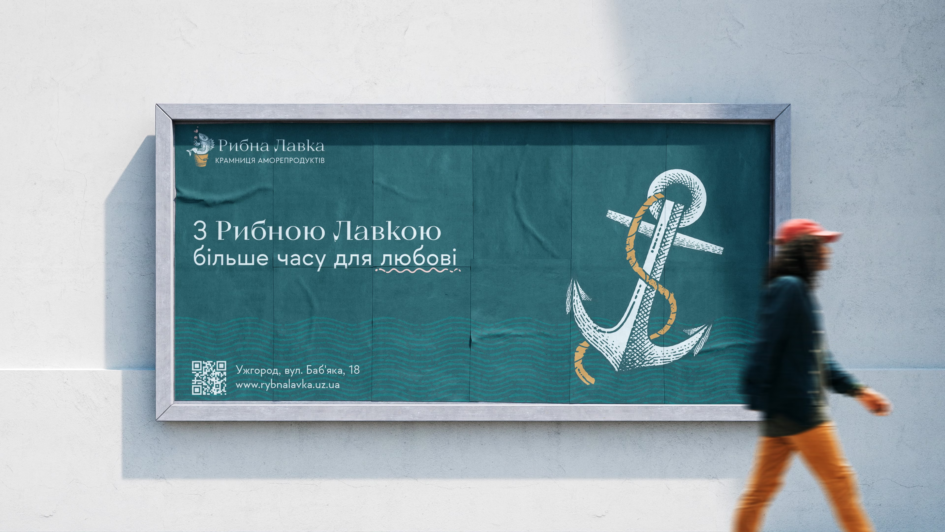
The name was born from wordplay. In Ukrainian, seafood is moreprodukty, from more, the sea. Amor means love in many languages and sounds close to more. So moreprodukty became aMOREprodukty, an idea where every purchase stands for more than food: it is time spent with the people you love.
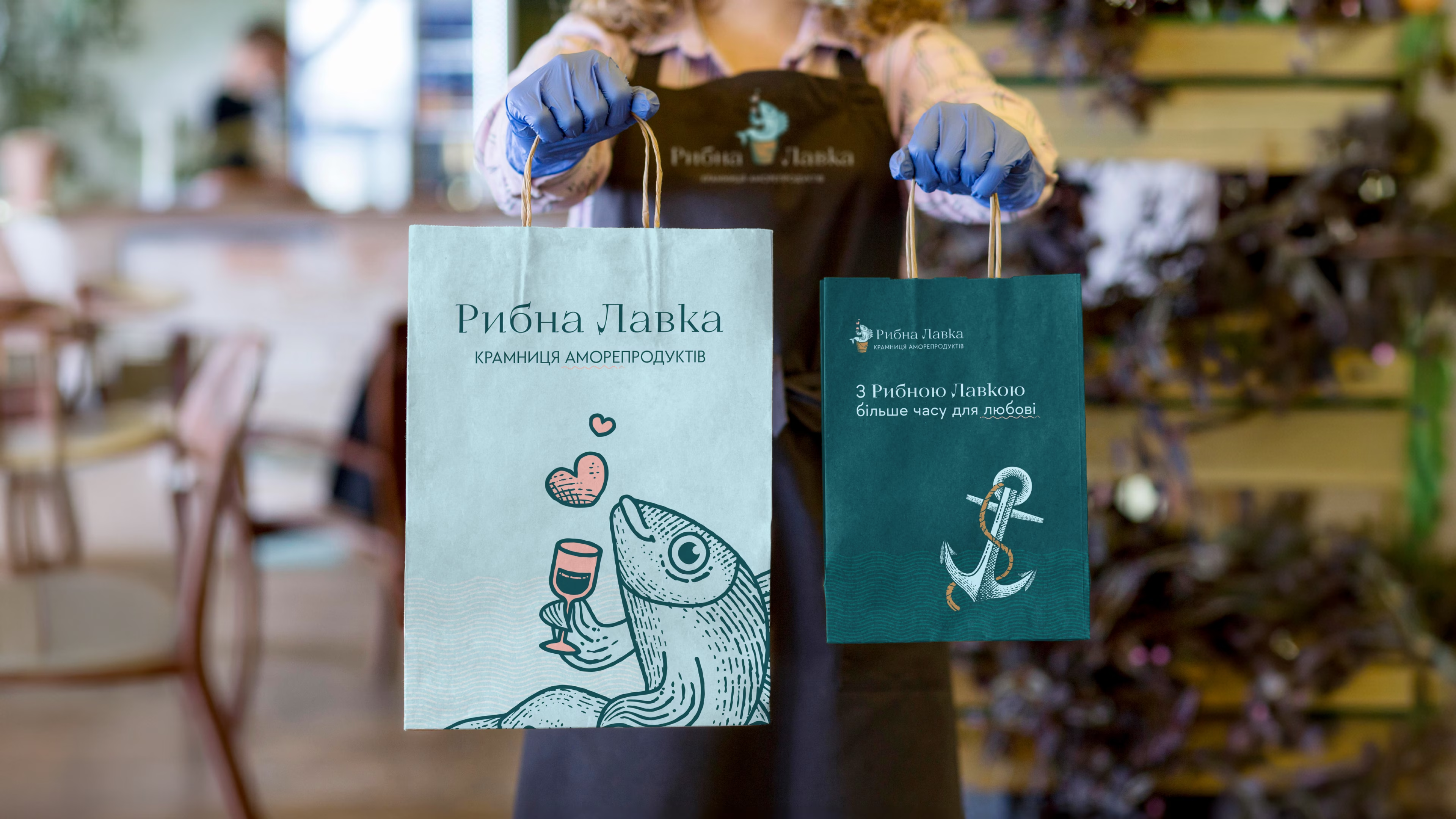
The slogan carries the thought on: “With Rybna Lavka, more time for love.”

About the business
Rybna Lavka grew from a small family business into a shop with a wide range of seafood. As it grew, its main value stayed the same: a family attitude toward every customer, which became the basis of the brand's character.


Requirements for the visual identity
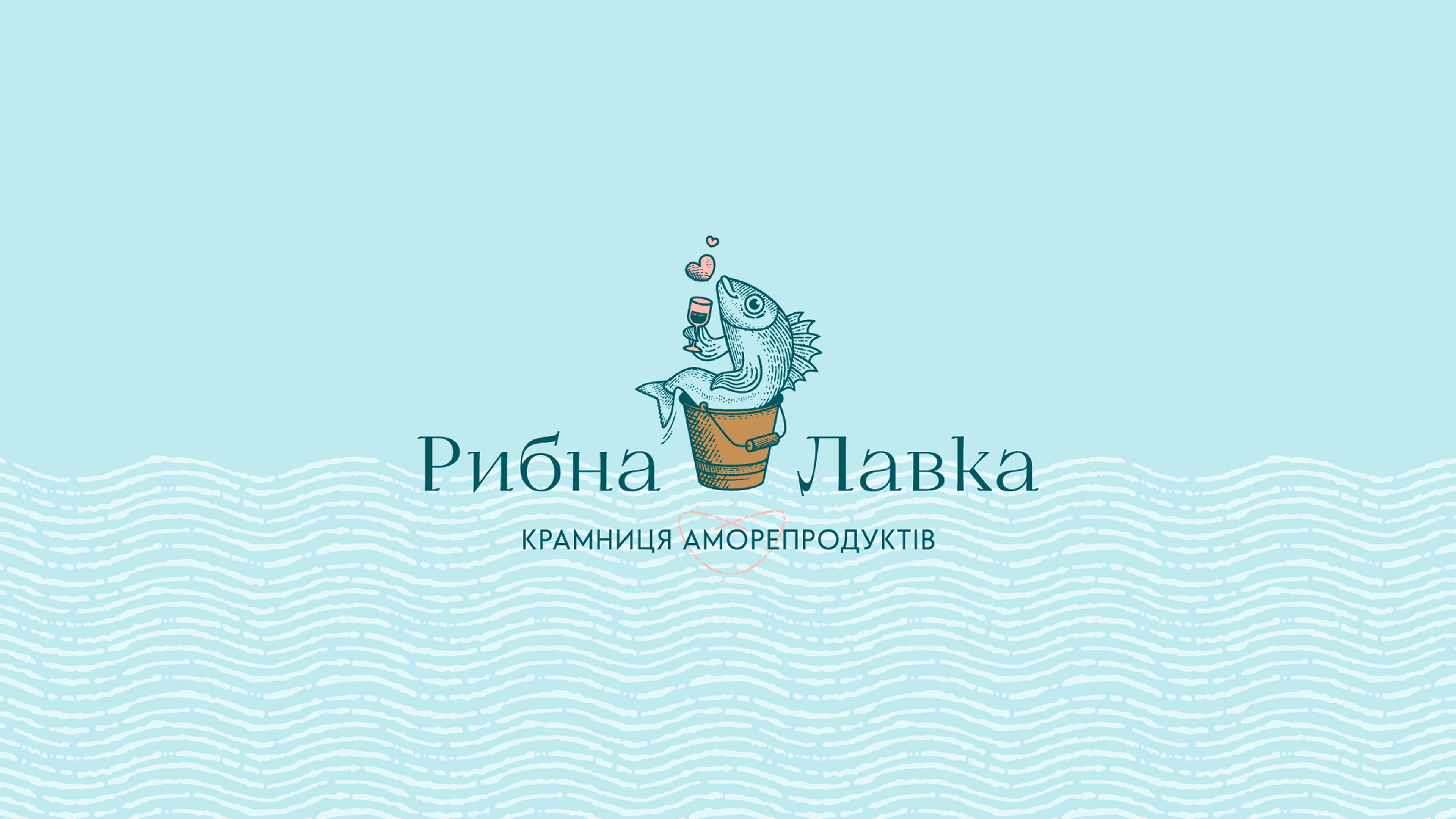
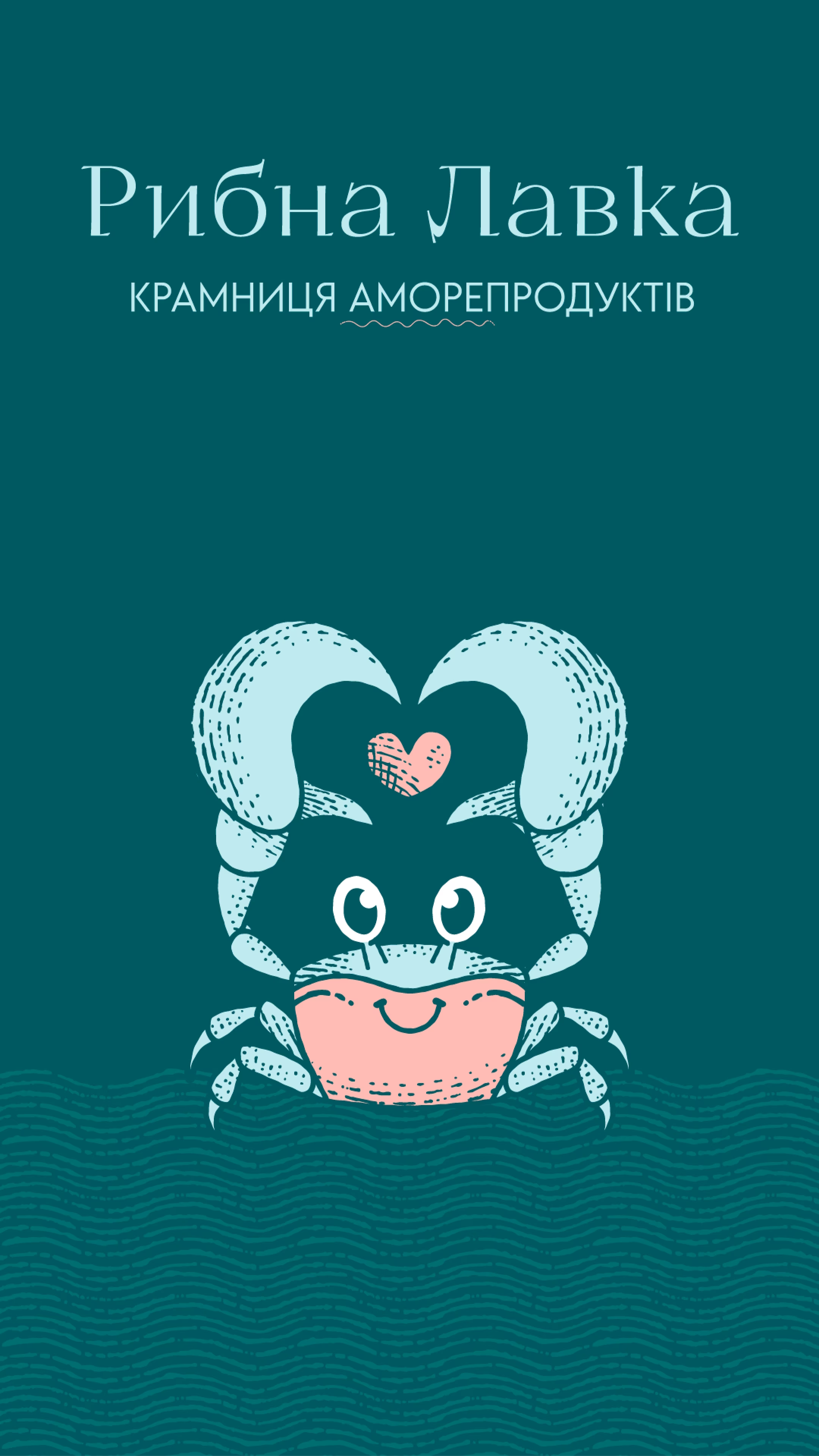
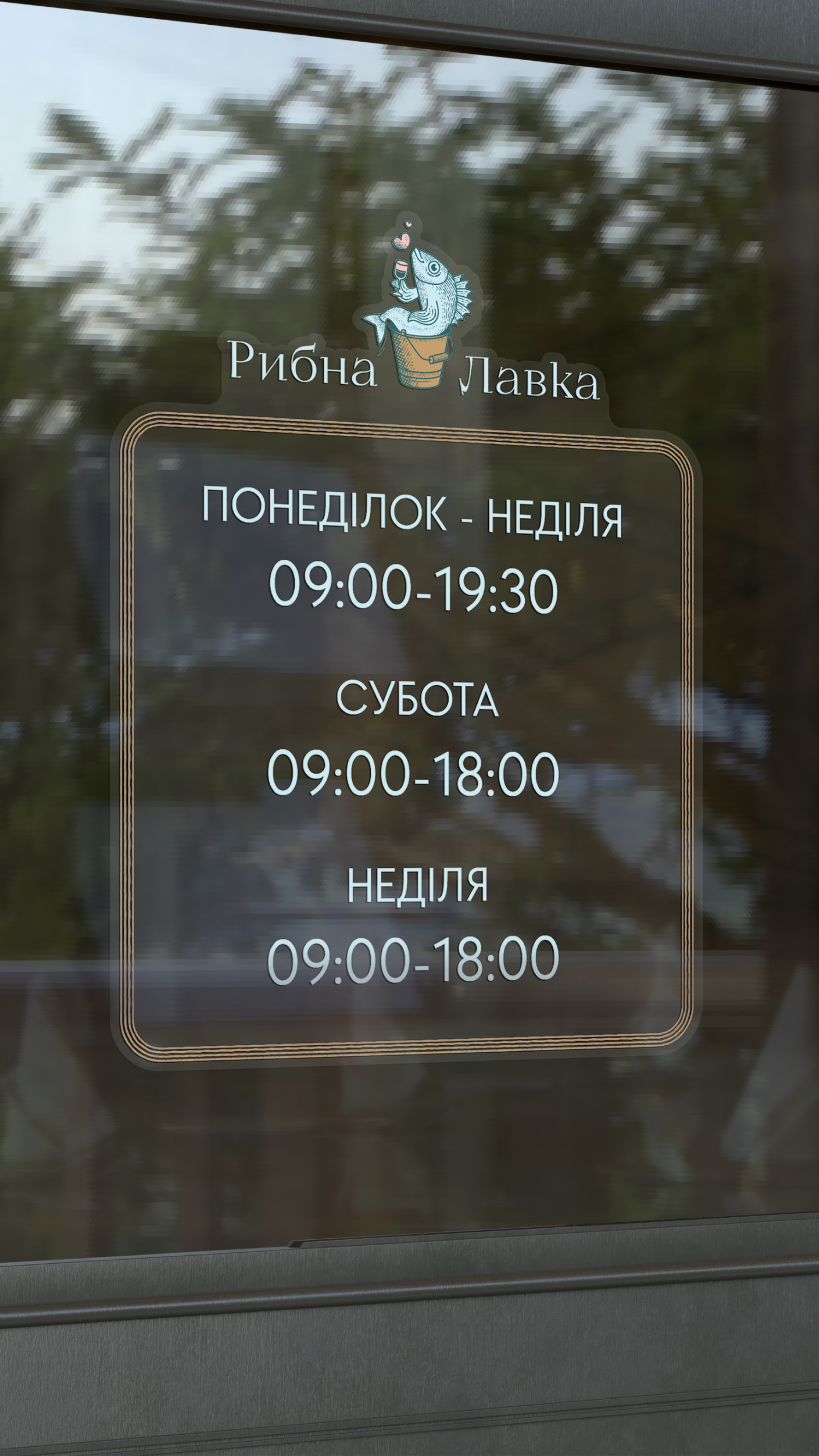
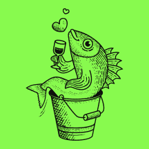
The symbol is rooted in the brand's story. A bucket of caviar recalls how the business began, and a fish character with a glass of wine adds lightness and character to the identity. Instead of showing the product literally, the symbol creates the mood the brand is associated with.
The wordmark is set in the Ukrainian typeface KyivType Titling Regular 3. Its sharp serifs recall fishing hooks, a detail that ties the typography to the heart of the business.
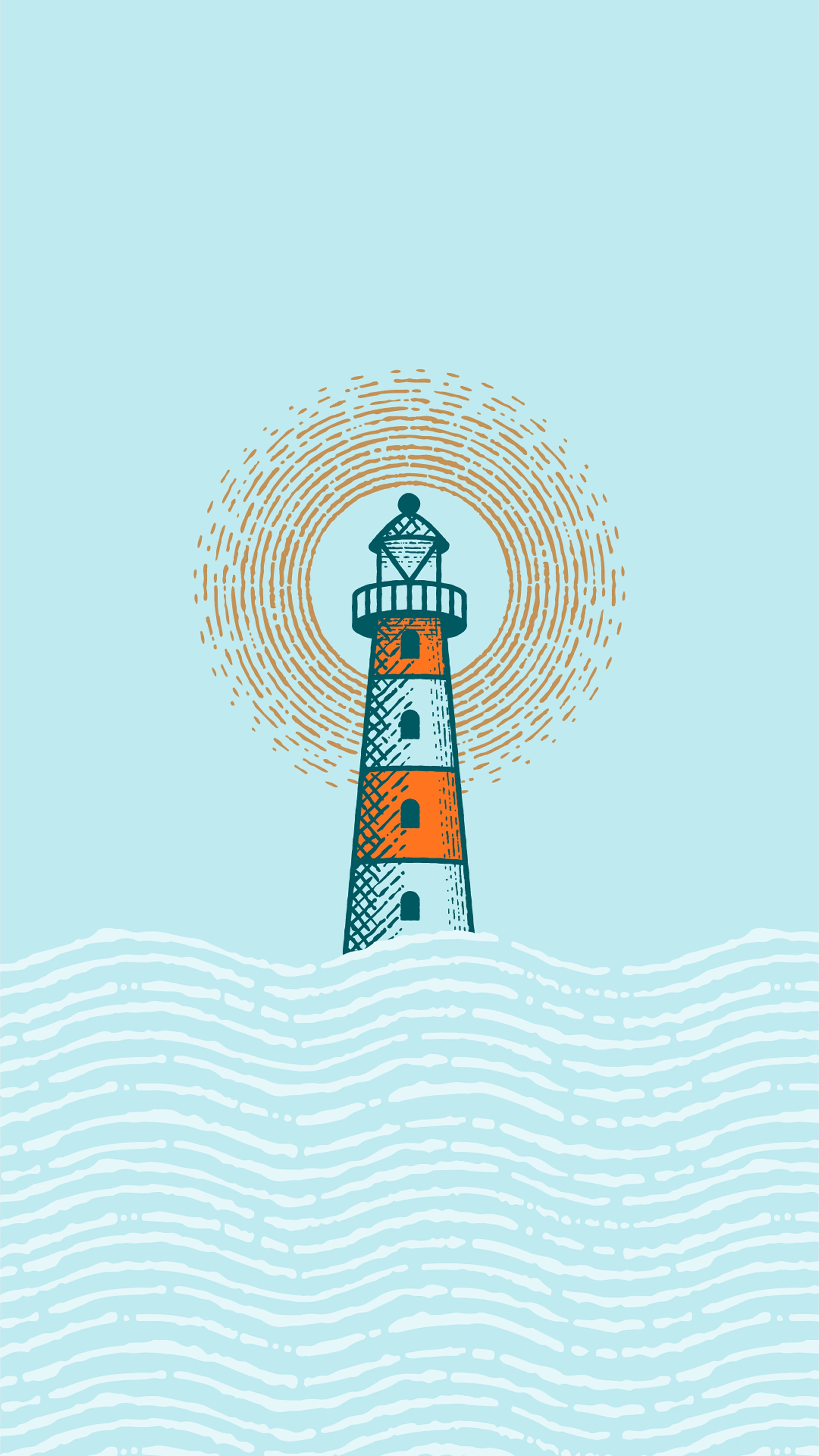
The palette has nine colors and draws on three sources. Turquoise and light blue shades refer to the sea and the ceramic tiles of the interior. Salmon and golden tones refer to the main product. A bright yellow repeats the color of lemon, the natural companion of fish dishes, and adds freshness and accents to the system.


Shall we talk about your 👤 project?