Konta

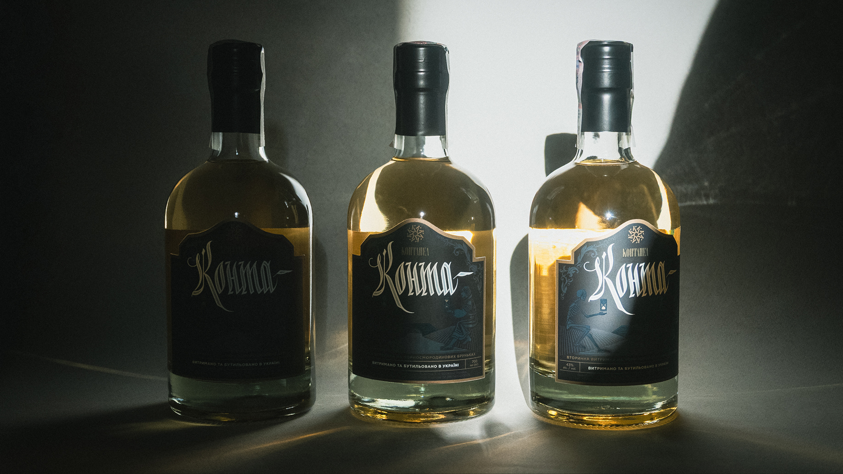
Konta is the younger brother of Kontabas from Kontapel, a maker of authentic Ukrainian drinks. It is infused on blackcurrant buds, which get a second life in Konta after Kontabas. The logo and label design keep the kinship with the older brother but give Konta its own, lighter character.
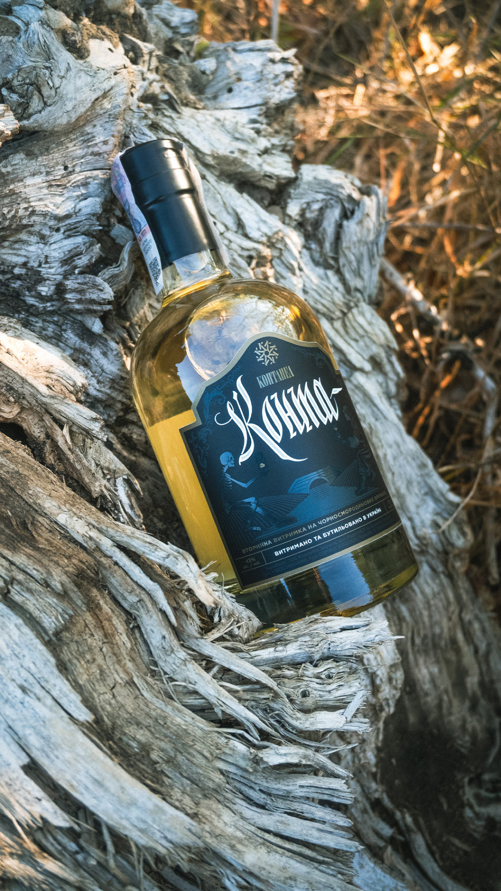
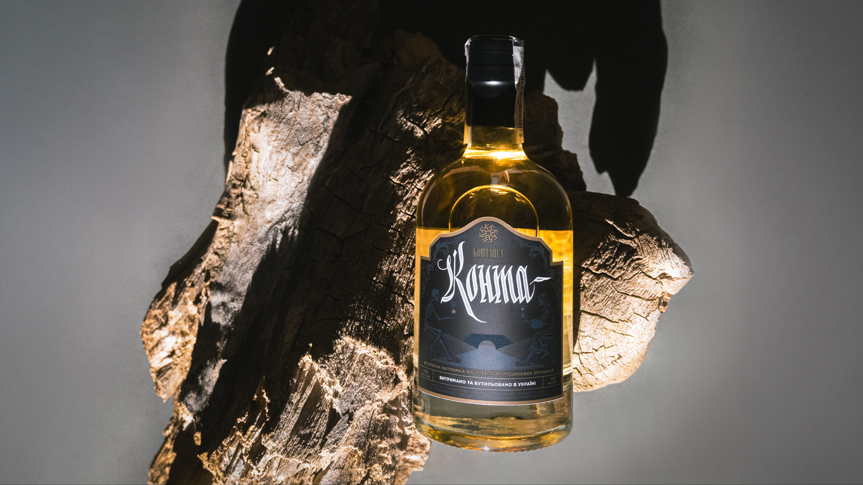
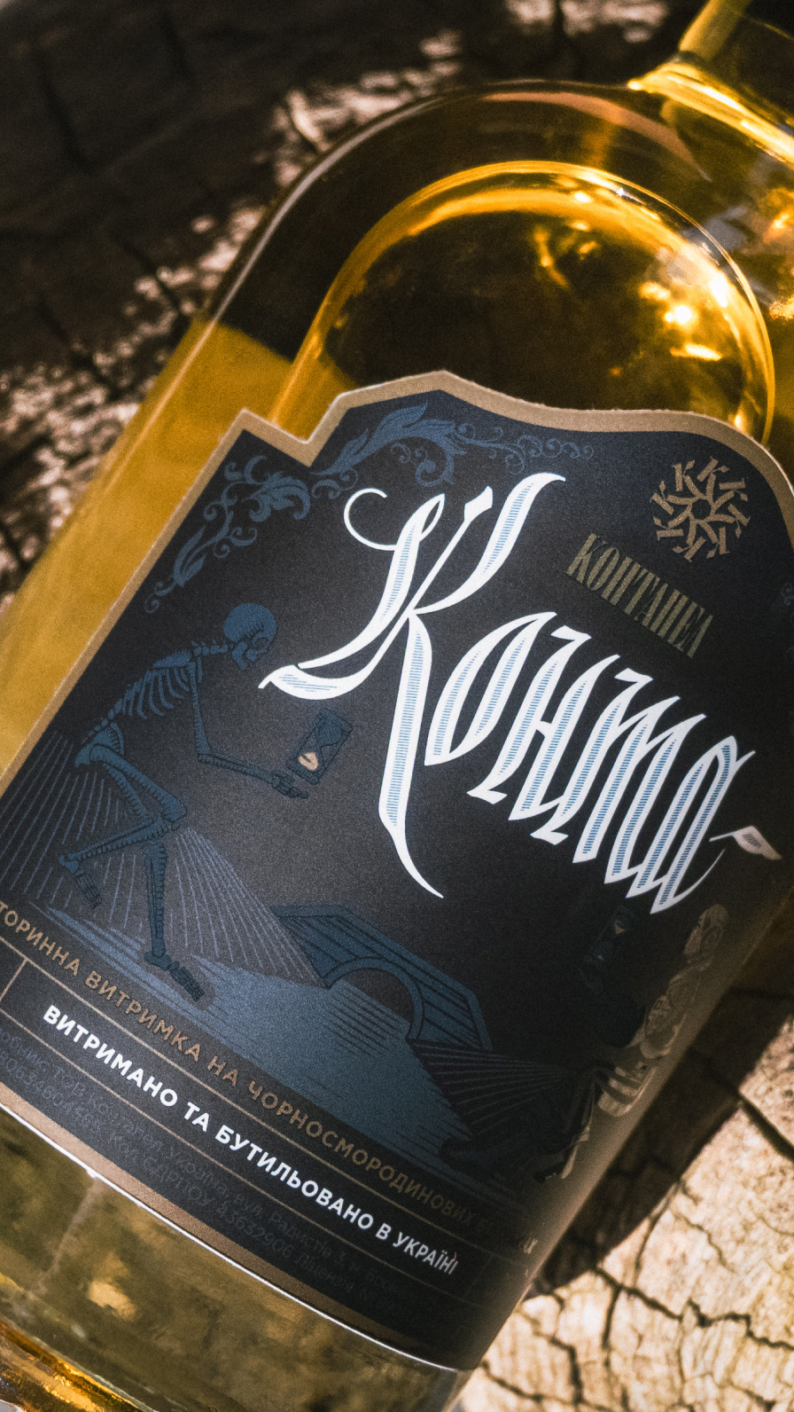
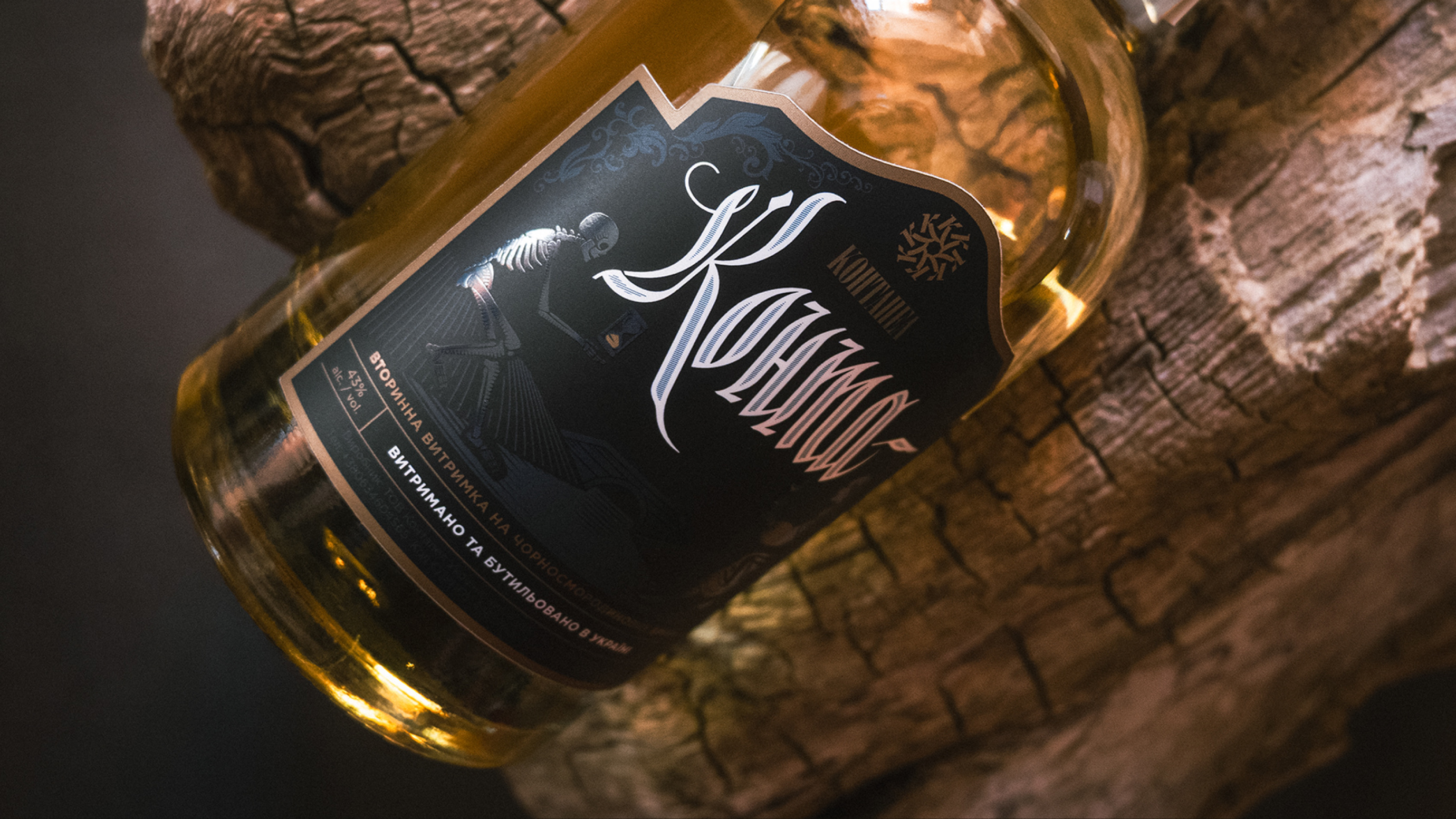
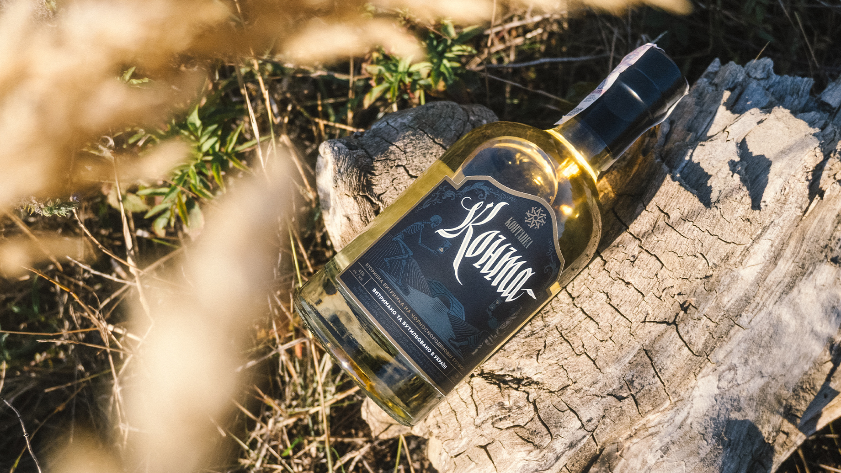
A bottle of Konta on old wood

SERVICES

IDEA

Kontapel

Kalyniv Bridge over the Smorodyna River

The blackcurrant buds for Konta have already given their first, most intense layer to Kontabas. For Konta, this is their second and last life. The brand tells this passage through the legend of Kalyniv Bridge. In folk tales, the bridge spans the Smorodyna River, and crossing it meant ending one life and beginning another. Smorodyna, the Ukrainian word for currant, became the common thread between the drink and the myth, and the bridge became an image of the bond between two brothers: Kontabas and Konta stand on different banks, but one raw material connects them.

About the business

Kontapel revives authentic Ukrainian drinks that were almost lost to modern culture. The company works in limited batches and with natural ingredients that cannot be replaced by synthetics. Konta has a style of its own: the buds left after Kontabas give a softer profile, more delicate green notes and a light berry bitterness. After infusion, the drink is aged for three months in an oak barrel.

Requirements for the visual identity

Logo

The calligraphic logo continues the language of Kontabas and grew out of dozens of handwritten sketches. The final version is lighter and more dynamic than the older brother's mark, just like the drink itself.

Label

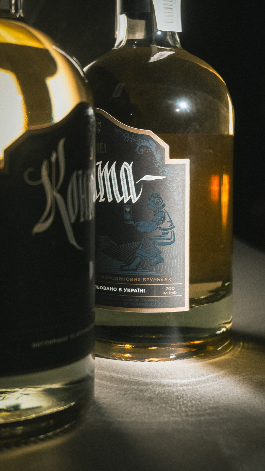
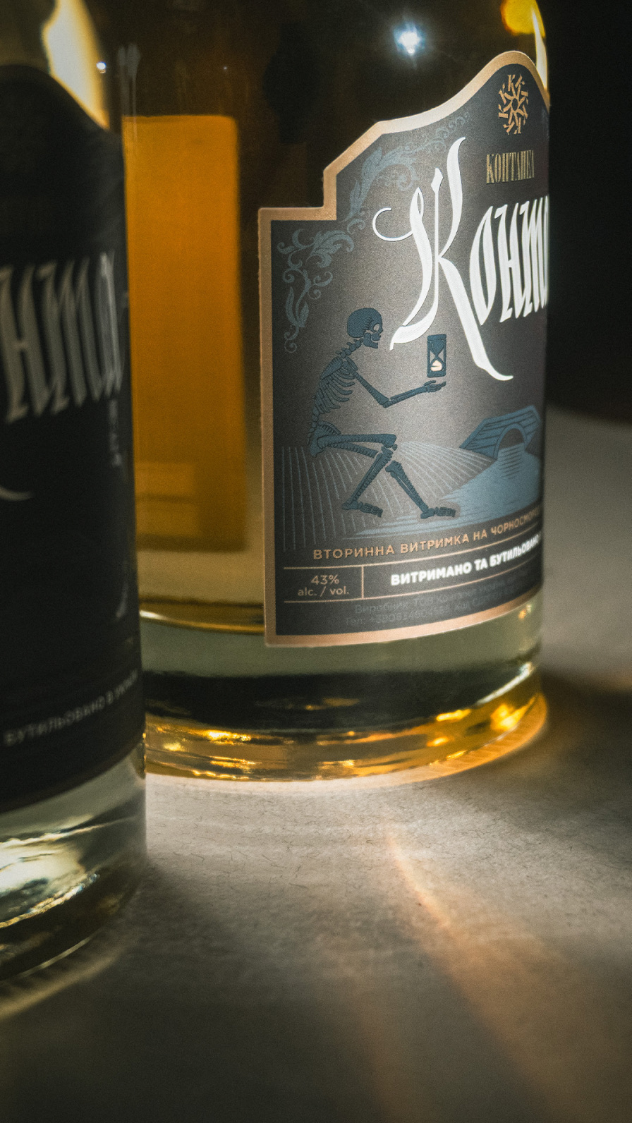
An engraving-style illustration shows Kalyniv Bridge between two banks. The same girl sits on both sides: in the past and in the present, in the world of Nav and the world of Yav, the otherworld and the world of the living. She holds an hourglass, a symbol of passing time. The dark palette of the label refers to Kontabas.

Family

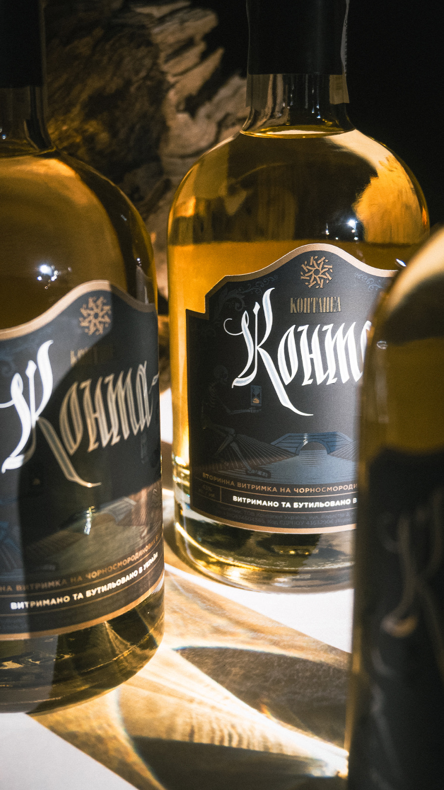
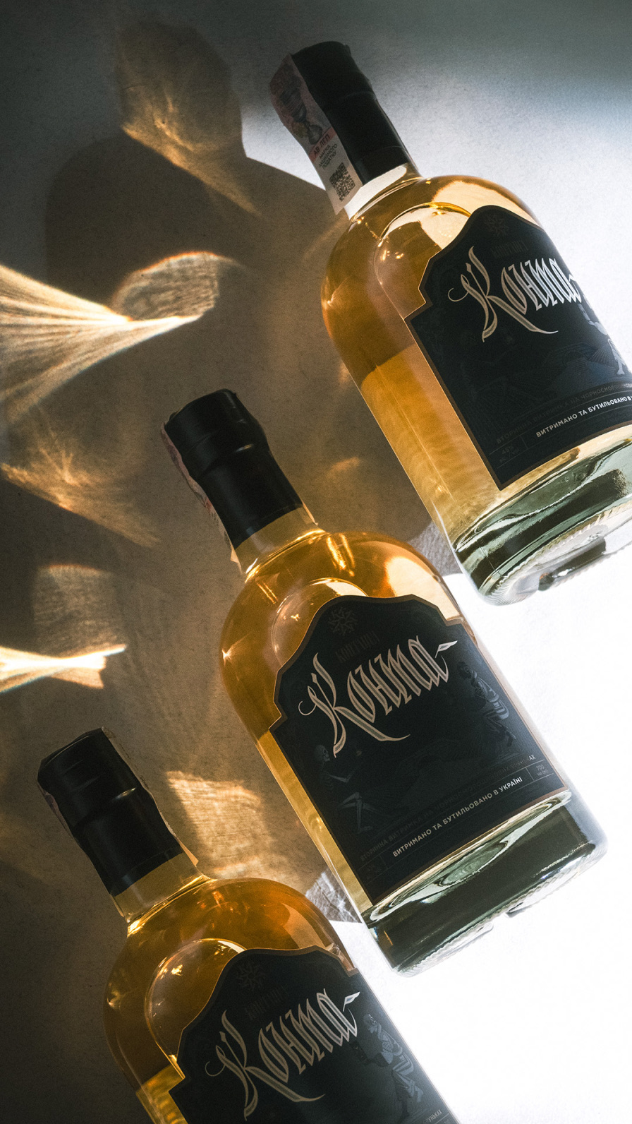
Konta joined the Kontapel line next to Kontabas and Kopchena Hrusha. Shared calligraphy, label shape and maker's mark make the family recognizable on the shelf, while color and illustration set the products apart by character and taste.

More cases

Back to all cases

Suprasoul hands illustration

Shall we talk about your 👤 project?

Thank you. Your message is with us, and we'll reply soon.
The message didn't go through. Please try again a little later.