Verto

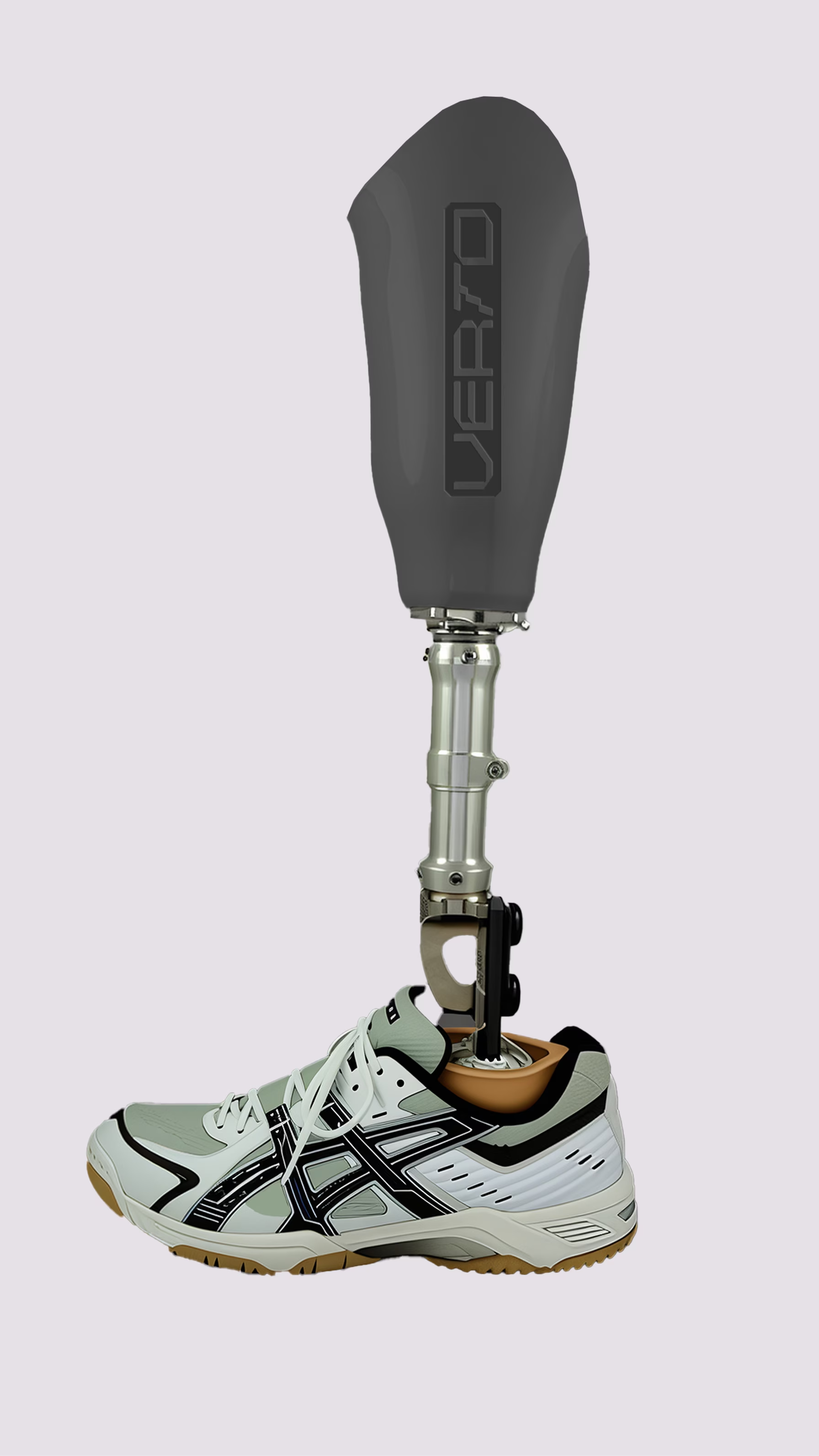
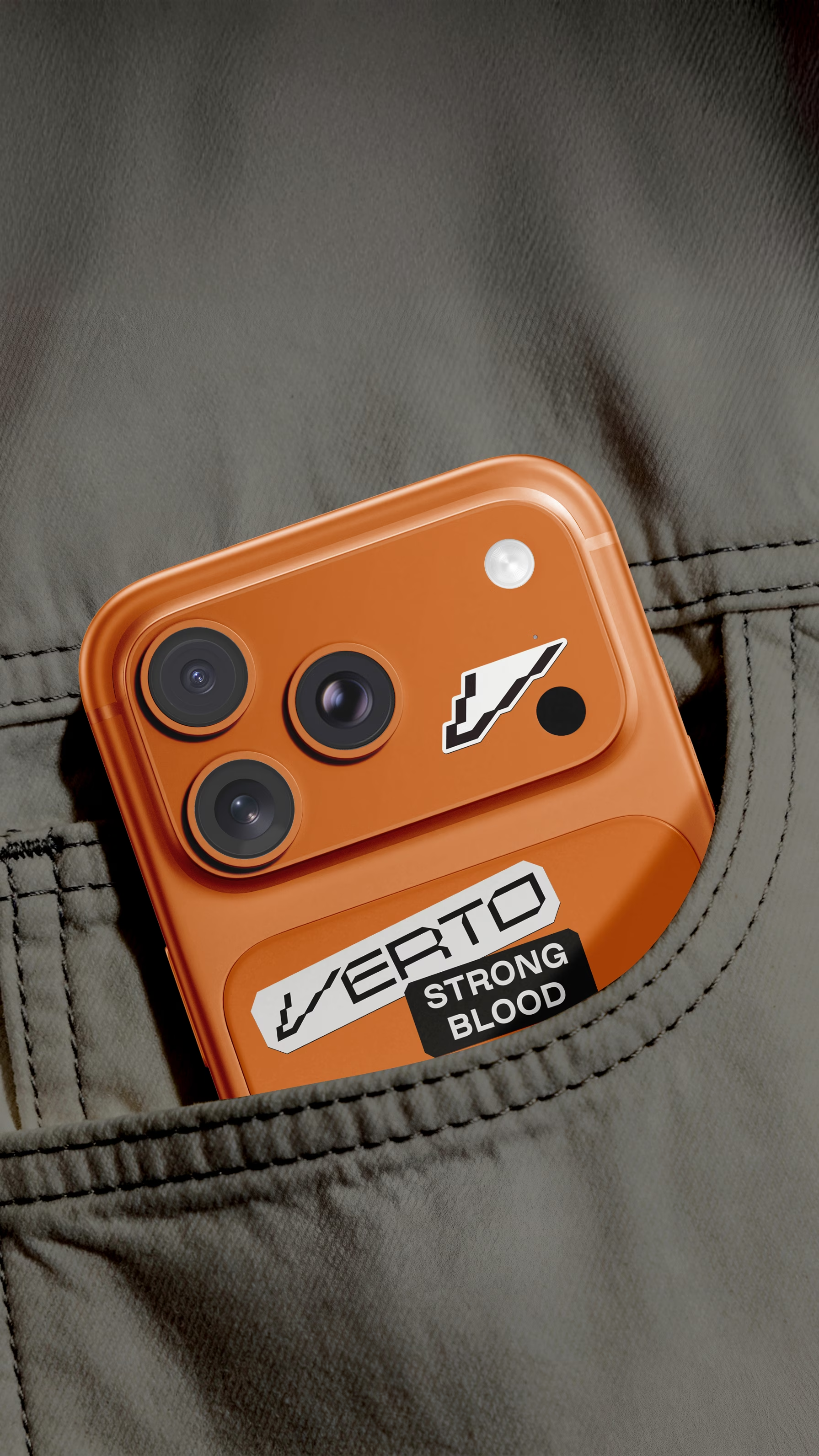
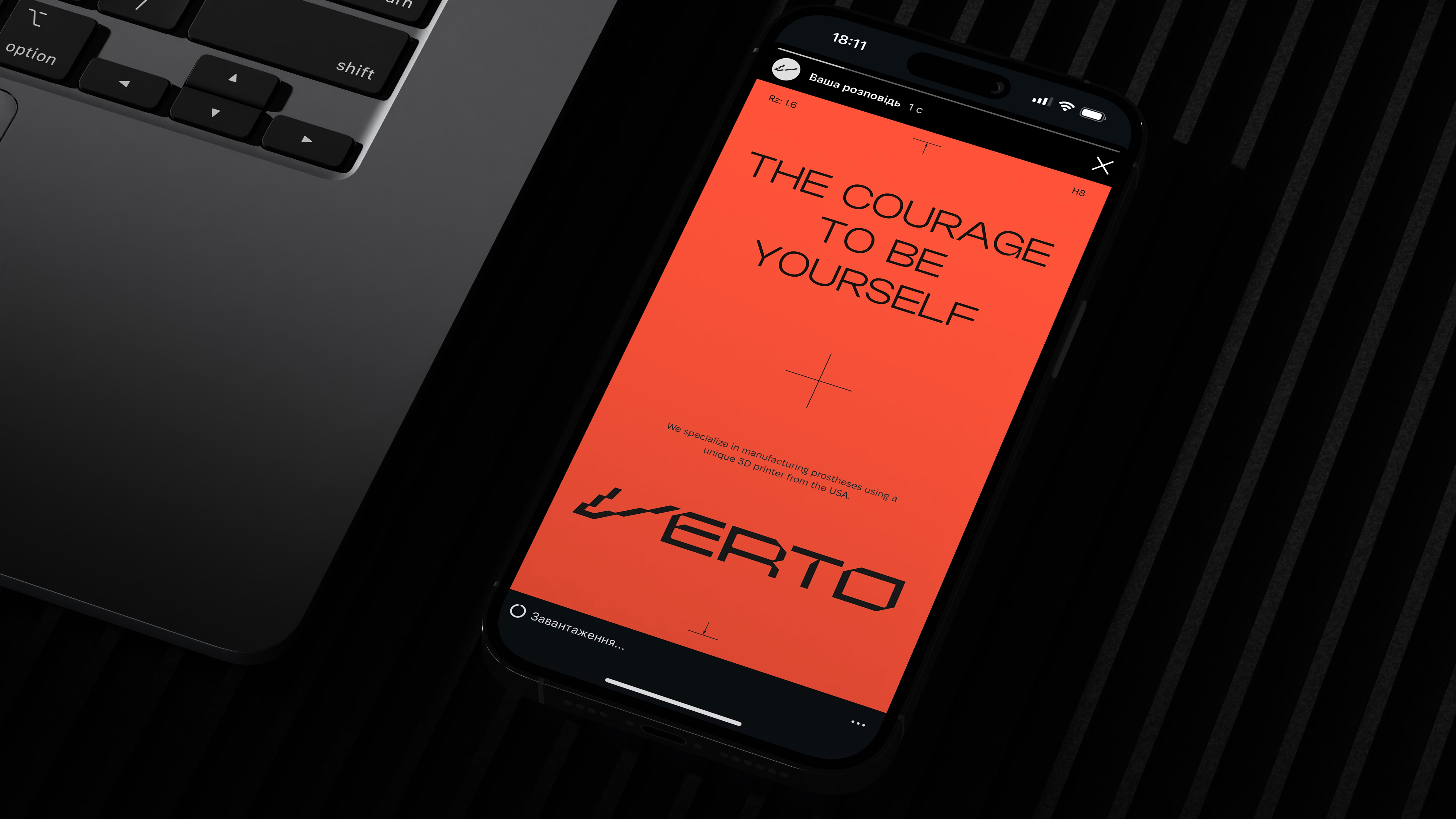
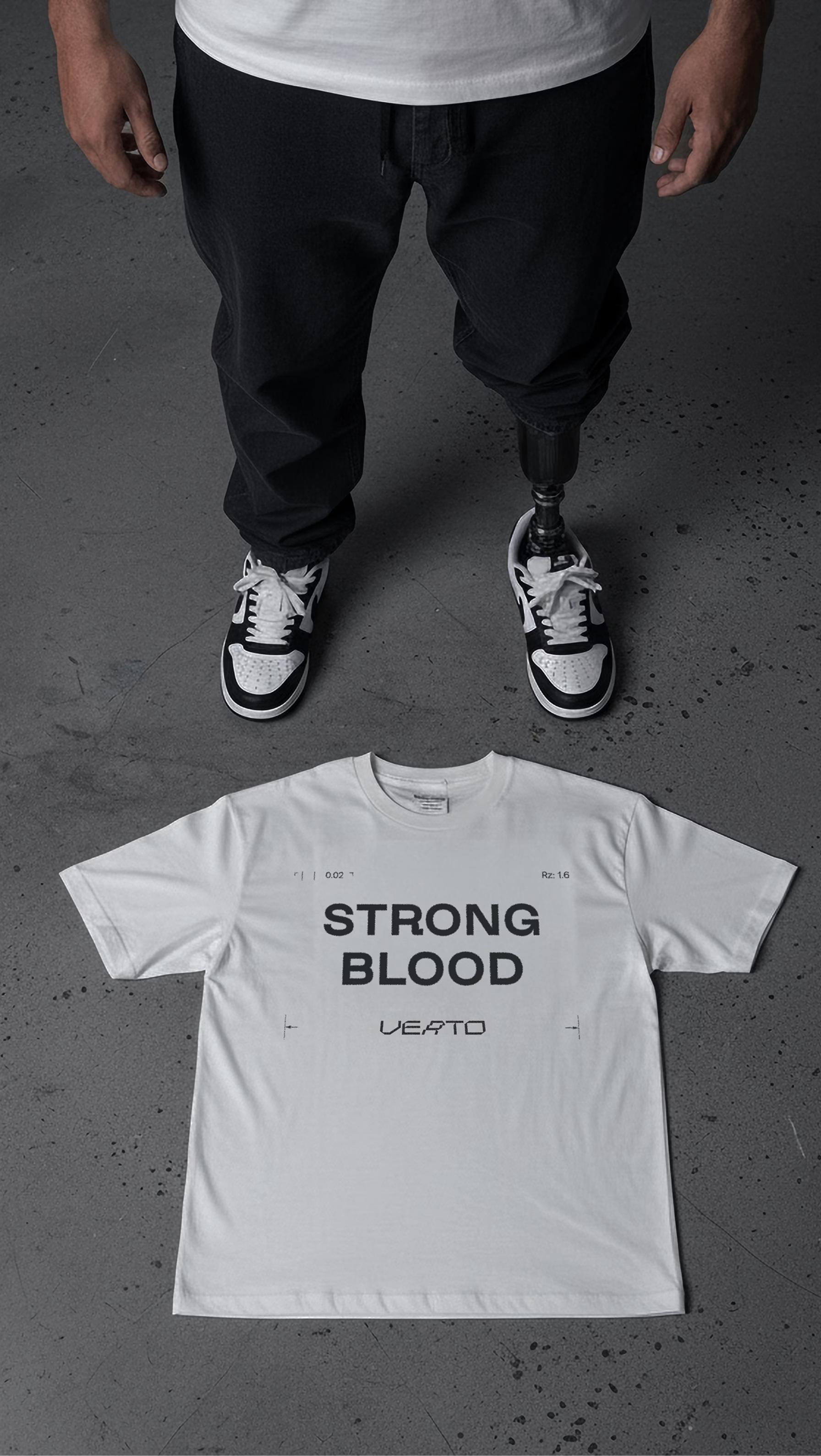
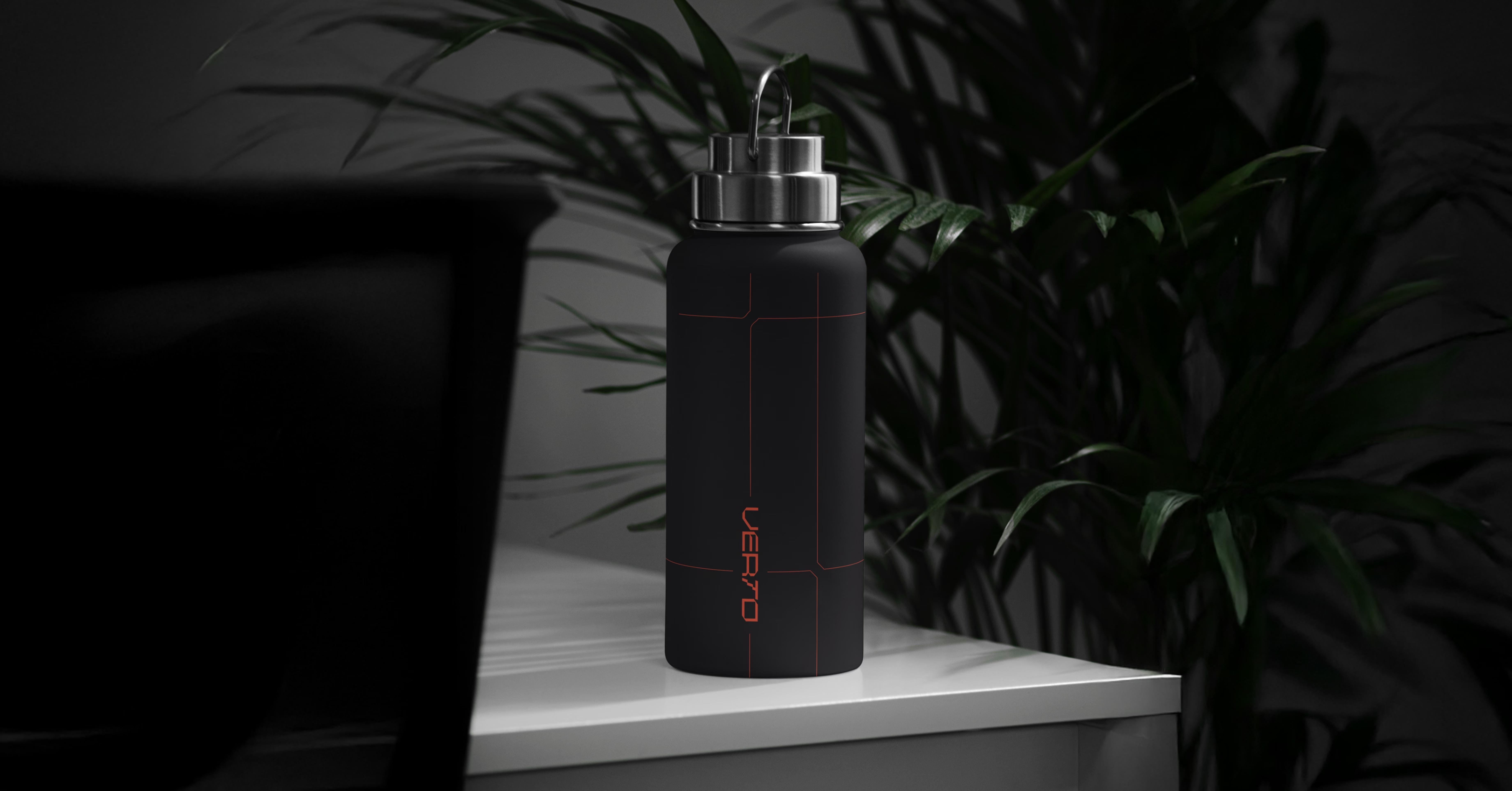
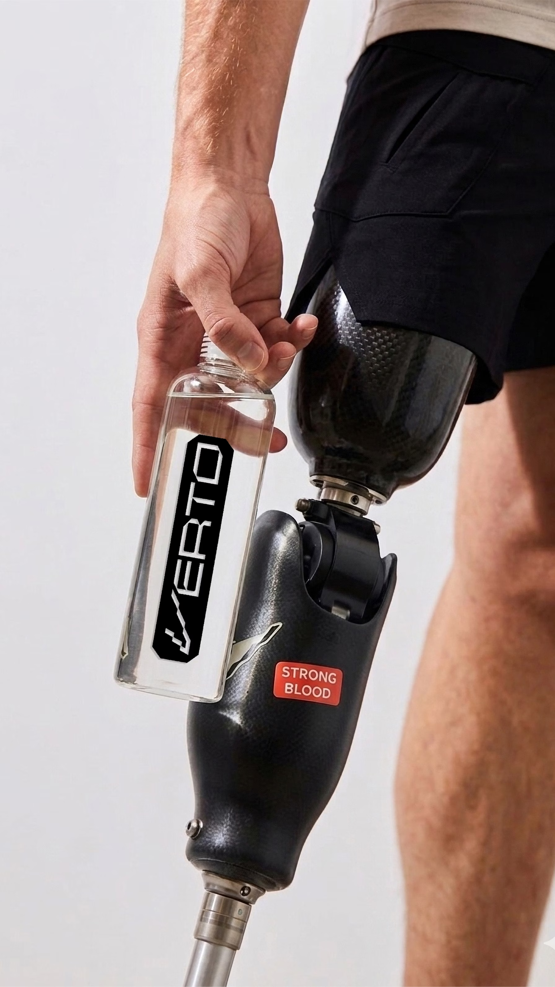
VERTO is a prosthetics center in Uzhhorod that specializes in modeling and 3D printing lower-limb prostheses. Its main focus is helping service members who have survived amputation. The brand had to continue this mission: not speak the language of medicine, but create a sense of movement, confidence and order. The naming, the mark and the whole identity are built around one idea: a change of form that does not change the essence.
SERVICES
IDEA

Verto Prosthetics Center

A word that holds under pressure

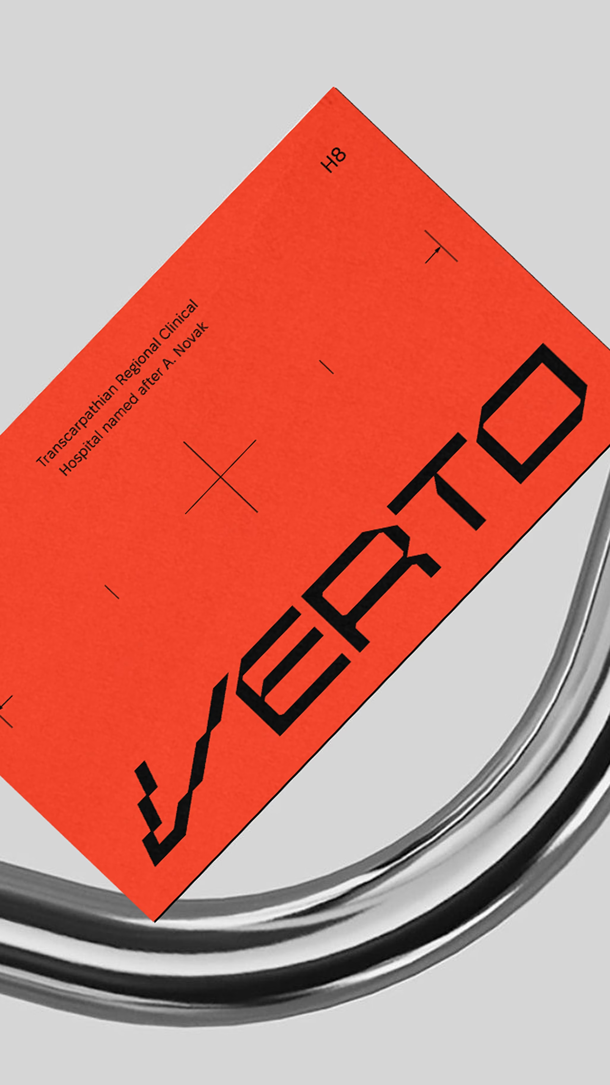
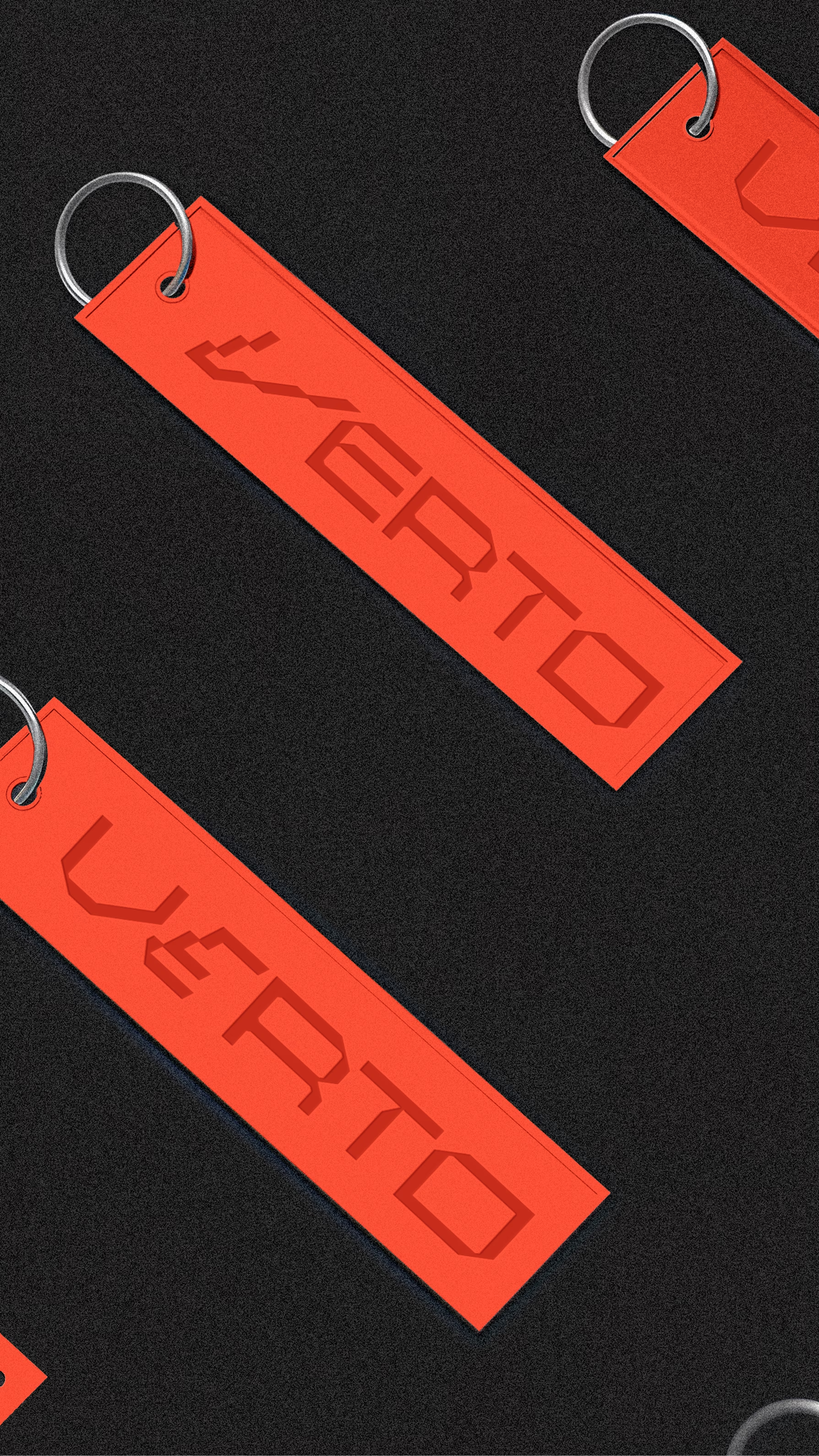
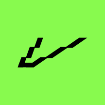
Verto comes from the Latin vertere, “to change”, “to turn”. In the mark, one of the letters is assembled from fragments: “prosthetic”, yet still recognizable and whole. The form changes, the essence does not. The same logic the center restores for its patients every day is built into its own mark.

About the business

The center works in Uzhhorod and specializes in modeling and 3D printing lower-limb prostheses. Its main audience is service members who have survived amputation. For them, the speed of production, a precise fit and the comfort of the prosthesis directly affect their return to an active life.

According to estimates by Ukrainian specialist organizations, a large share of people with amputations still have no access to modern prosthetics. That is why the brand had to work not only as a visual identity but as a system that helps people find their way, builds trust and supports them at every stage of contact.

Requirements for the visual identity

Naming

The name had to avoid direct medical vocabulary. Instead of describing the service, it had to convey movement, change and inner strength, and hold up for both the process of rehabilitation and the result it leads to.

Symbol

One letter is built from separate fragments: a direct graphic metaphor for prosthetics, applied to the logo itself rather than to an illustration of a prosthesis.

System

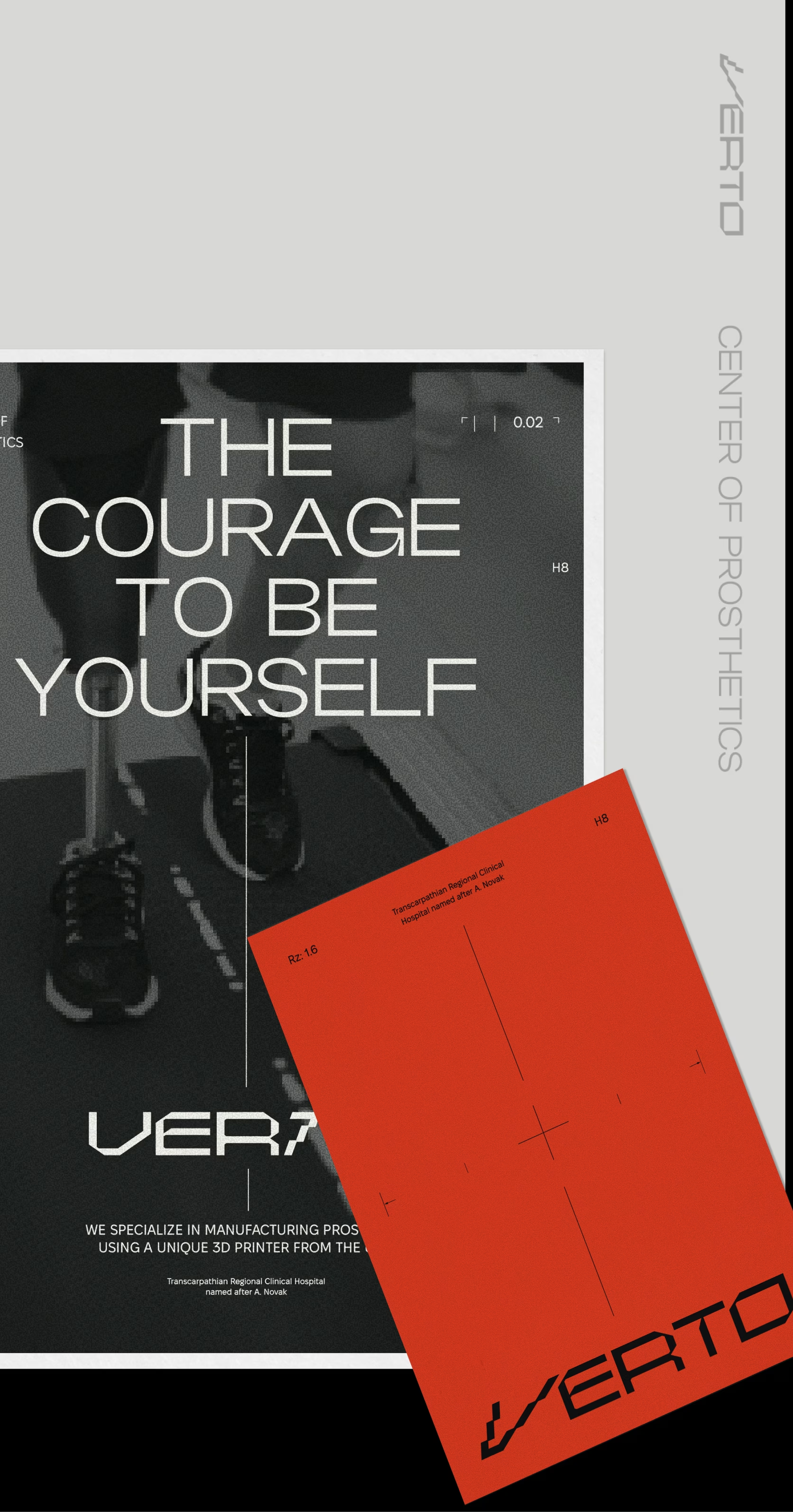
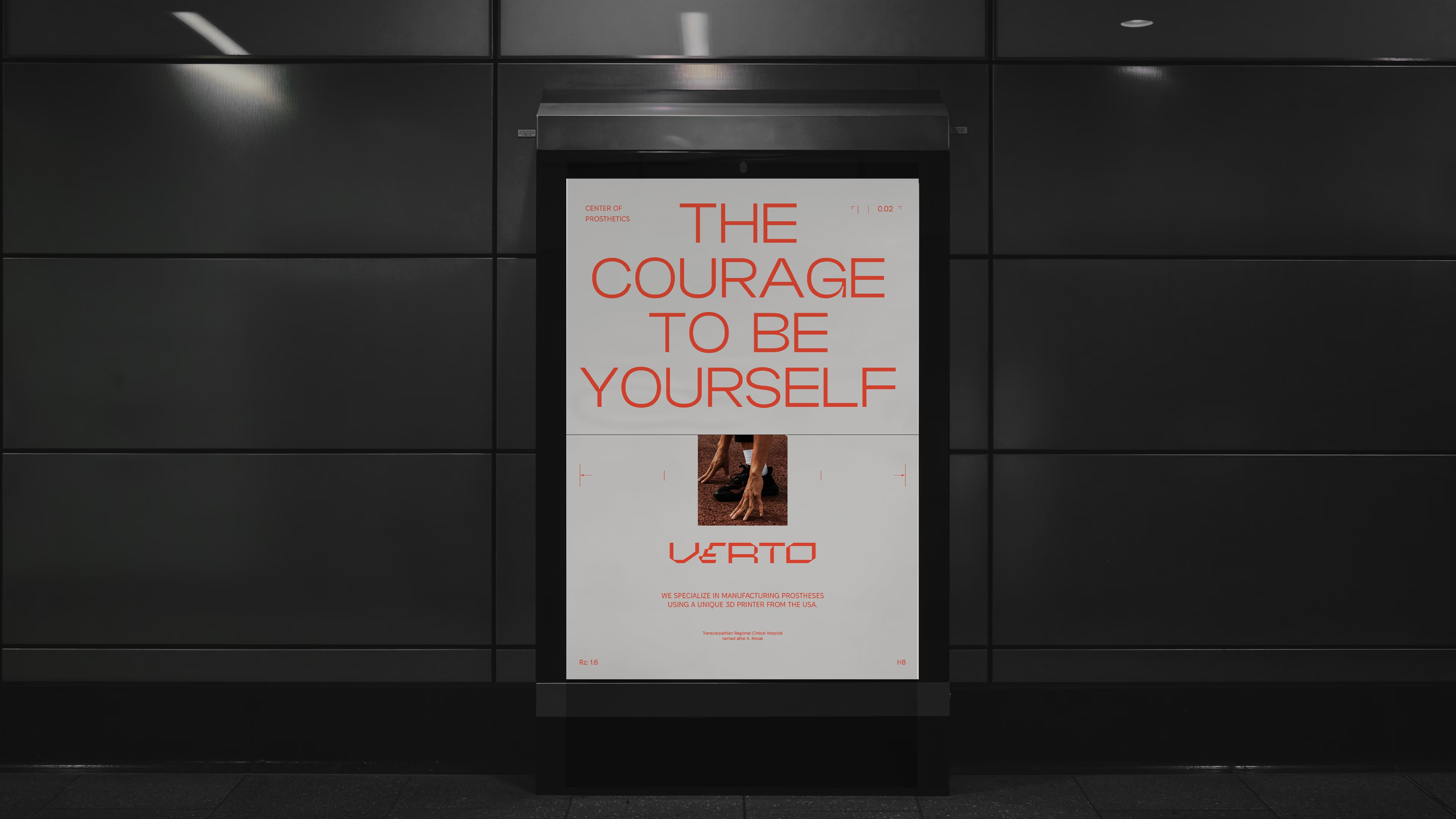
The identity brings all touchpoints into one system: from wayfinding inside the clinic to digital services, documents and social media. Contrasting typography, a modular grid and a clear information hierarchy help people find their way quickly and support a sense of order.

More cases

Back to all cases

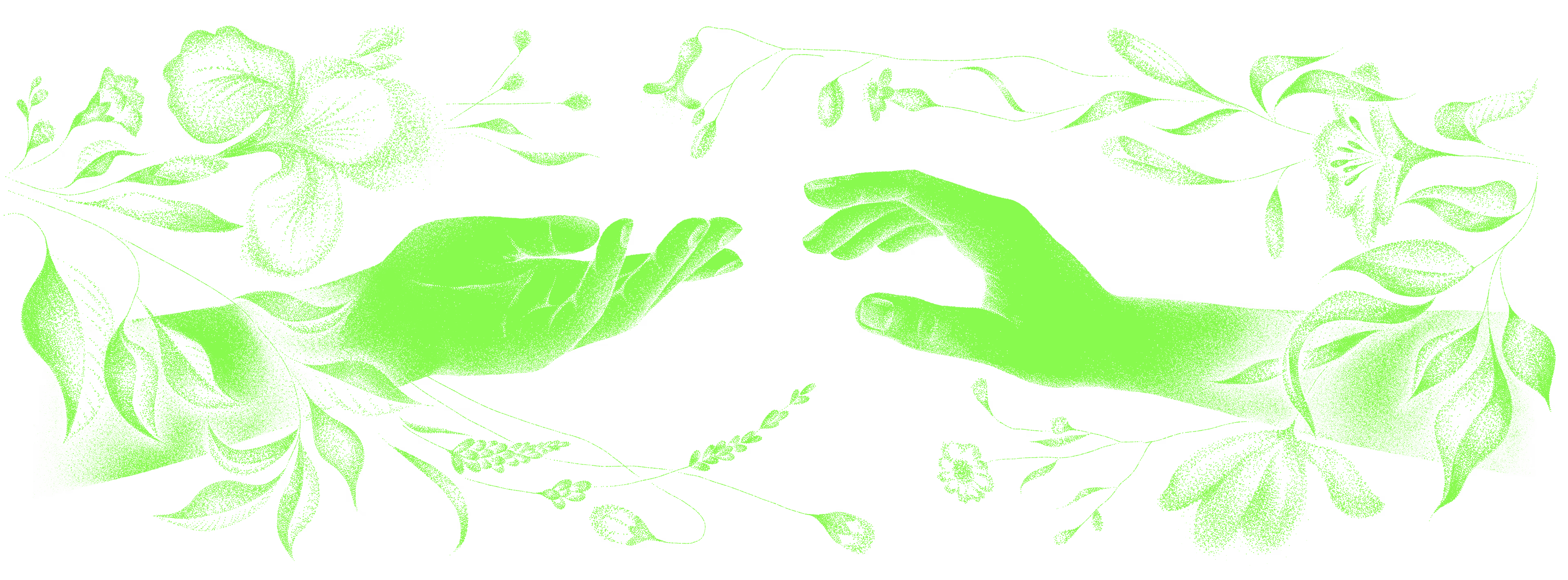
Suprasoul hands illustration

Shall we talk about your 👤 project?

Thank you. Your message is with us, and we'll reply soon.
The message didn't go through. Please try again a little later.