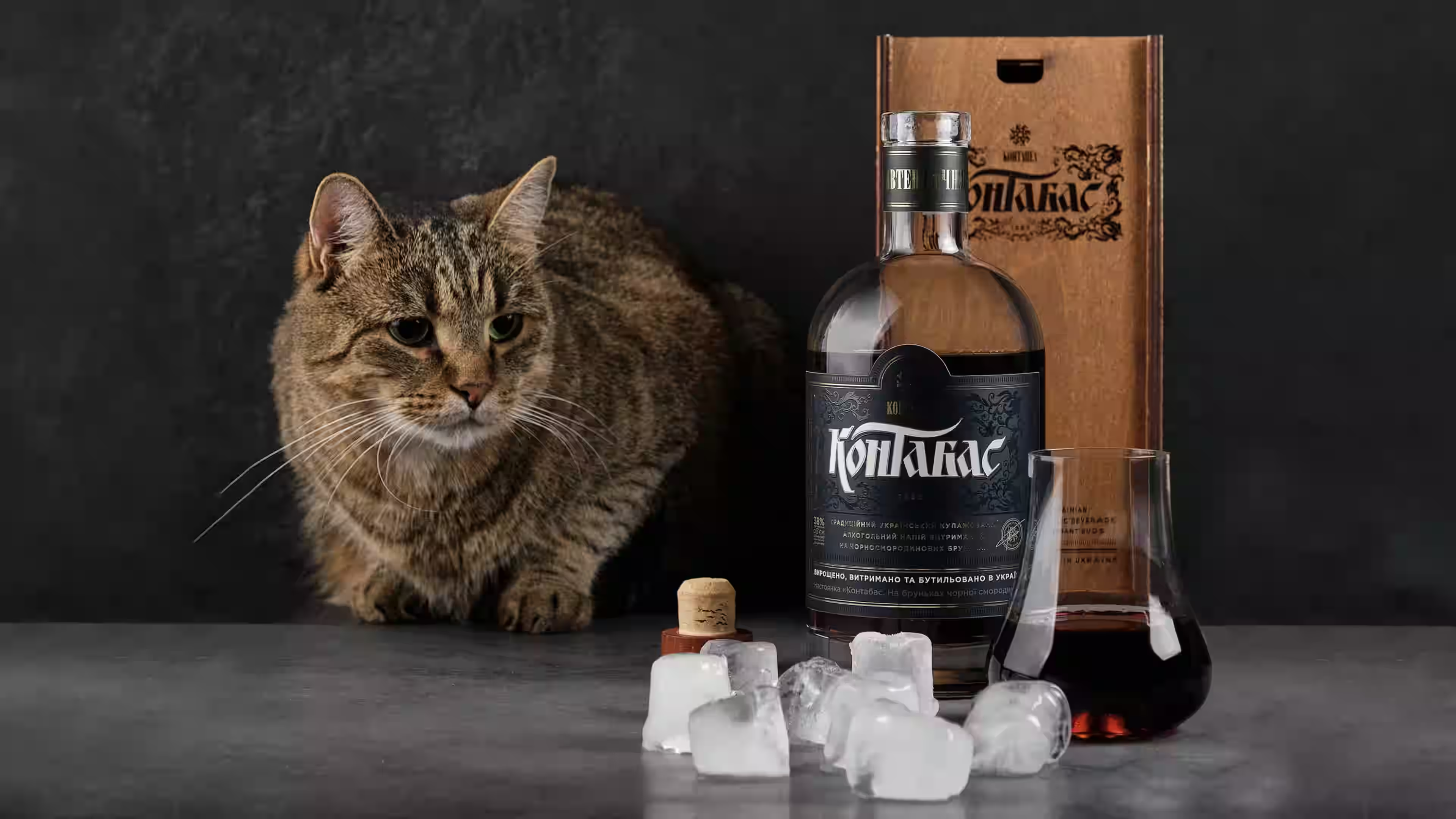
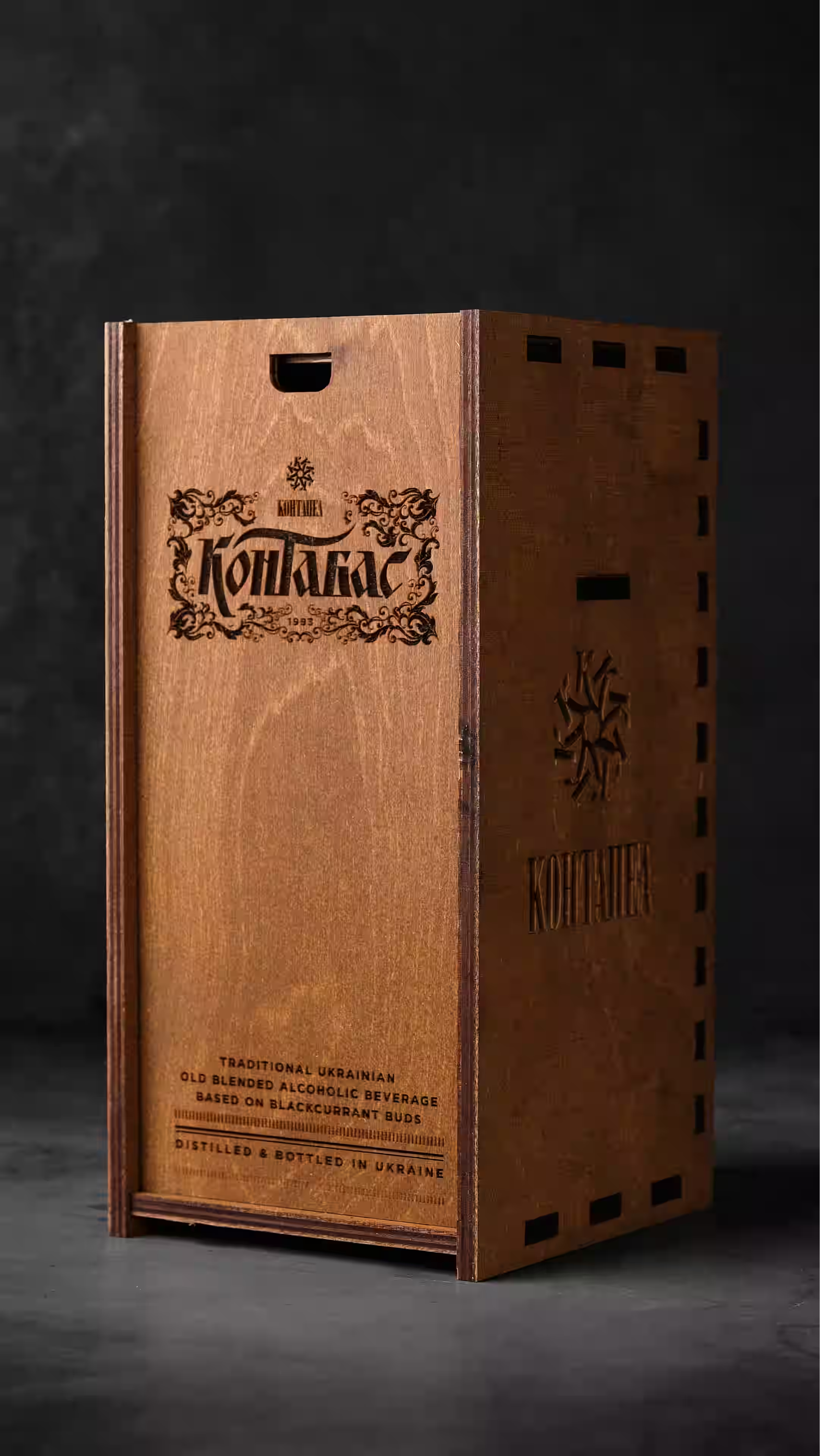
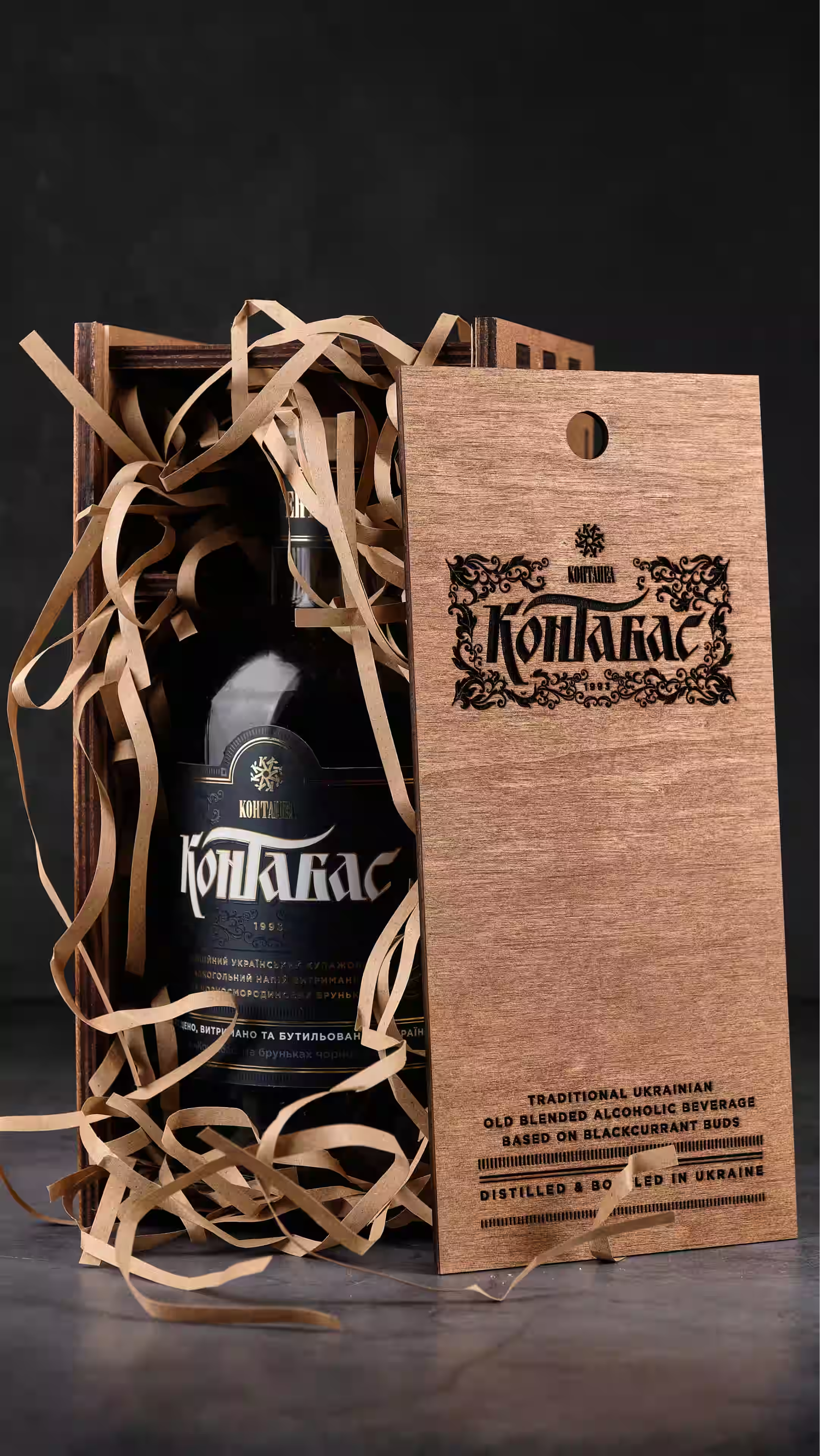
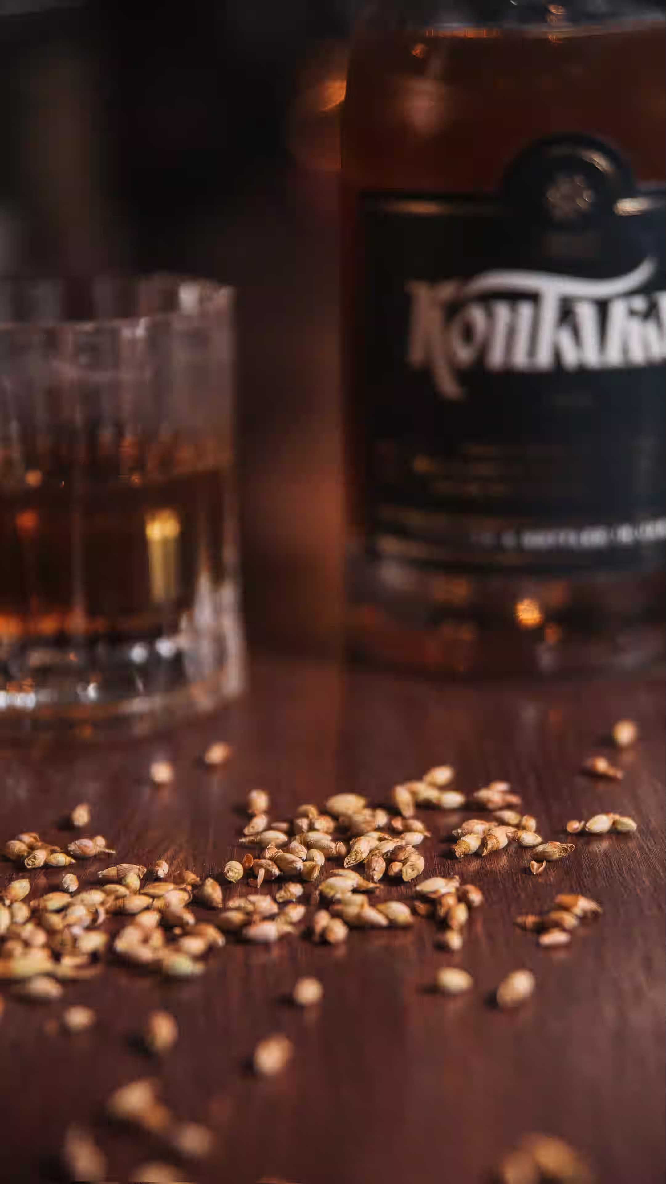
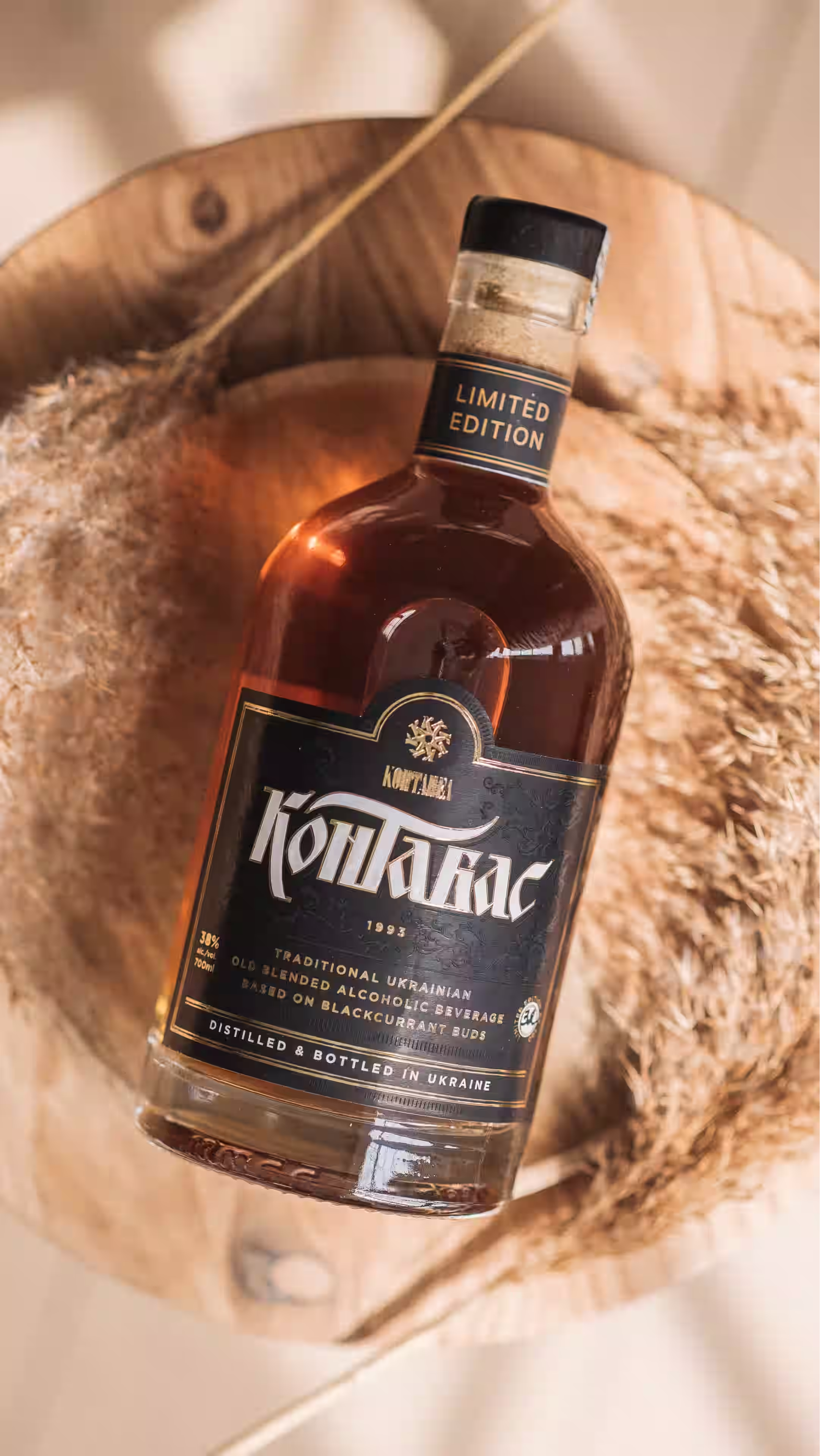
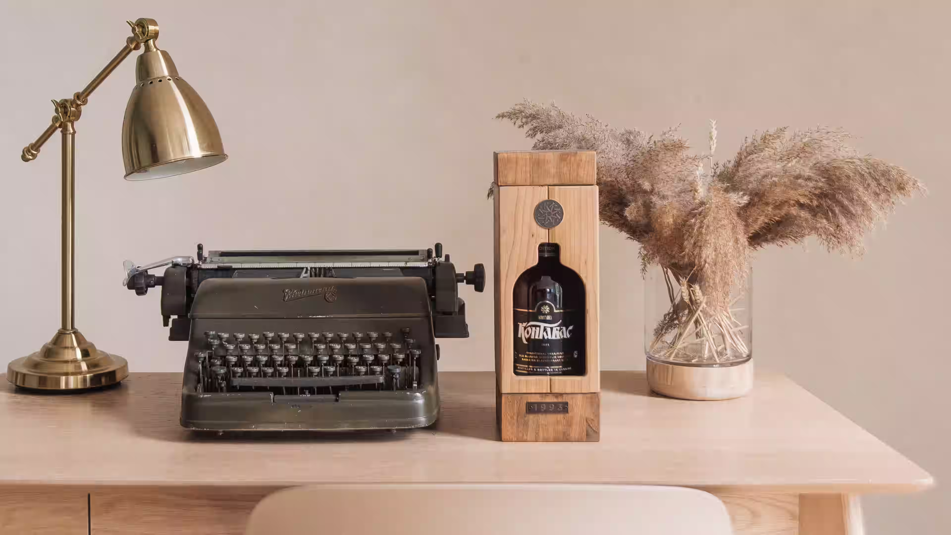
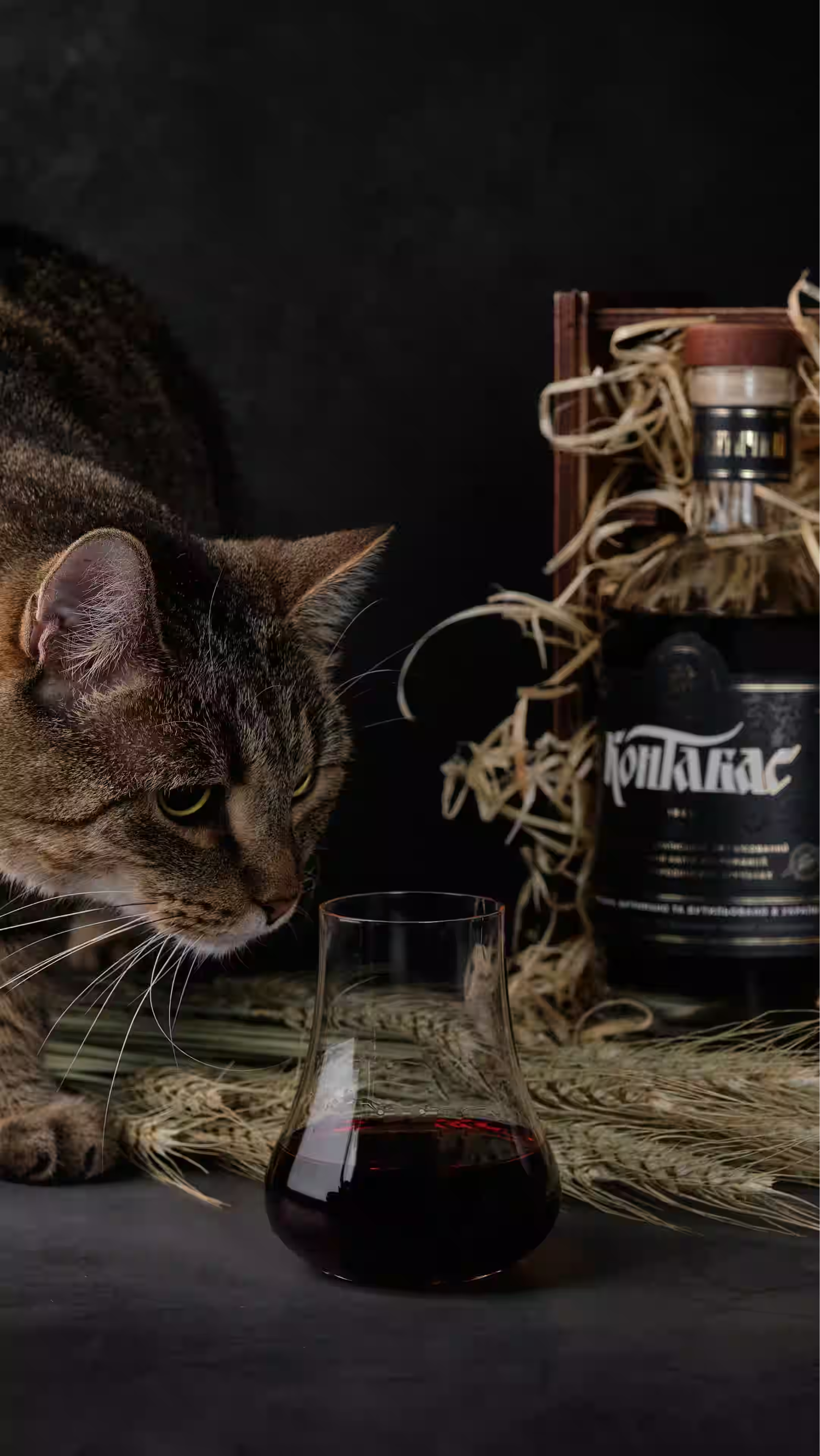
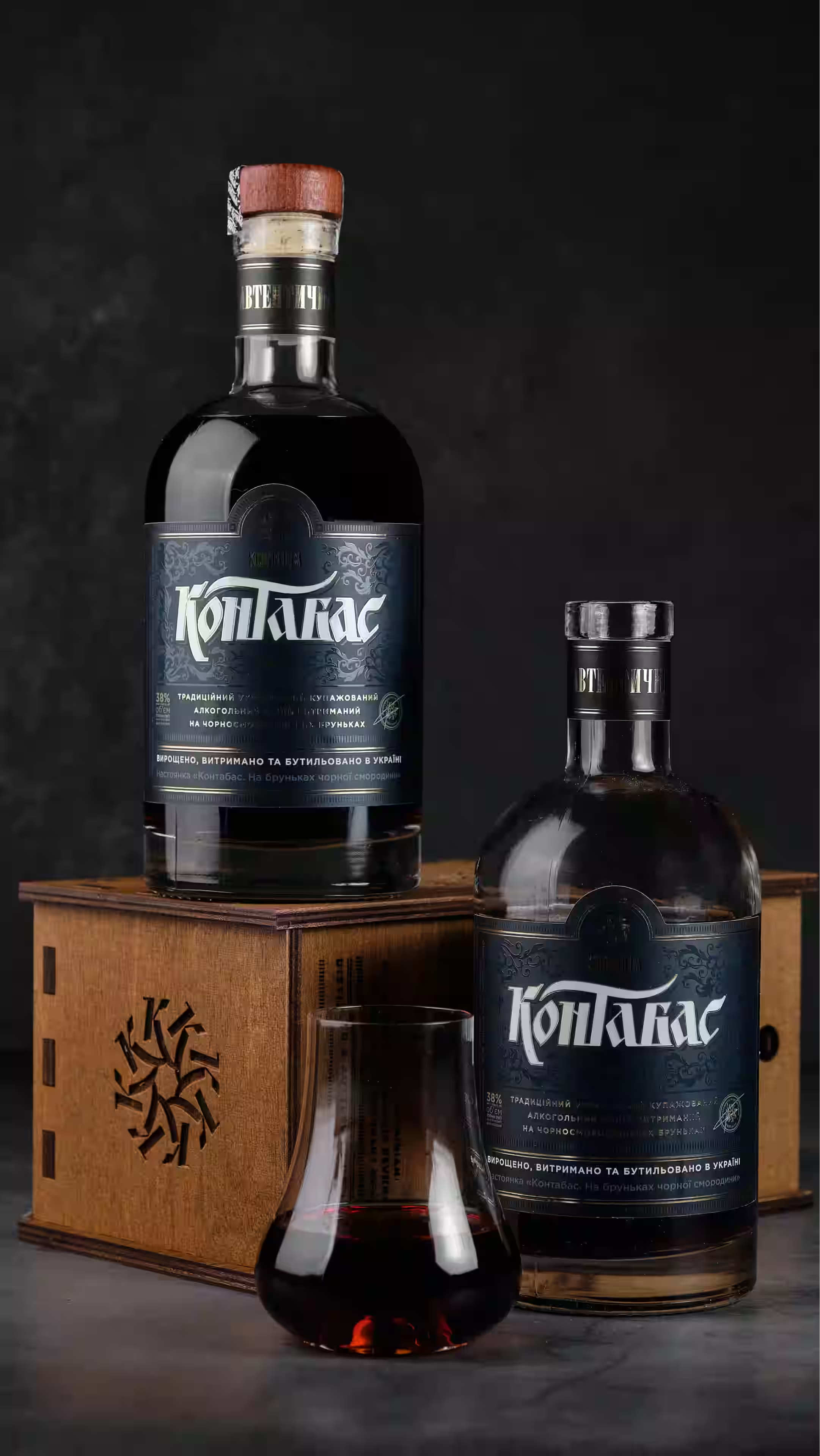
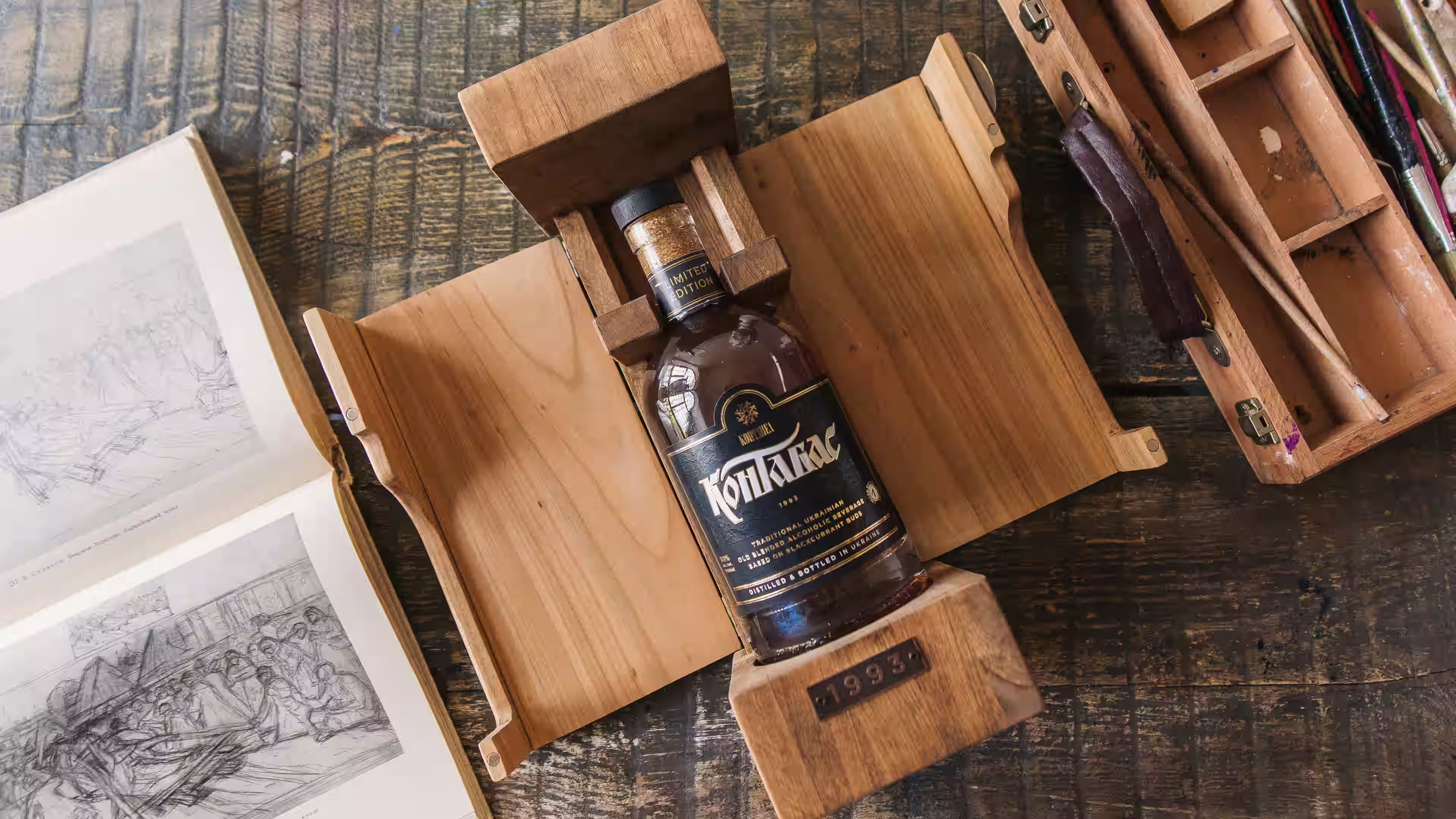
Kontabas is an old Ukrainian alcoholic drink whose tradition was almost lost. The first records of it date back to the 16th century. In the premium spirits category, traditionally led by French cognac and Scotch whisky, Kontabas claims a place of its own: Ukrainian spirits of the same level. The logo and packaging design had to convey Ukrainian origin without literal ethnic symbols and at the same time create a premium image.
SERVICES
IDEA
Kontabas
The handwriting of an era
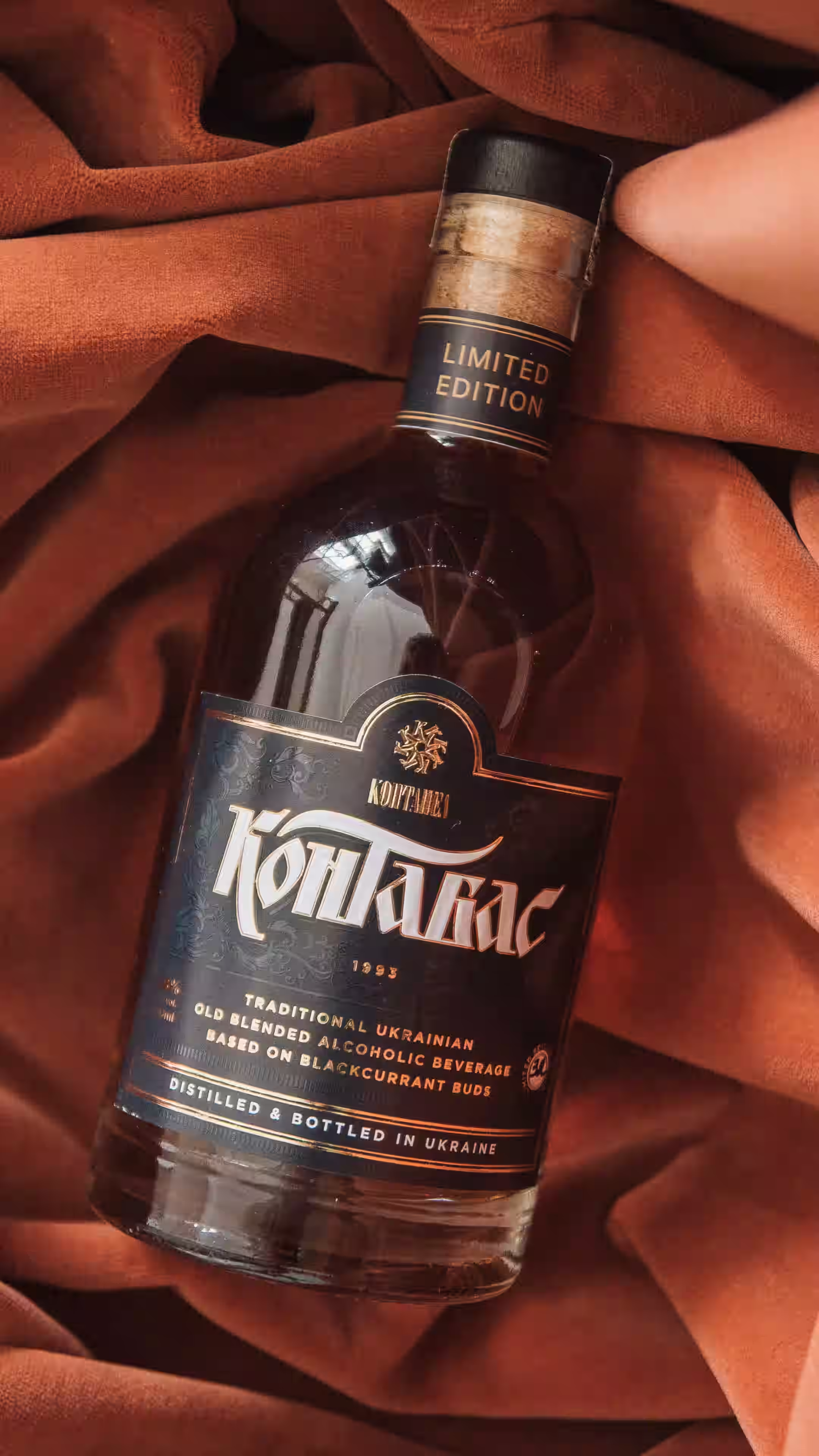
Kontabas dates back to the 16th century, so the search for a visual language began with research into Ukrainian writing of that period: handwritten forms, the character of the letters, the principles of calligraphy. Dozens of sketches led to the final wordmark. The product's history became part of the logo itself, not through decorative “old-style” stylization but through a return to genuine Ukrainian script.

About the business
Kontabas revives a Ukrainian tradition using the original old recipe: a drink that really existed and almost vanished from cultural memory returns in its original form.


Requirements for the visual identity
The lettering is built on a modernized form of Ukrainian semi-uncial script (napivustav) with calligraphic elements of skoropys, the old Ukrainian cursive hand. This kept the character of historical writing while freeing the mark from the feel of a church manuscript and making it contemporary.
The label design continues the brand's historical logic, combining custom calligraphy with a restrained composition. Gray and gold give the product a premium character without turning it into decorative ethnic styling.
The first batch of limited-edition Kontabas 1993 sold out within a month. A product little known to today's market got its own visual image and quickly found its first admirers.


Shall we talk about your 👤 project?