Pryano

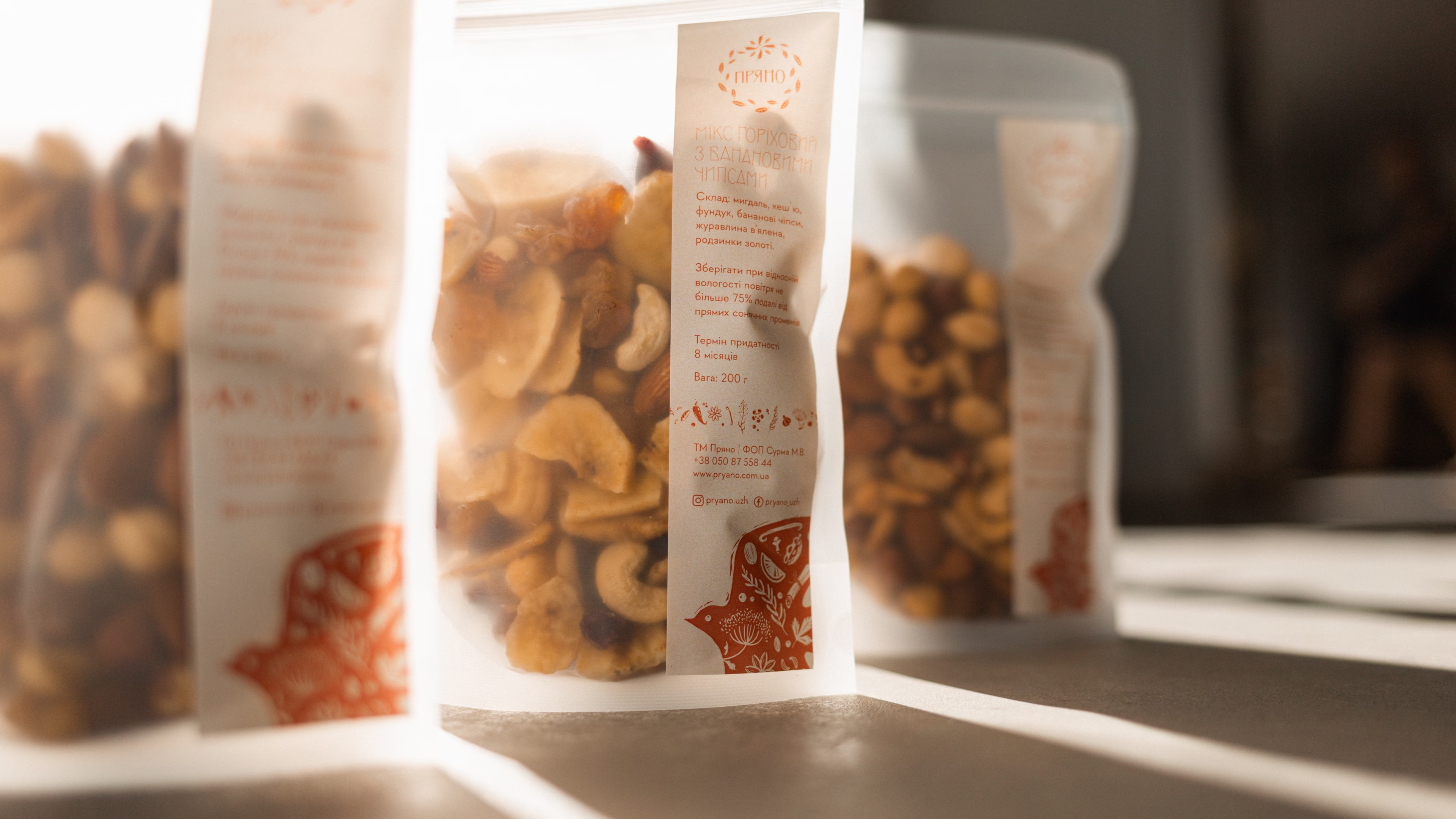
Pryano is a shop of spices and craft foods for people who value quality, love to cook and like discovering new flavors. The repositioning had to find the brand its own territory in a category where craft producers and the mass market speak the same language: “natural”, “organic”, “quality”. The project covered brand strategy, positioning, a slogan, and an update of the logo, visual identity, packaging design and corporate style. At the core of the whole system is a shift from naturalness as a product feature to authenticity as a brand value.

SERVICES
IDEA

Pryano

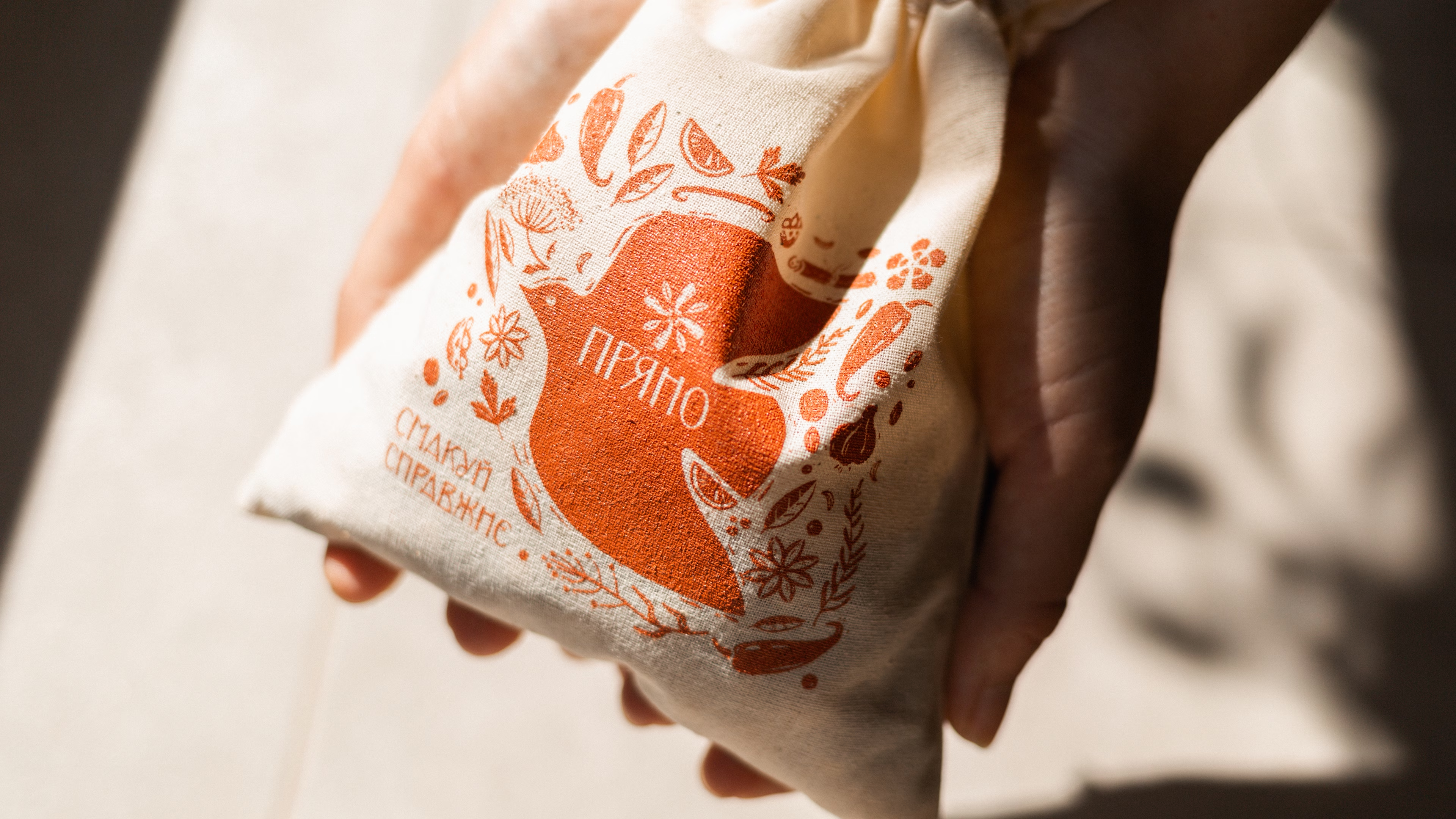
Taste what's real

In the category of spices and natural products, “eco”, “organic” and “quality” stopped setting anyone apart long ago. So Pryano talks about authenticity: pure taste, honest origin and products with character.

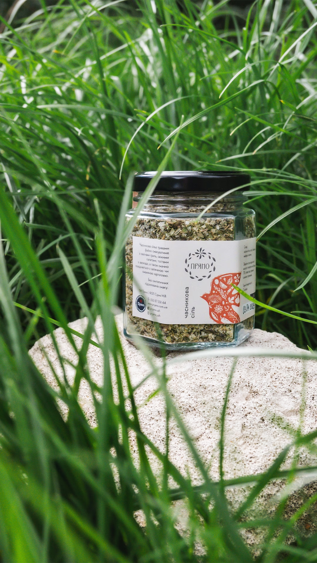
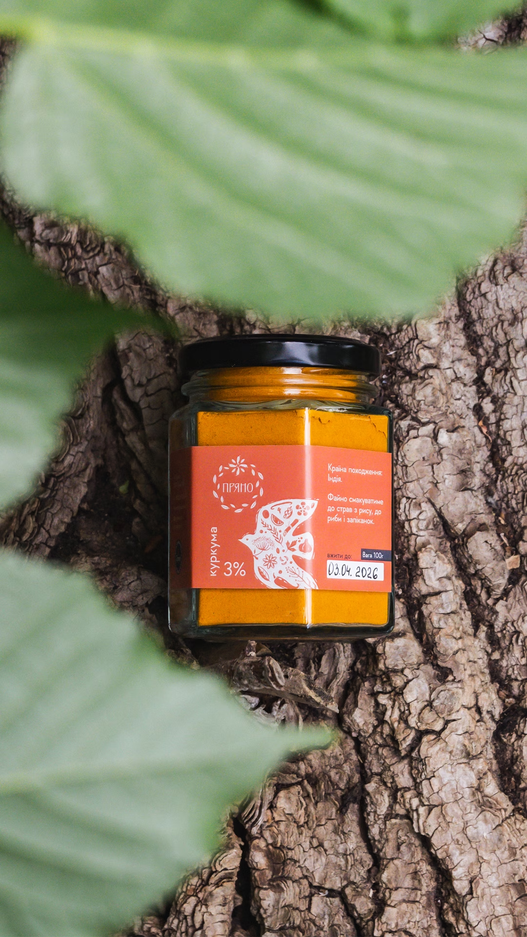
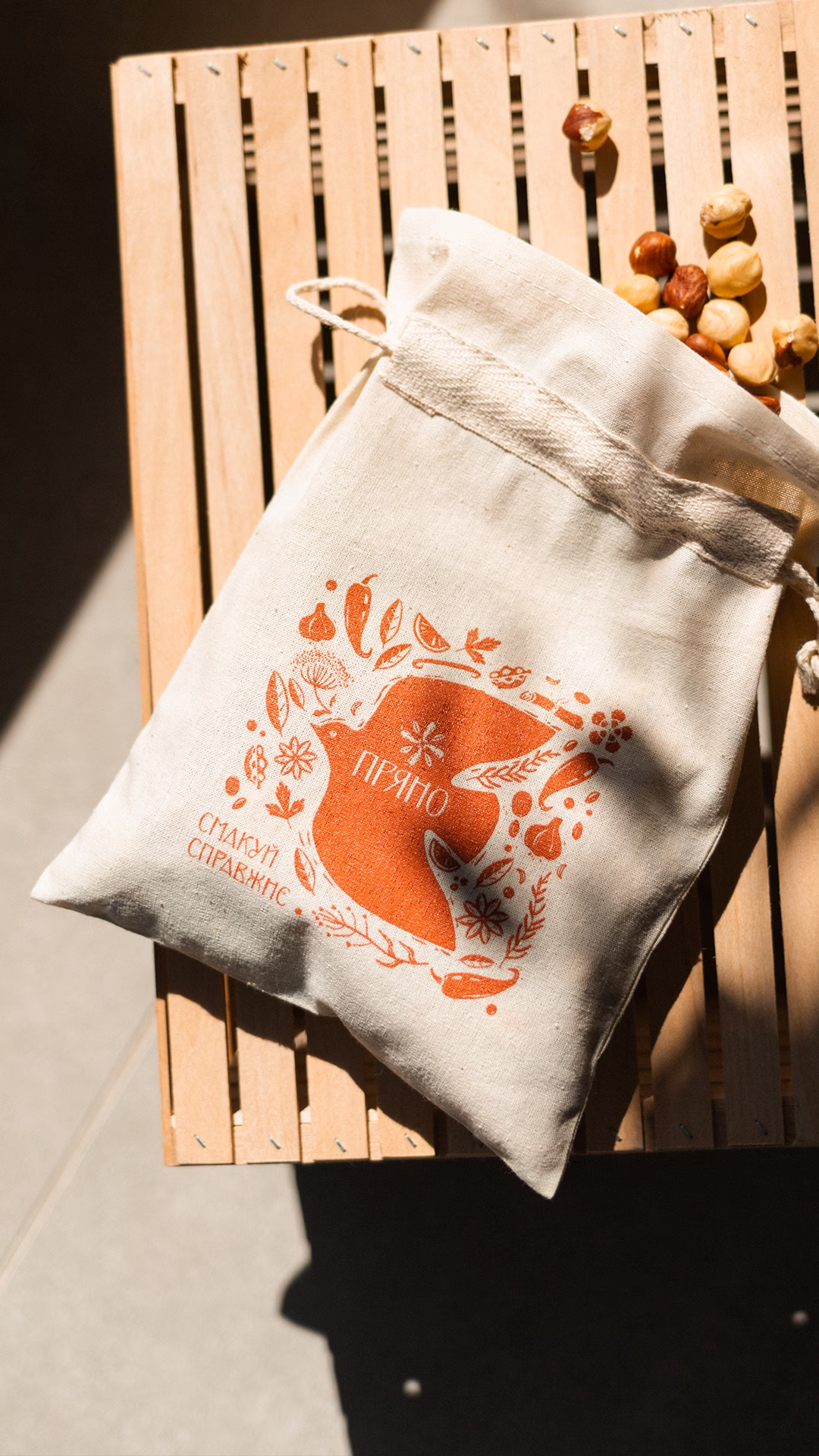
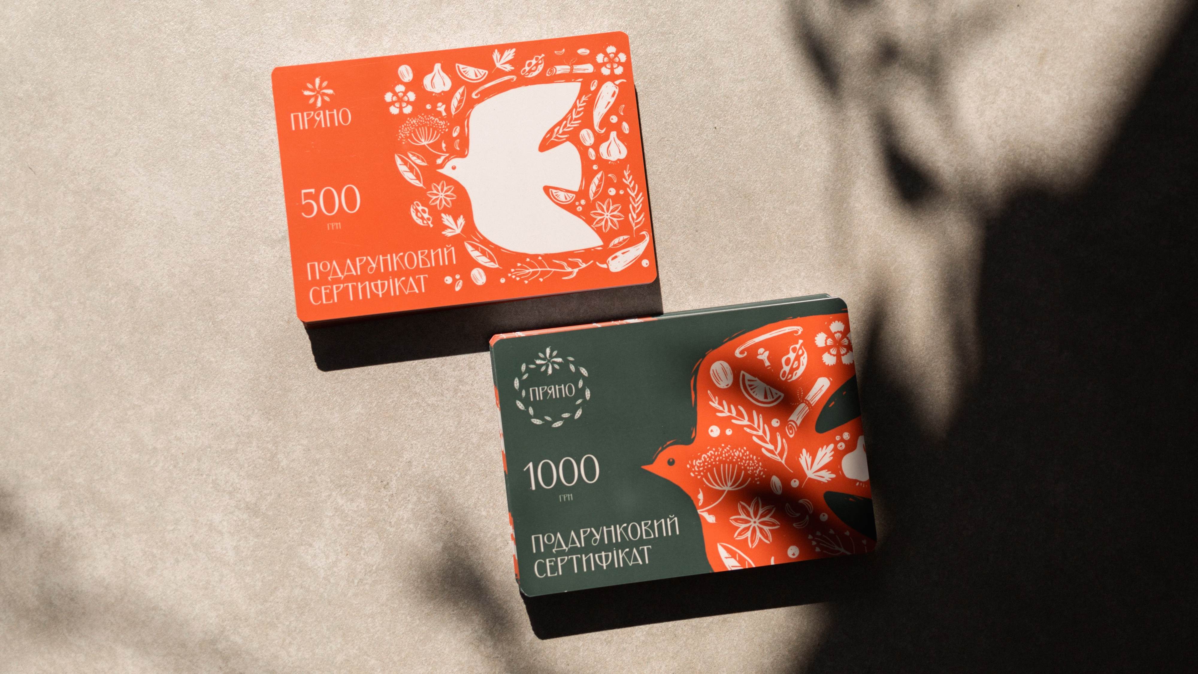
The brand's symbol is a guardian bird. It joins legends about the guardians of rare spices with the Ukrainian image of the bird as a protective charm. Both meanings meet in one idea: to keep what is real.

About the business

Pryano works where two categories meet: a spice shop and a space for local craft products. The range includes spices, sweets, sauces, delicacies and gift sets, among them products from small producers that are hard to find in chain retail.

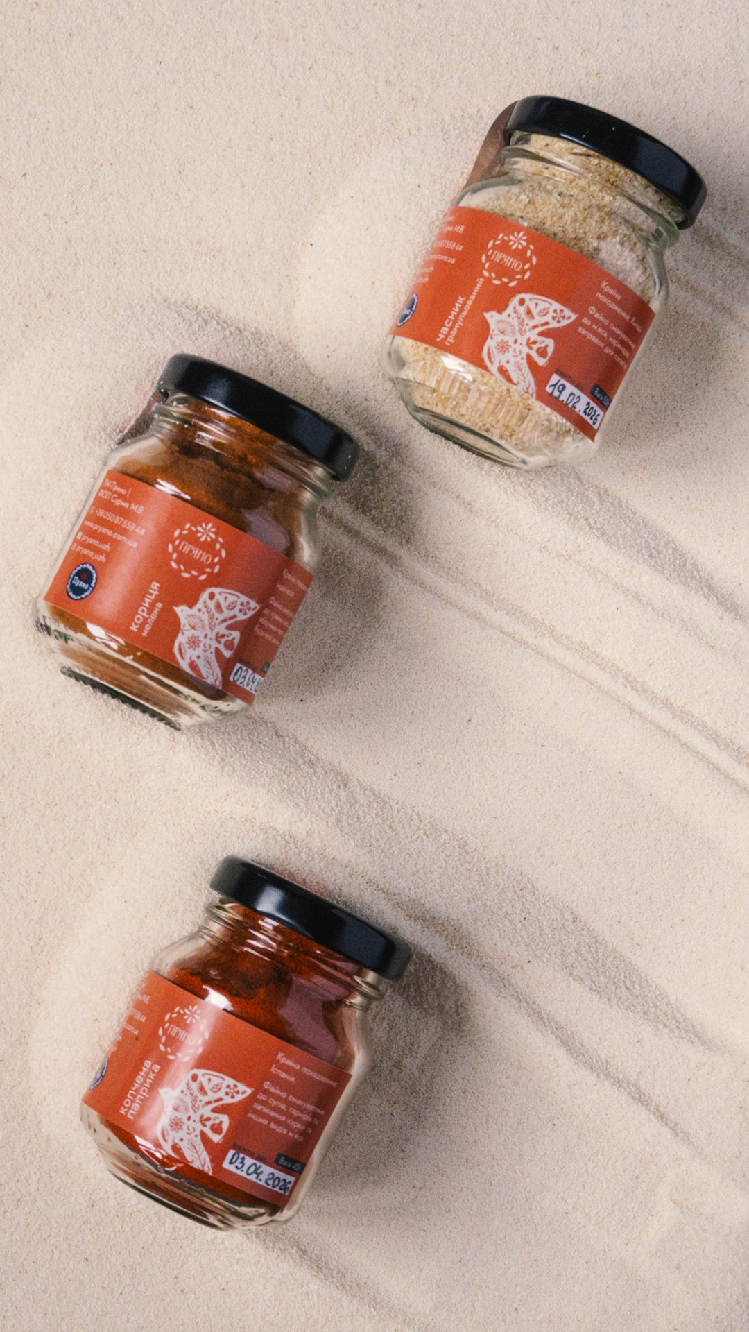
As the range grew, the brand needed to stay coherent without losing the character of individual products. The new brand system had to remain recognizable whatever the product category.

Requirements for the visual identity

Positioning

Instead of competing in the “natural / organic / quality” category, the brand took the territory of authenticity. The slogan “Taste what's real” became a short expression of the positioning and united different product categories around one value.

Illustration system

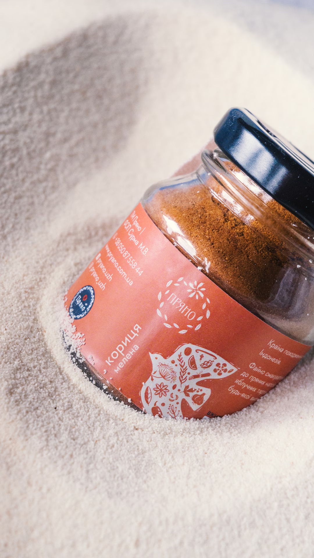
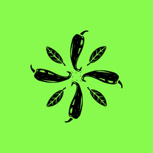
The visual style rests on a pattern of plant elements and recognizable spices. The graphics imitate linocut: uneven outlines and texture create a handmade feel and support the brand's craft character without a literal “eco” aesthetic.

Typography and color

Distinctive typography is paired with a restrained graphite palette that forms a neutral base for rich product graphics. The system works across different categories and packaging formats while keeping Pryano's visual identity consistent.

More cases

Back to all cases

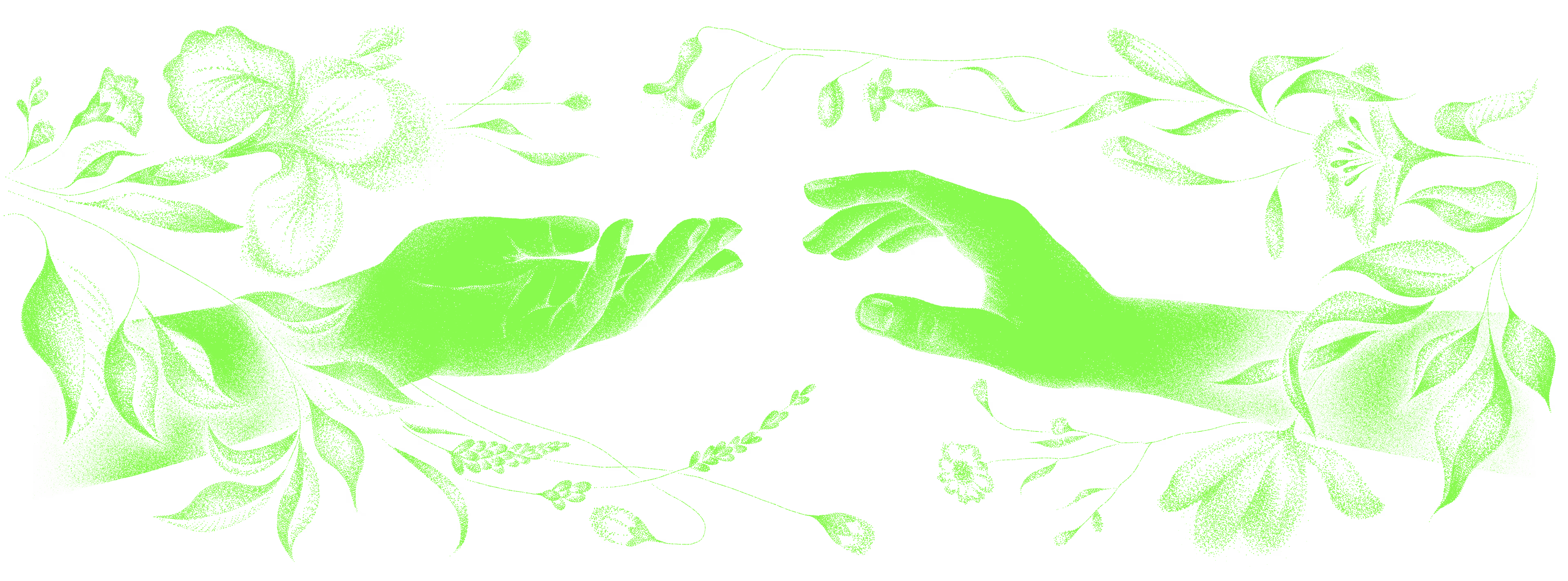
Suprasoul hands illustration

Shall we talk about your 👤 project?

Thank you. Your message is with us, and we'll reply soon.
The message didn't go through. Please try again a little later.