Prodan
Prodan is a family dental clinic. The brand had to move away from the usual dental imagery of teeth, smiles and sterile medical aesthetics, and find an image of its own for the uncompromising quality and trust the clinic is built on.
SERVICES

Prodan is a family dental clinic. The brand had to move away from the usual dental imagery of teeth, smiles and sterile medical aesthetics, and find an image of its own for the uncompromising quality and trust the clinic is built on.
SERVICES
IDEA
Prodan Dental Clinic
The bird that cleans a crocodile's teeth
According to an old legend, the Egyptian plover flies into a crocodile's mouth to clean its teeth of leftover food. This unexpected image became the basis of the Prodan mark: instead of a literal dental symbol, a metaphor of interaction in which care is possible only with complete trust.
About the business
Prodan Dental Clinic is a family business that makes trust not an advertising word but the result of the same people working together for years. Patients come back not for a promotion or a discount but for a doctor they know. They bring their children and recommend the clinic the way you recommend trusted people, not an institution.
Requirements for the visual identity
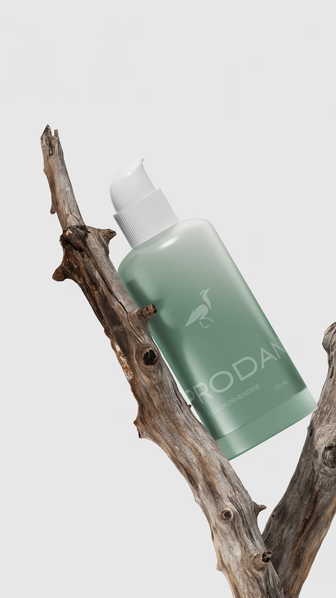
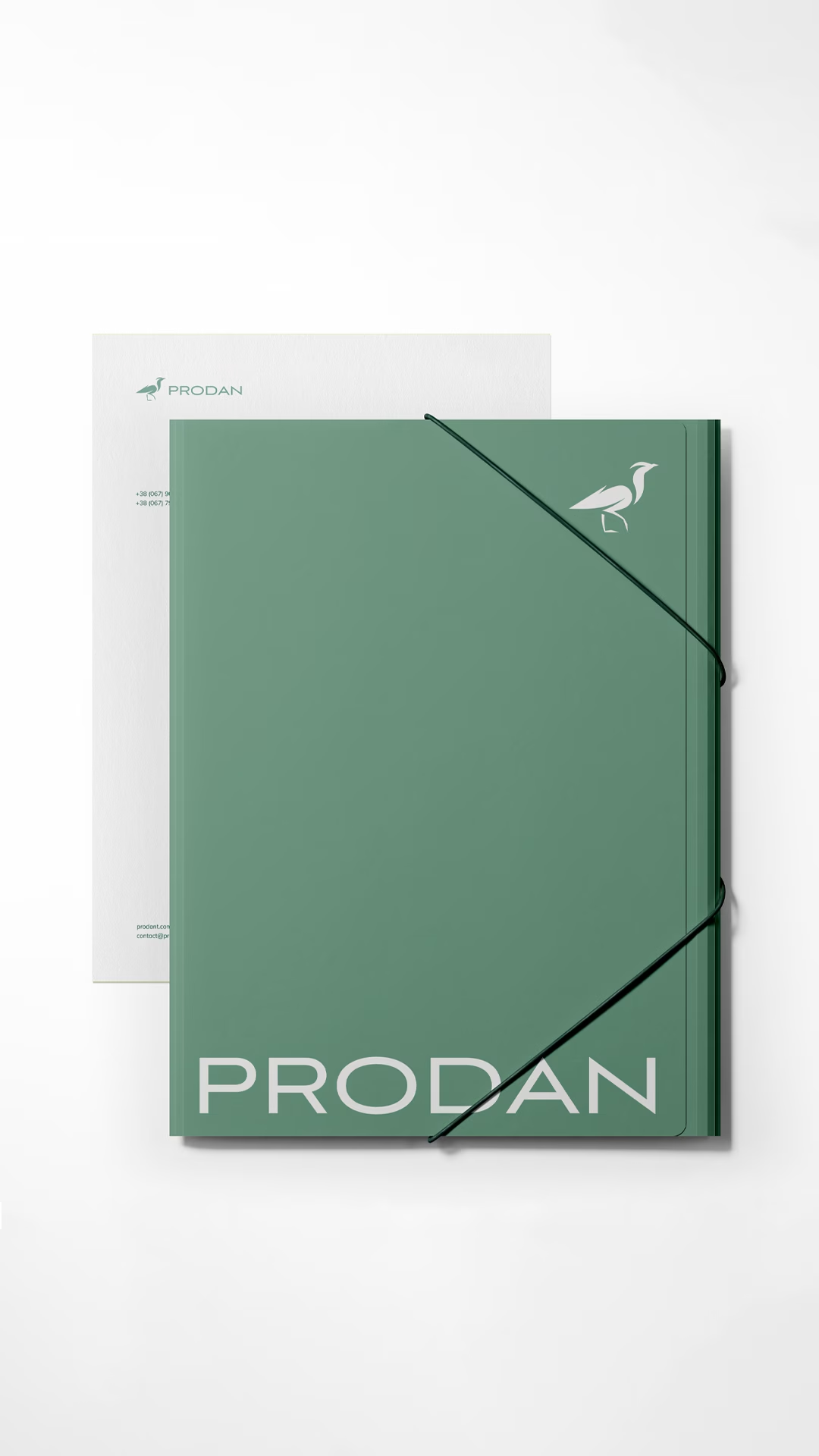
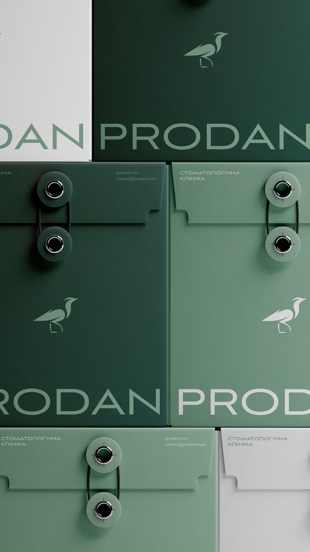
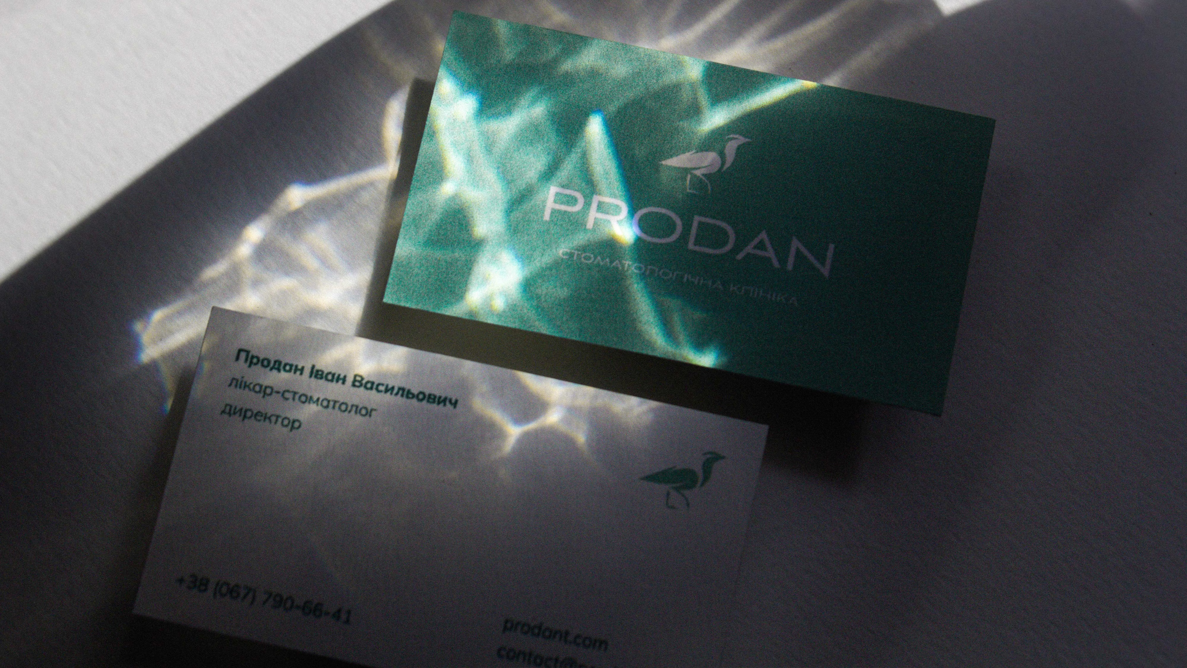
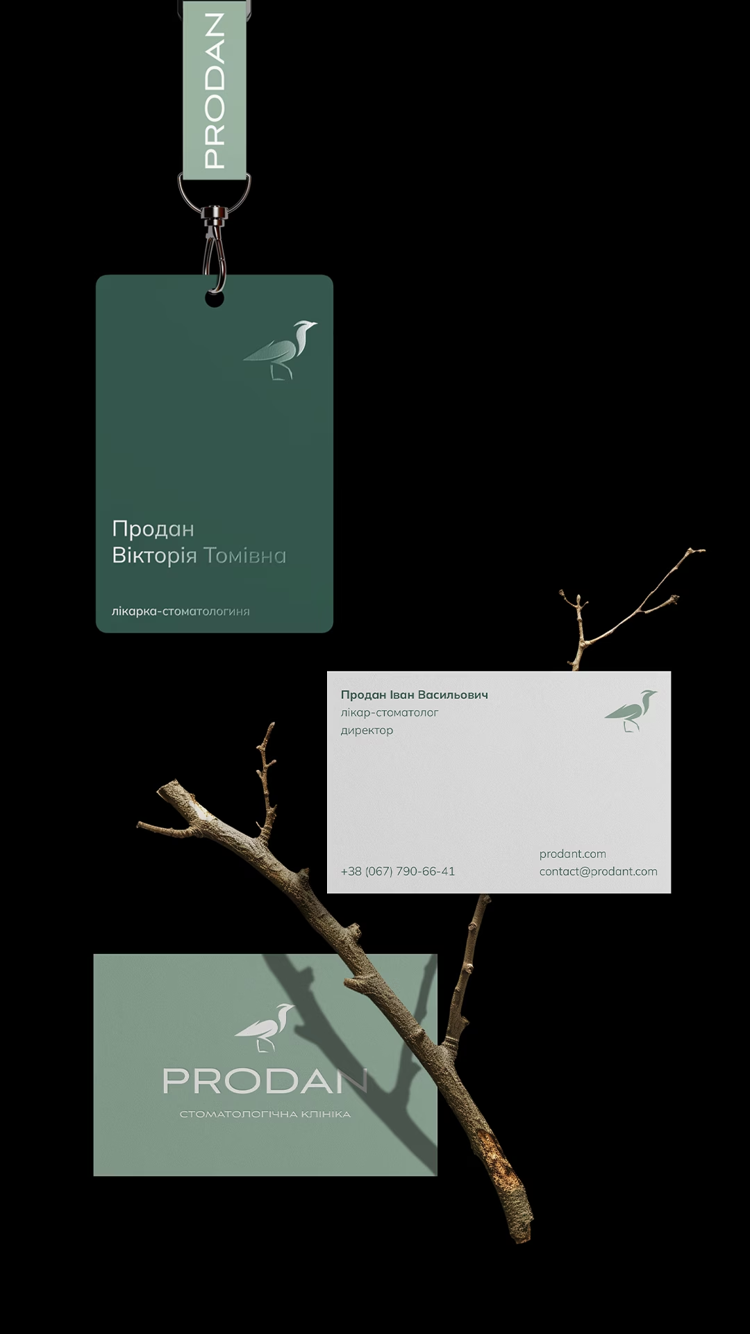
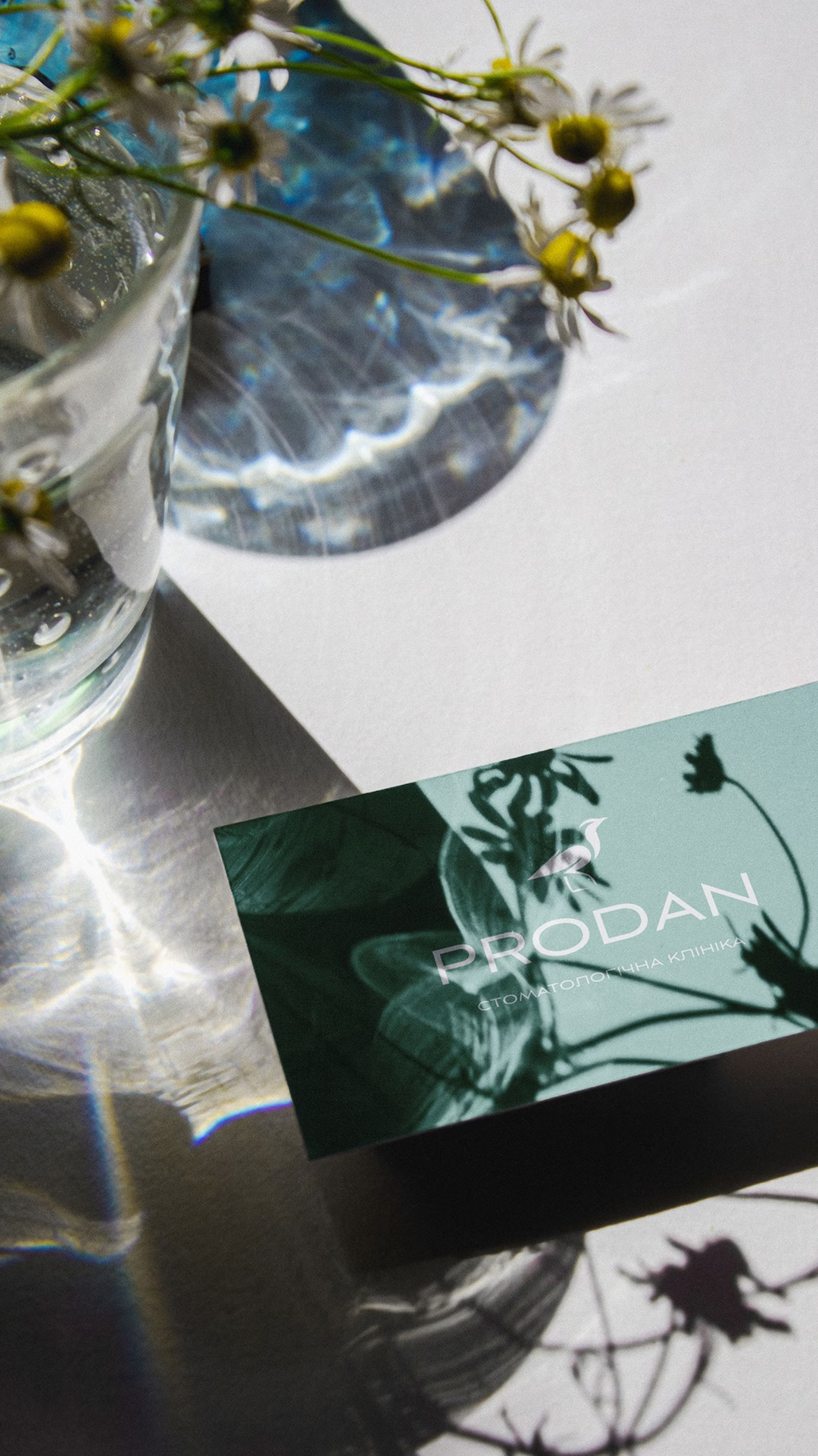
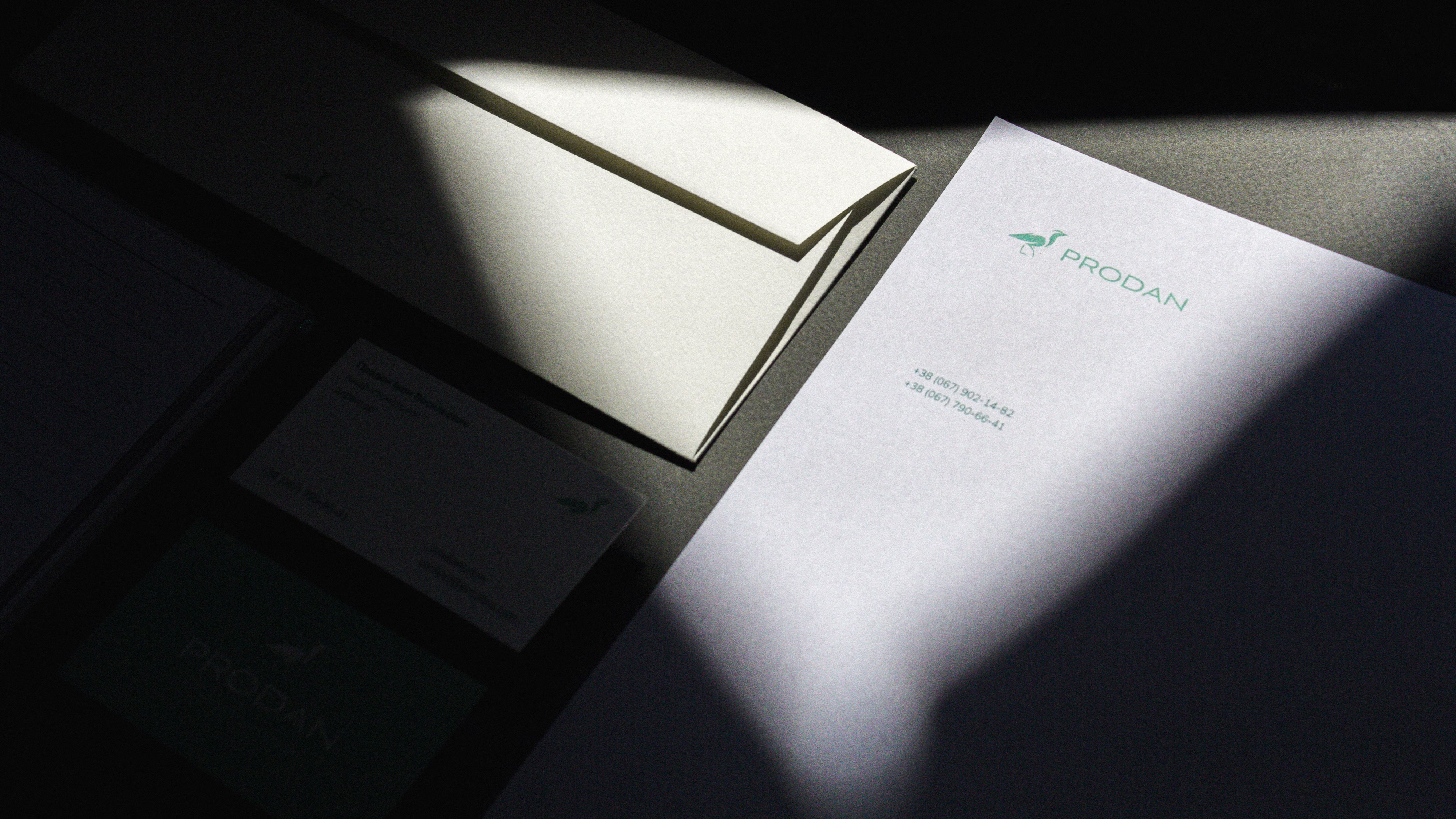
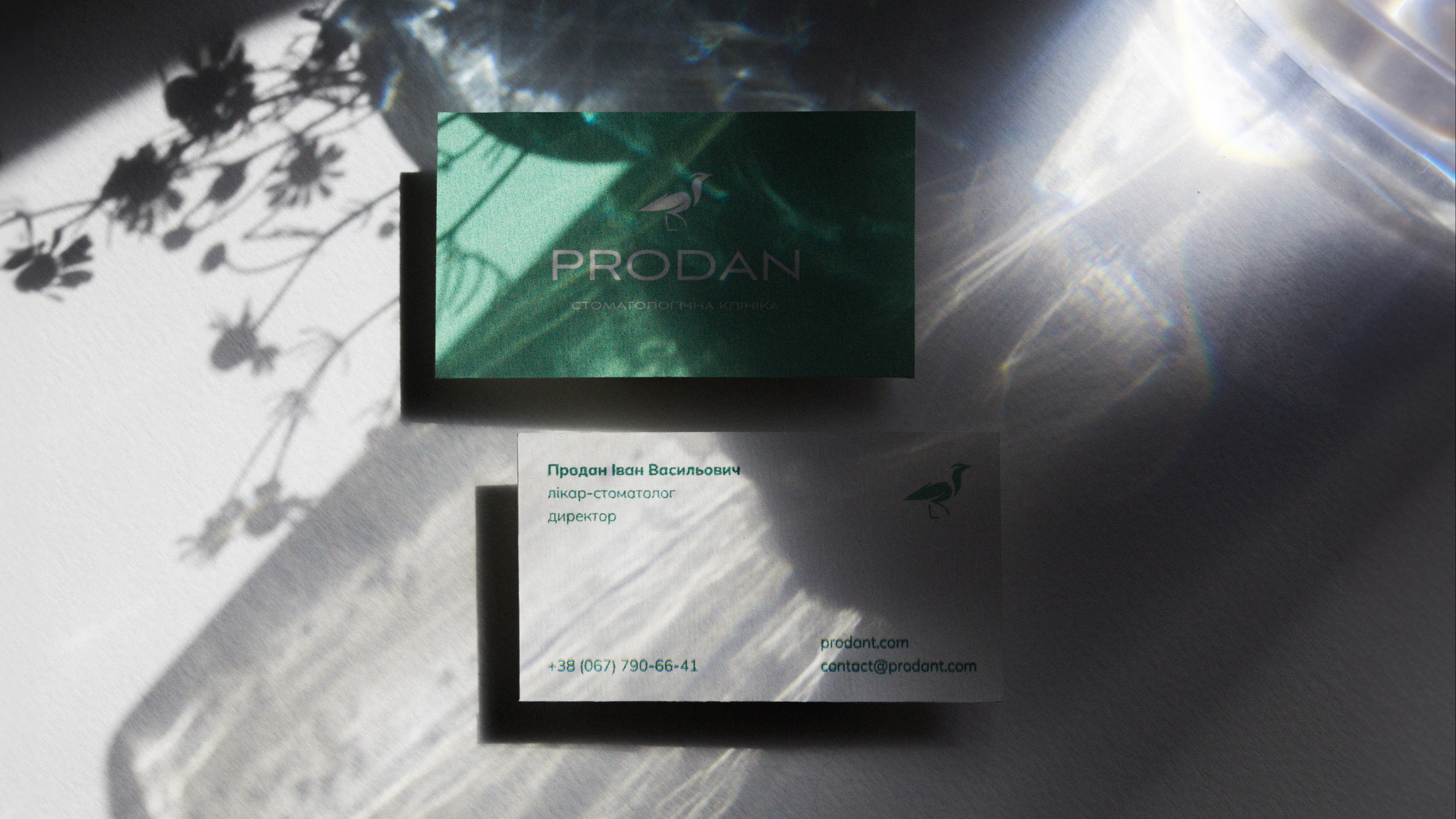
The silhouette of the Egyptian plover became the basis of the dental clinic's logo and the brand's main identifier. An image unusual for a dental clinic made it possible to move away from the category's literal symbols and create a recognizable mark of its own.
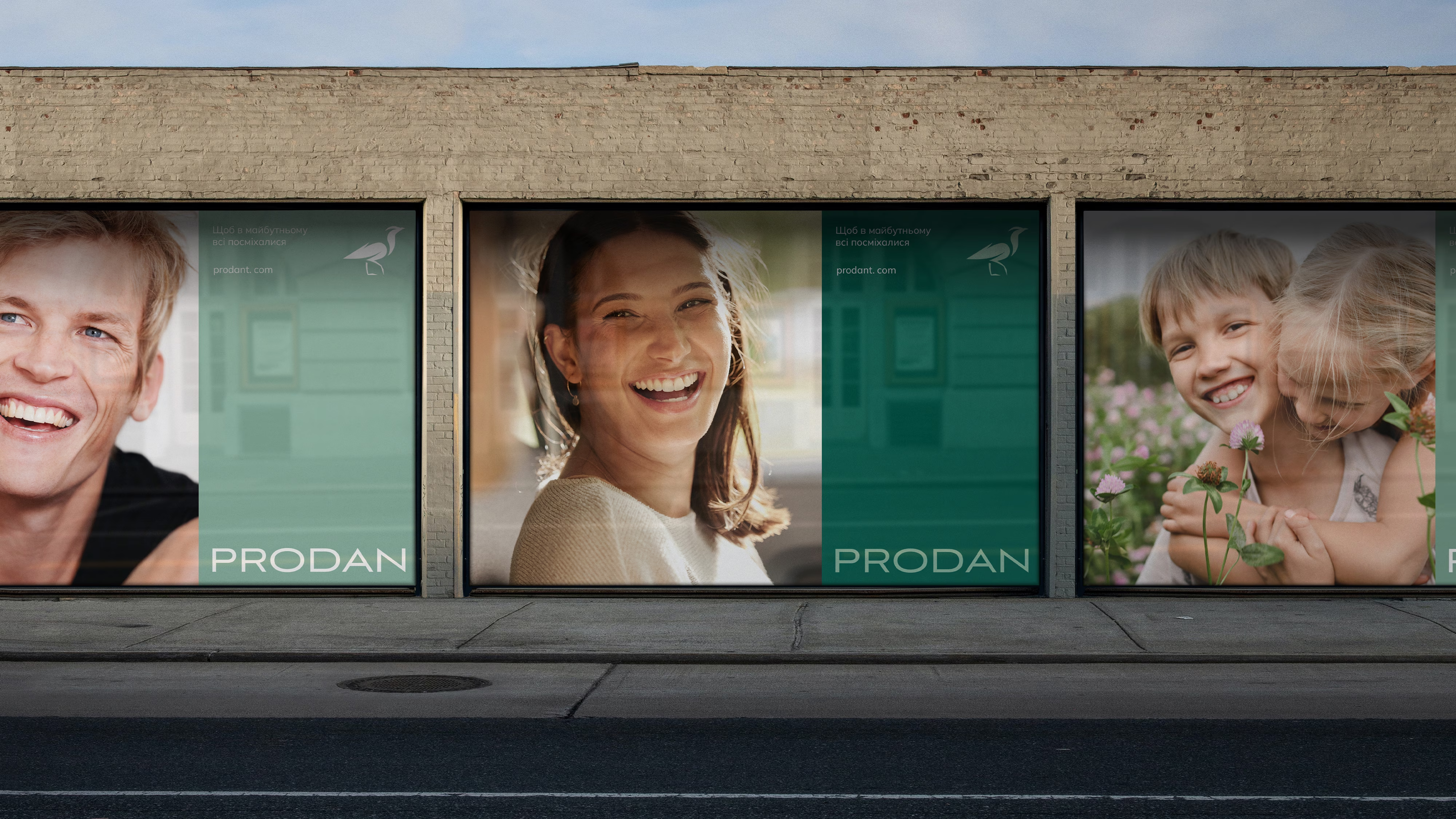
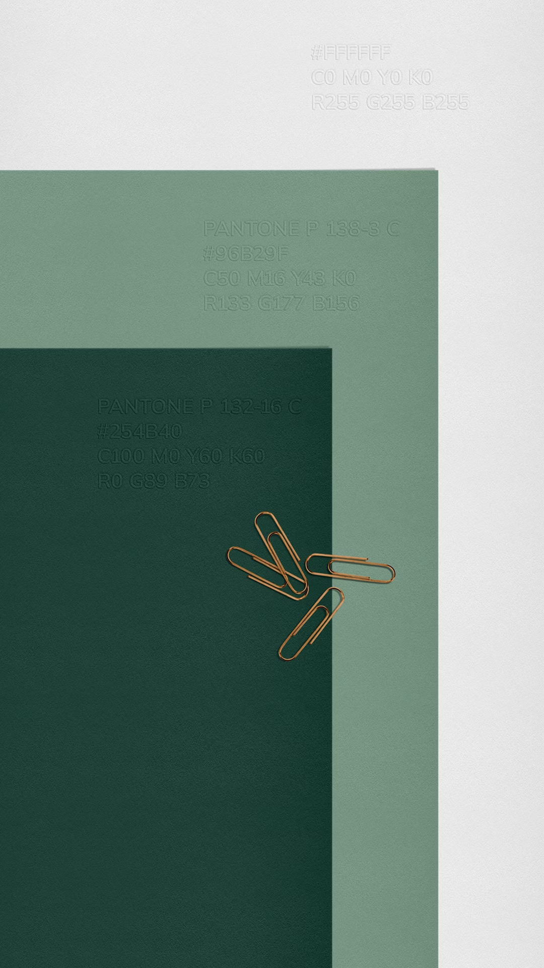
Instead of sterile white, a muted natural palette. It softens the medical context and helps create a calm, warm environment without losing a sense of professionalism.
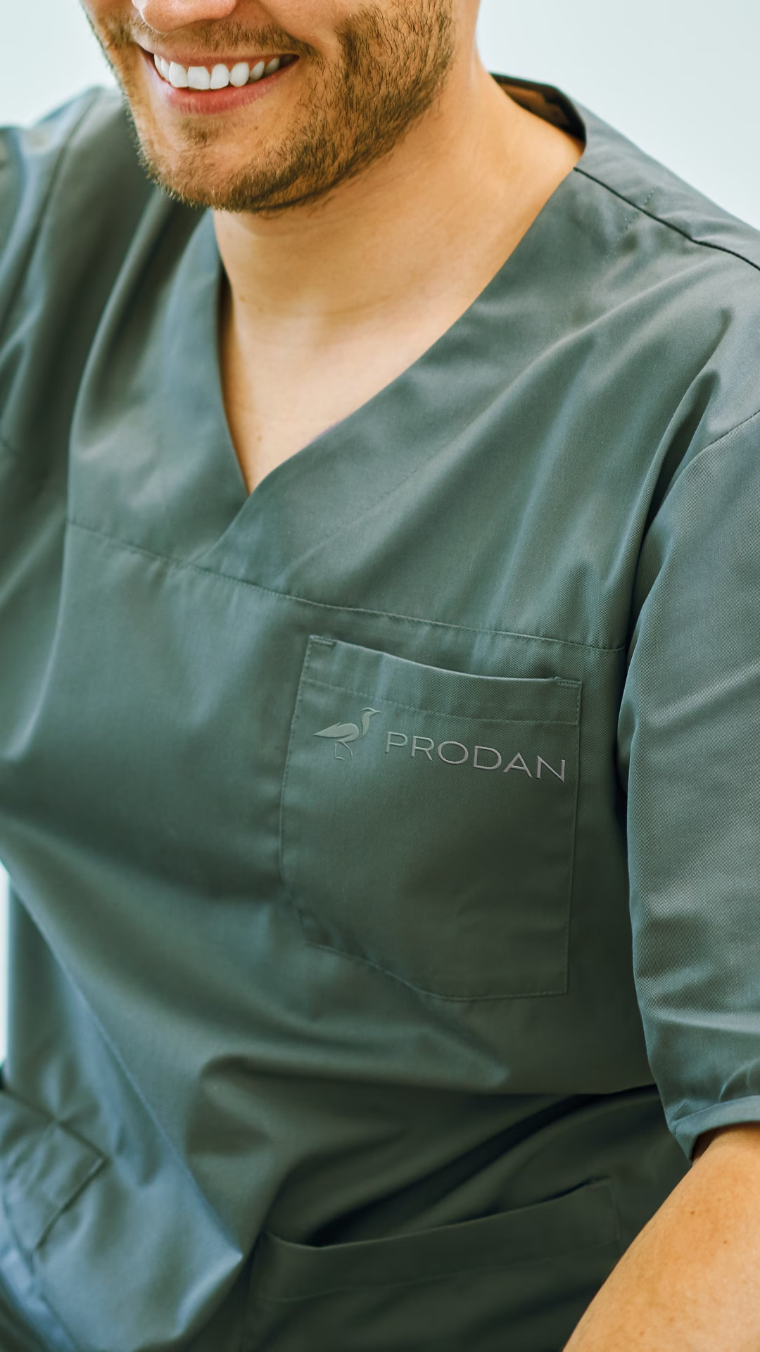
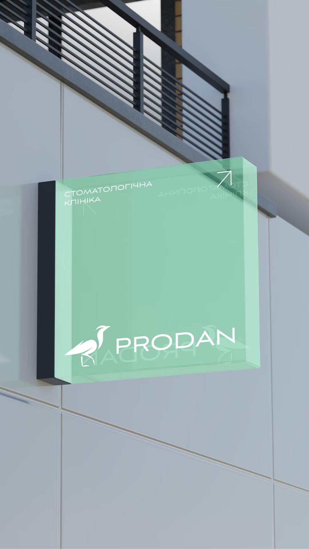
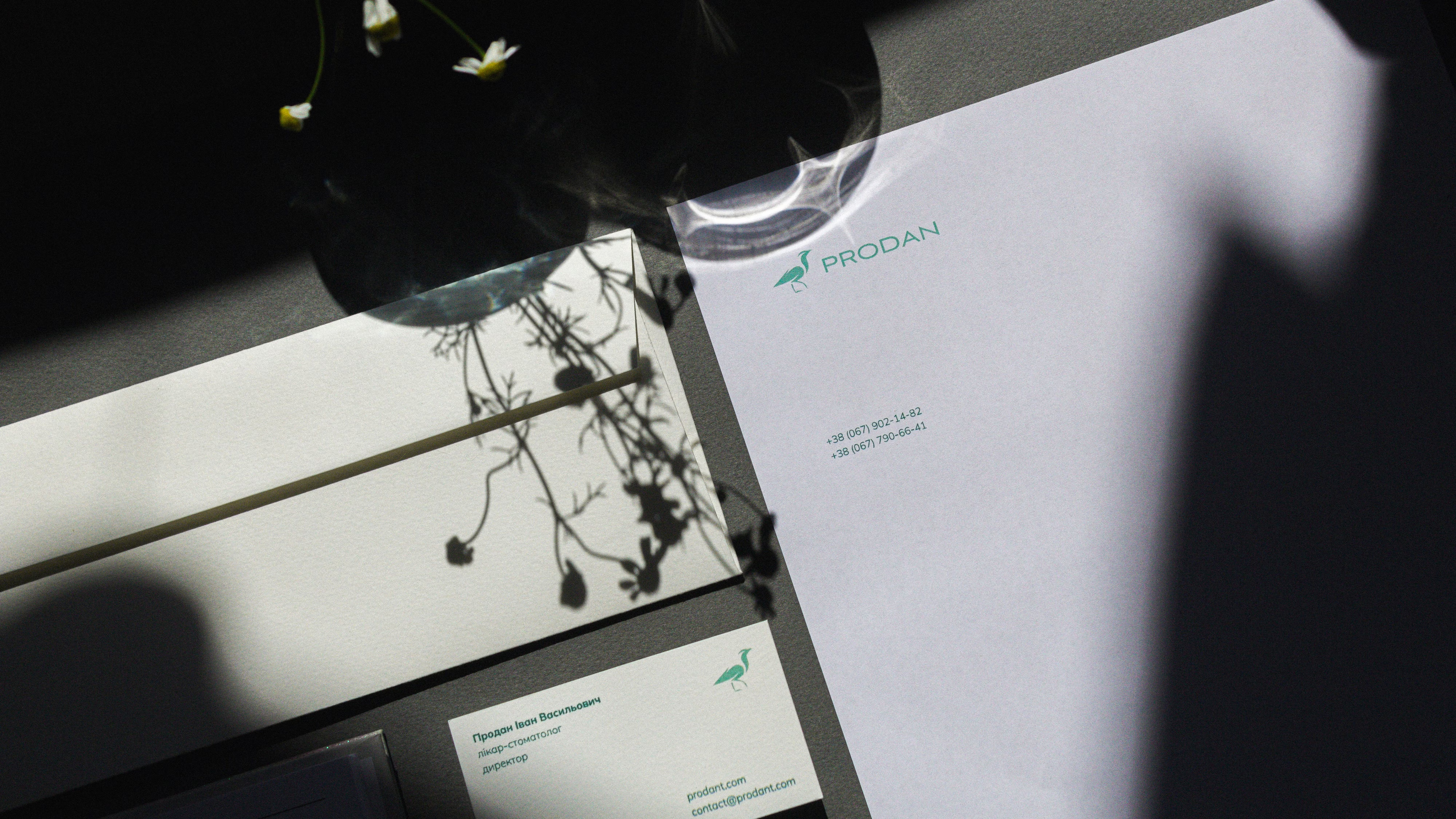
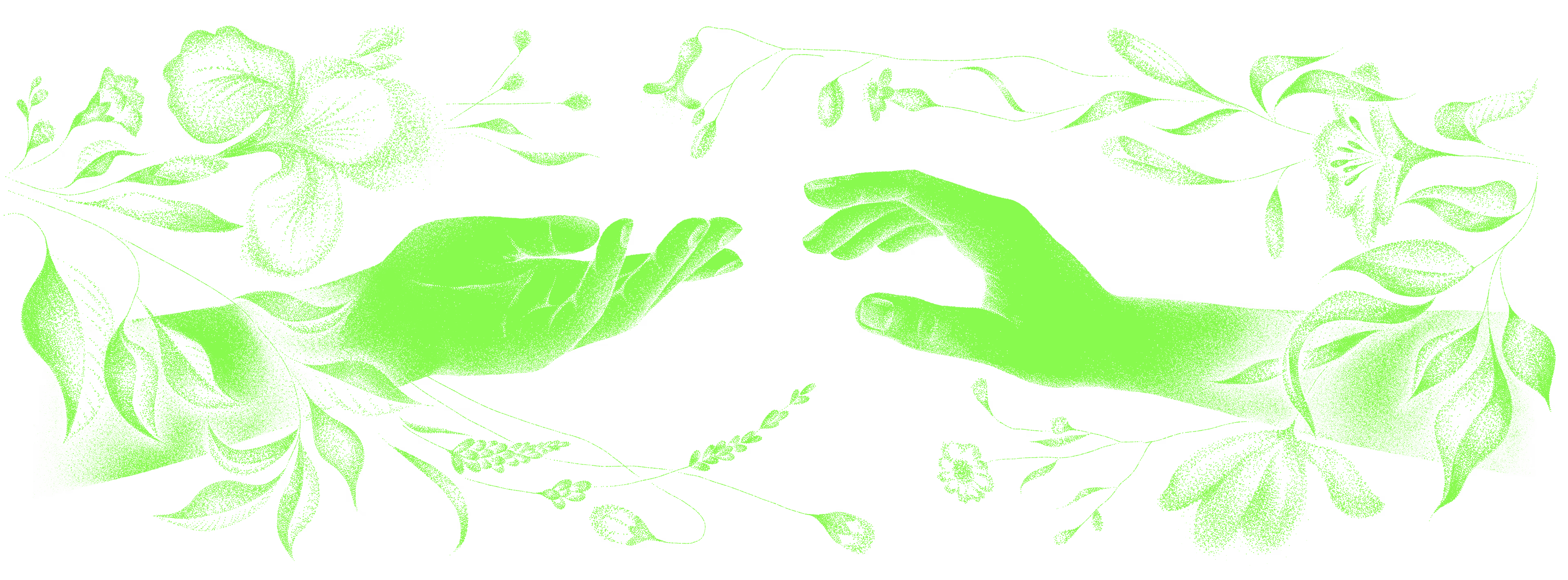
The identity works at every patient touchpoint, from signage and interior wayfinding to documents, uniforms and social media. The visual style and the typography of the materials form a coherent brand image. The brand book covers, among other things, typography and wayfinding.


Shall we talk about your 👤 project?