Loza

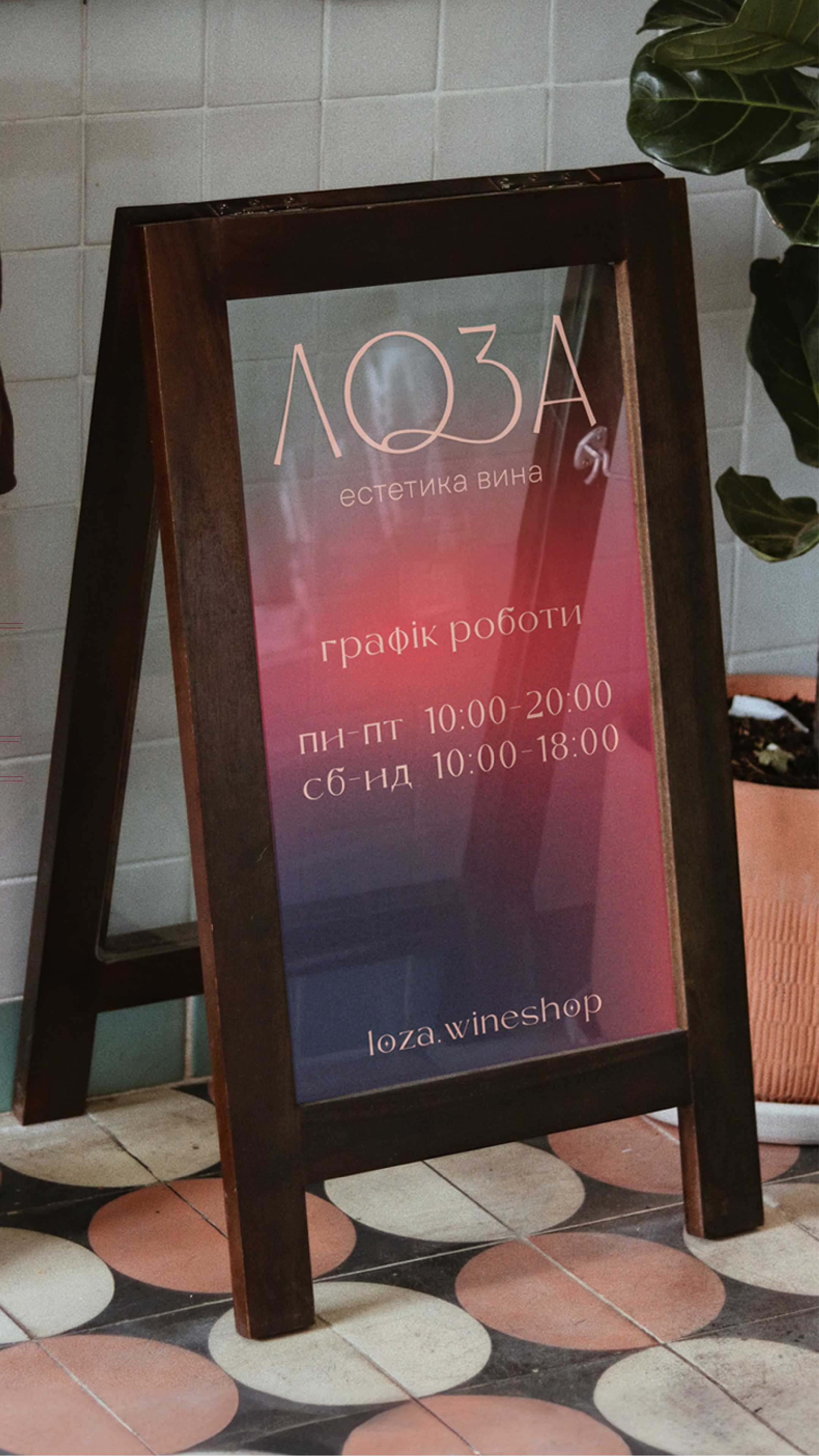
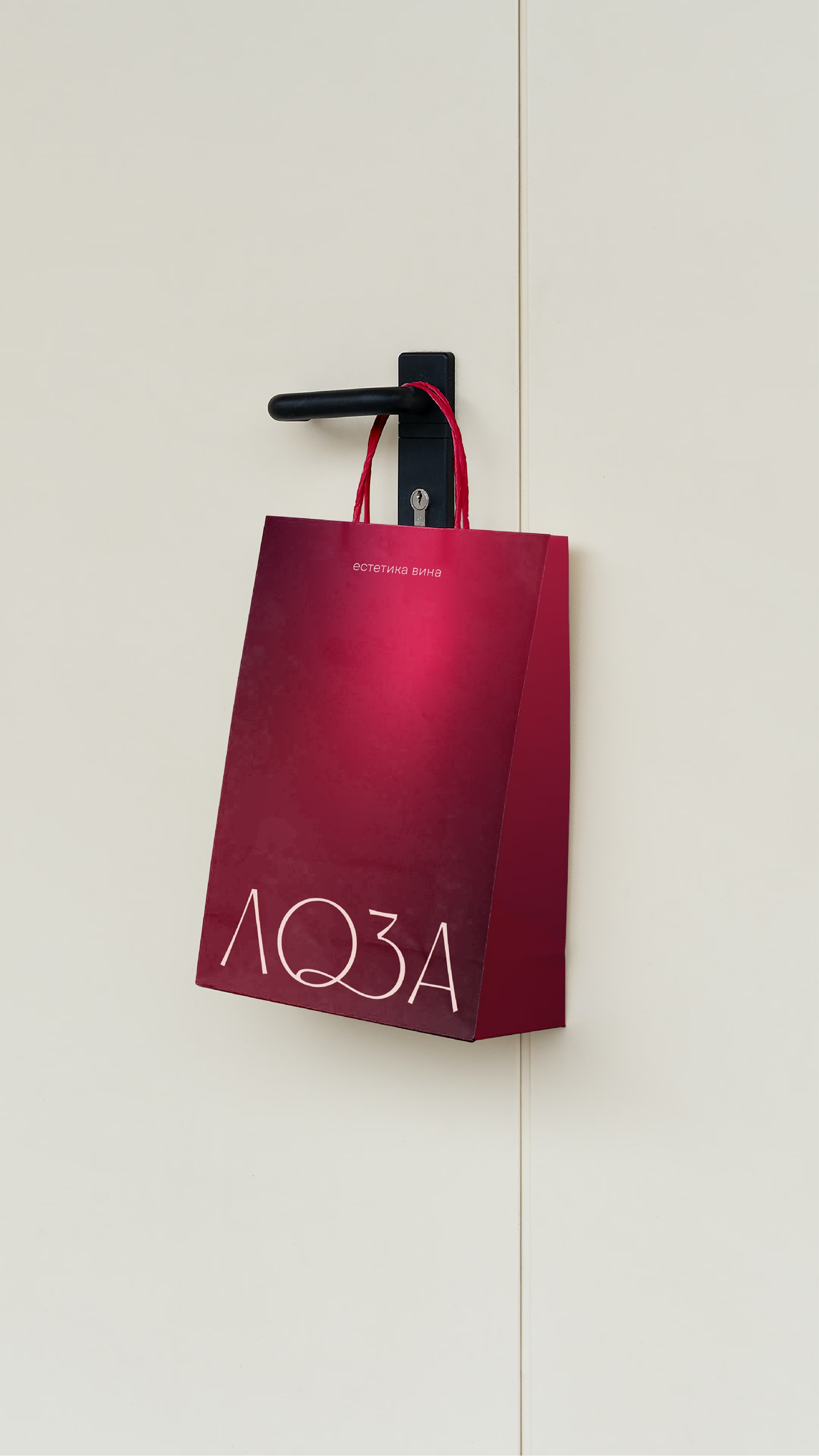
Loza is a wine shop in Uzhhorod with the largest wine list in the Zakarpattia region. Here guests taste fine wines in a refined atmosphere and get guidance at every step, from choosing a bottle to the checkout. It is not a mass-market store but a space for those who want to enter a private club without needing a pass. The naming, visual identity and communication system are built around one metaphor: the grapevine (loza in Ukrainian), which holds the brand's form, character and aesthetics.

SERVICES

IDEA

Loza

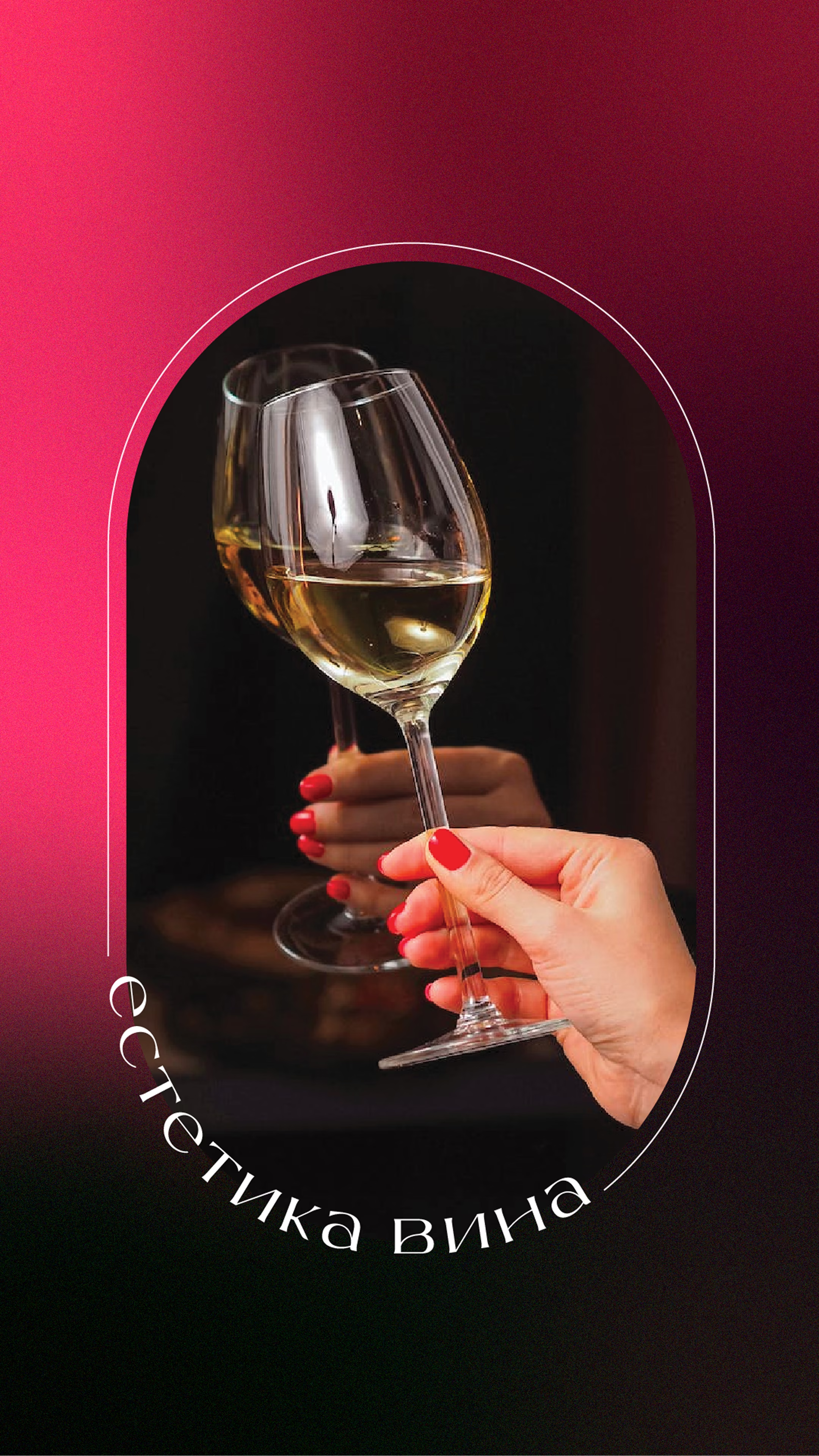
The aesthetics of wine

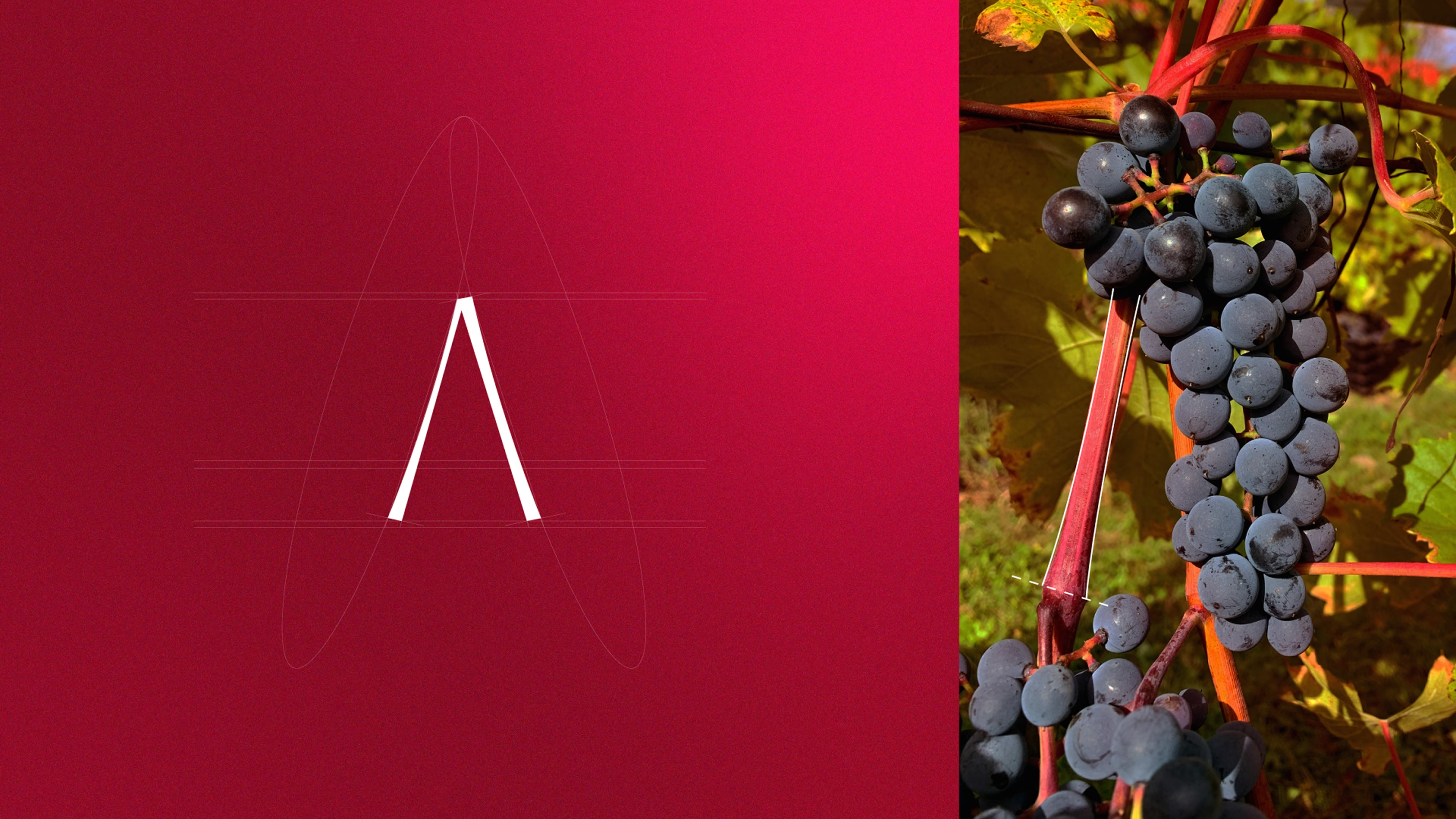
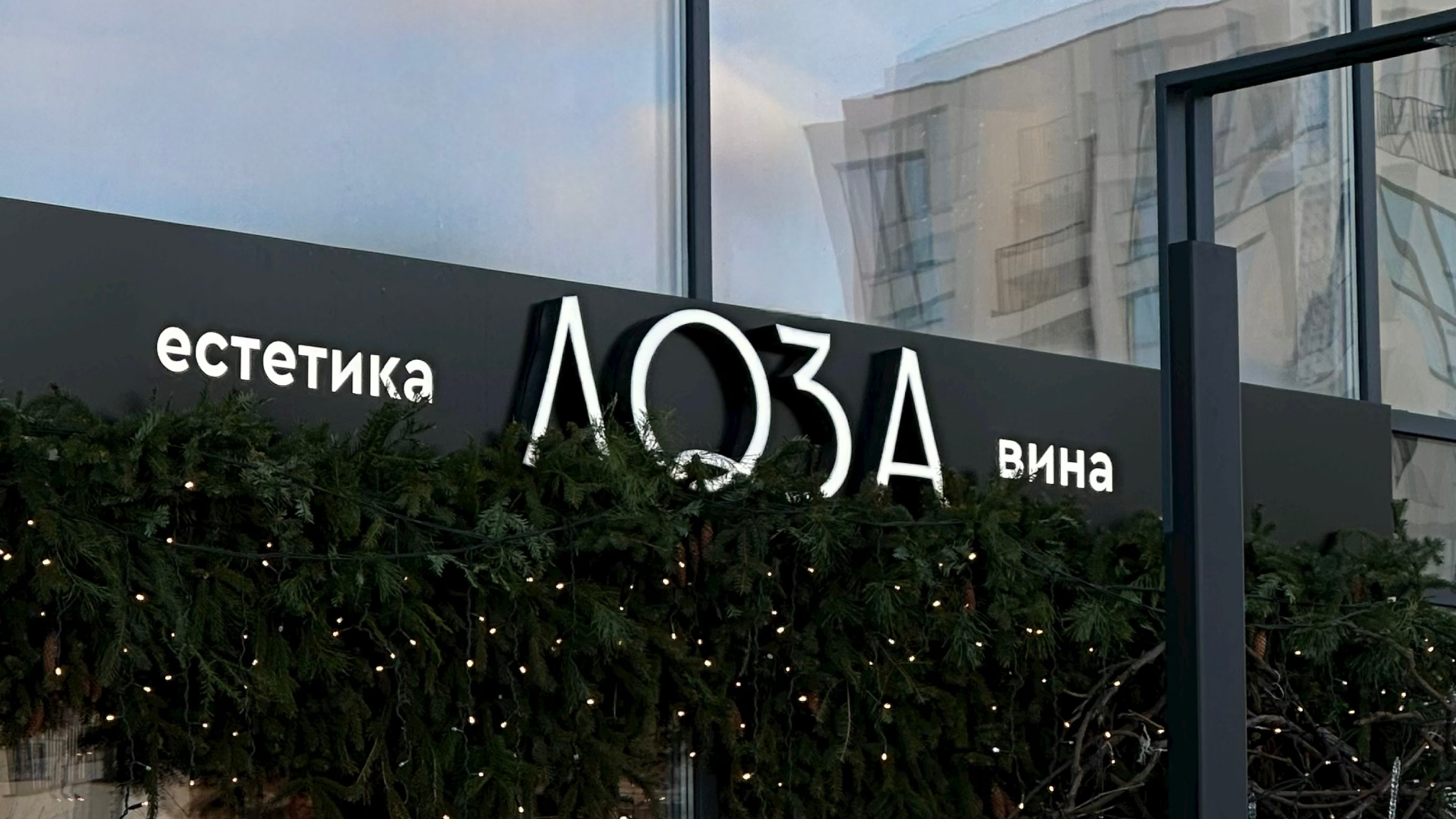
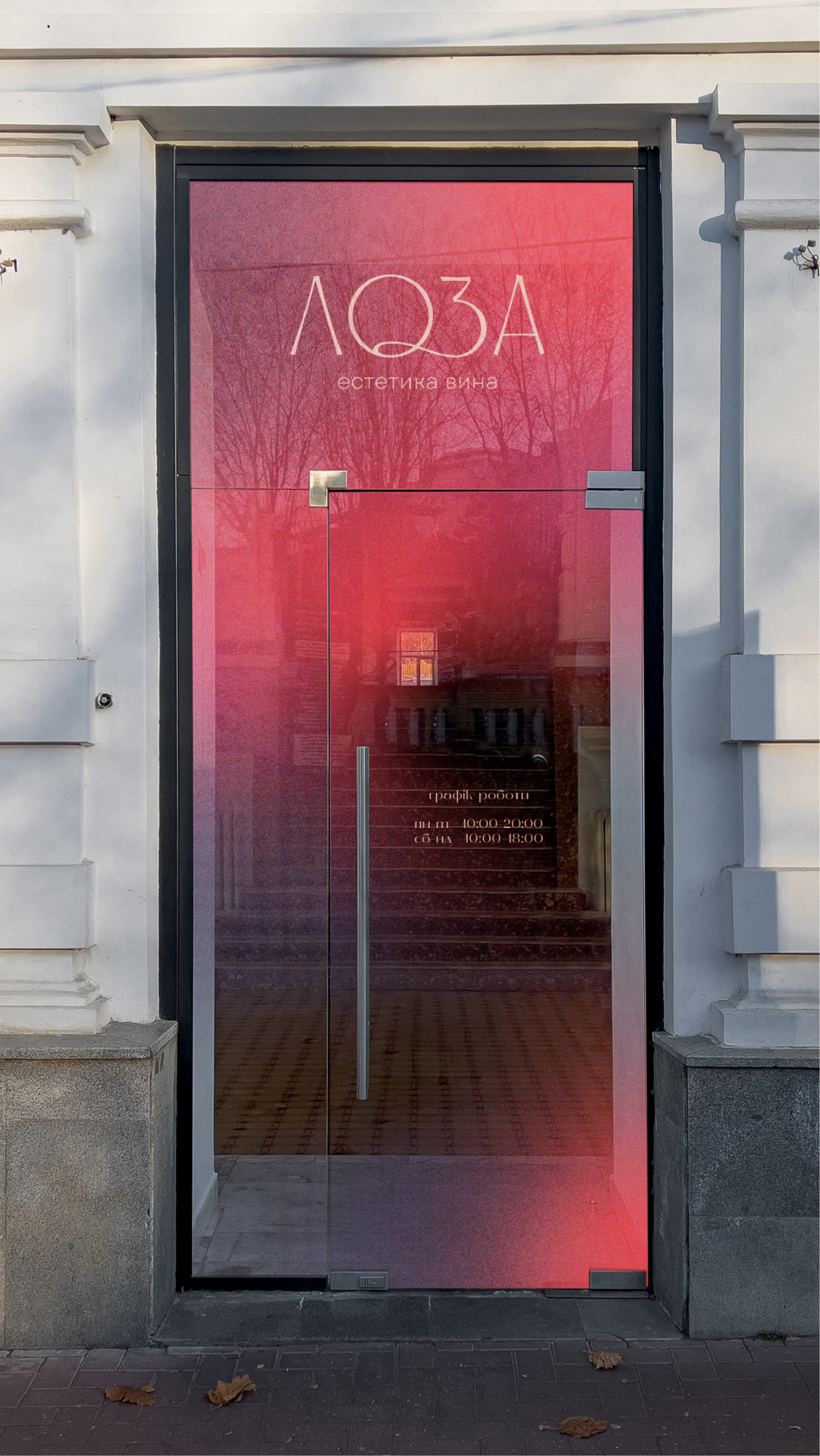
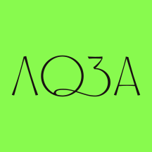
A form born of movement. The curve of the vine does not describe grapes or wine: it repeats the plasticity of the plant itself, a bend that seeks support and winds around it, holding its shape under its own weight. This line became the basis of the letter O and turned the name into a mark without a single literal symbol. The logo does not depict grapes literally. It works through form and leaves room for associations.

‍

About the business

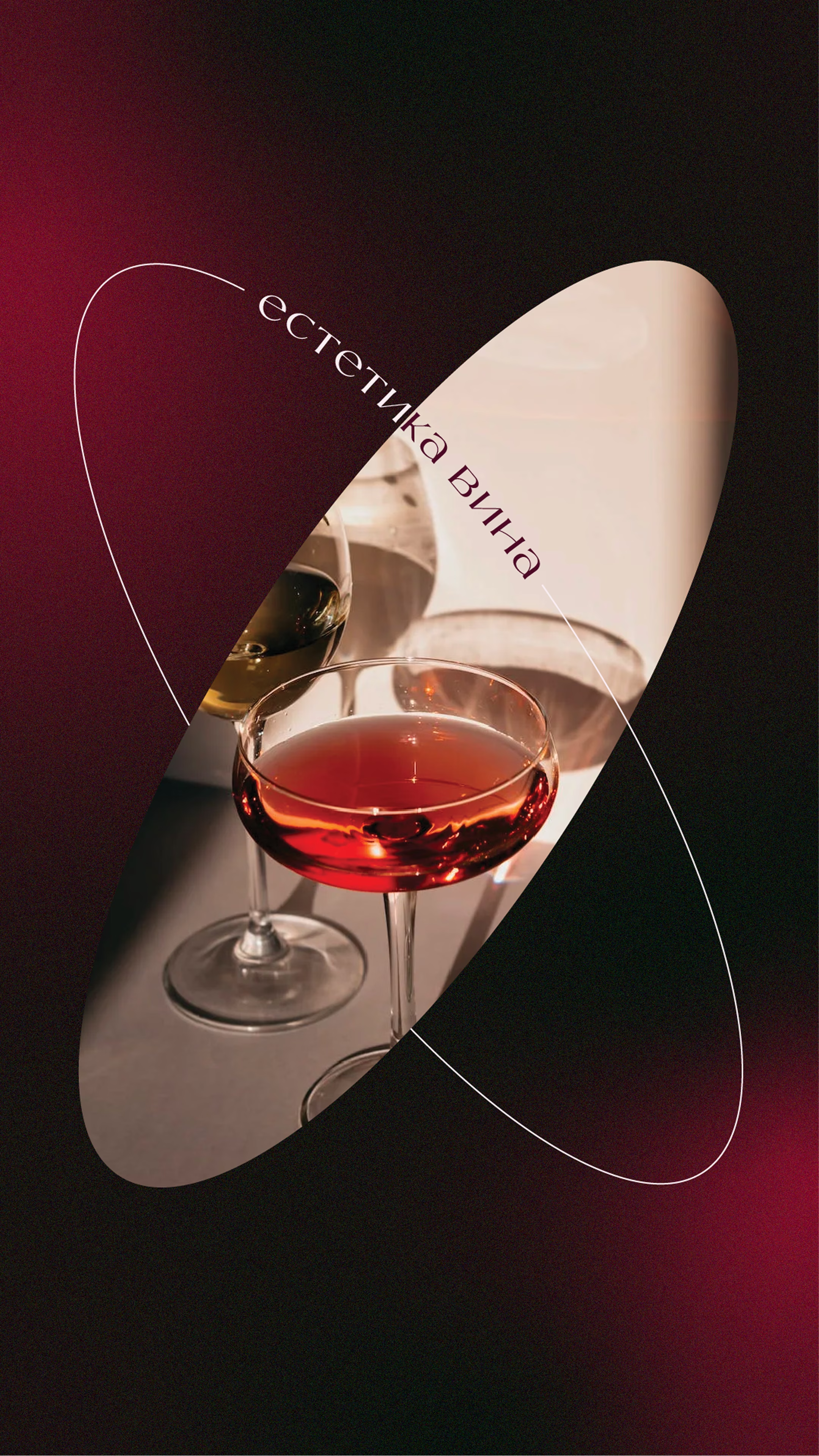
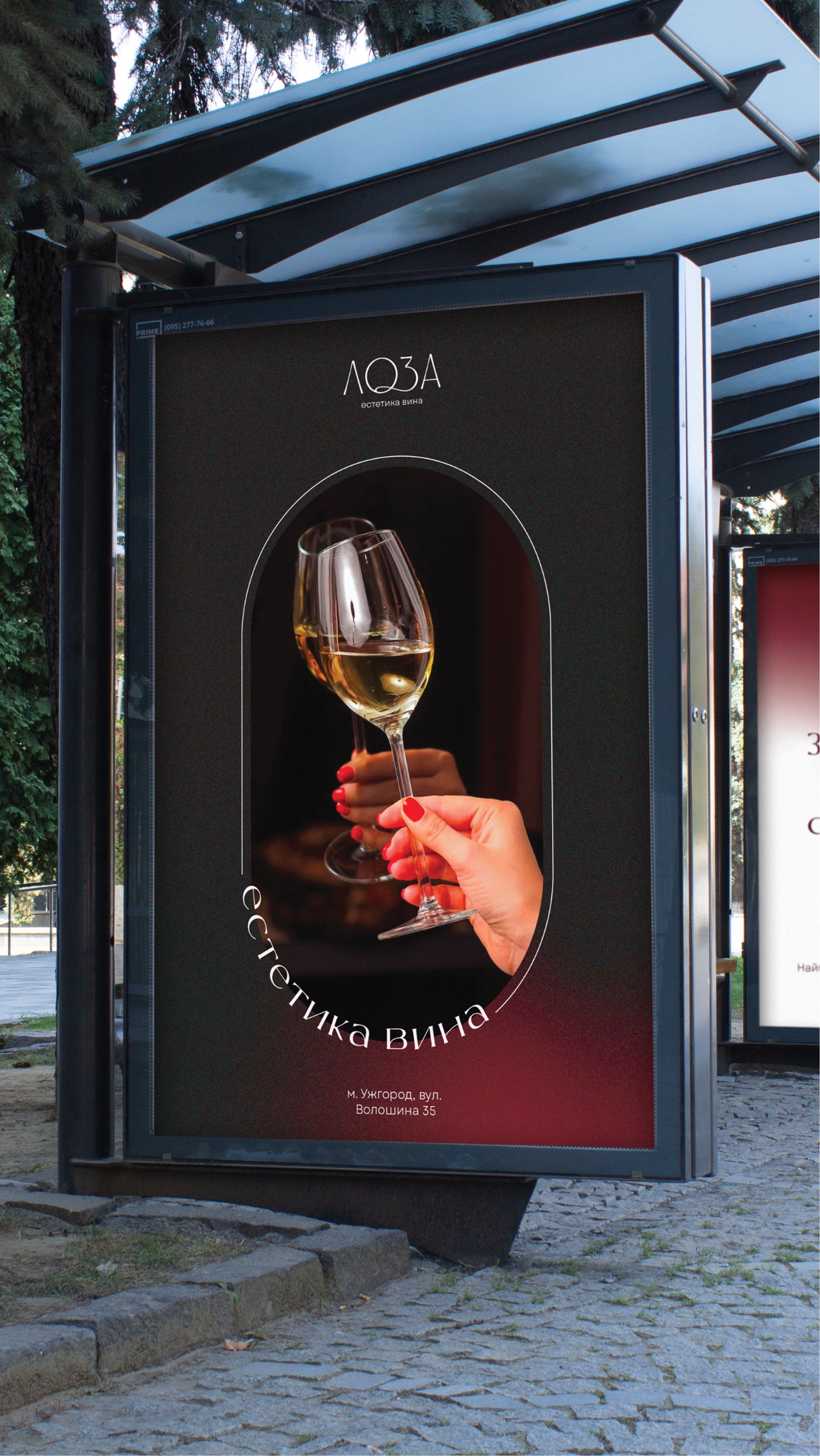
Loza brings together three pillars of a refined wine space: atmosphere, service and selection. The largest wine list in Zakarpattia opens up both the mass segment and collectible bottles, and tasting by the glass lets guests try an expensive wine without committing to the bottle. The positioning rests on the slogan “The aesthetics of wine”: for everyone, from enthusiasts to connoisseurs.

Requirements for the visual identity

Naming

The name does not point to the product directly: it starts a chain of associations that leads there on its own. Vine, plant, harvest, wine: a path the guest walks in their head, not a ready picture served at once. This gives the brand a natural rather than decorative link to wine and frees it from direct competition with dozens of shops that use the same visual clichés.

‍

Logo

The shape of the mark is built on the curve of the vine itself, a plant that spirals around its support and holds its shape under its own weight. This plasticity became the basis of the lettering: refined, elongated letterforms carry the same elegance as the movement of the vine. The mark does not illustrate wine literally. It conveys the brand's character through form.

‍

‍Character

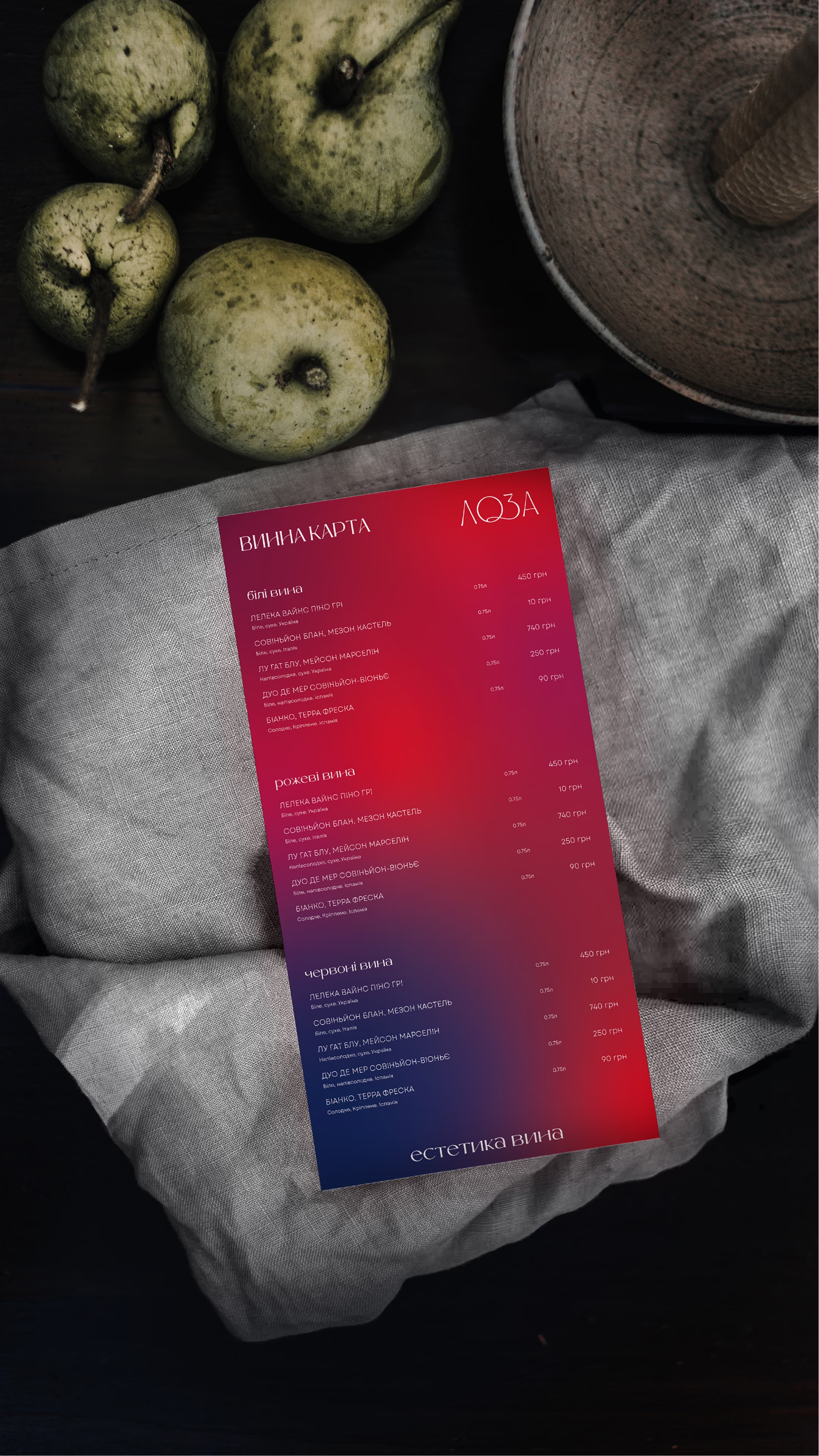
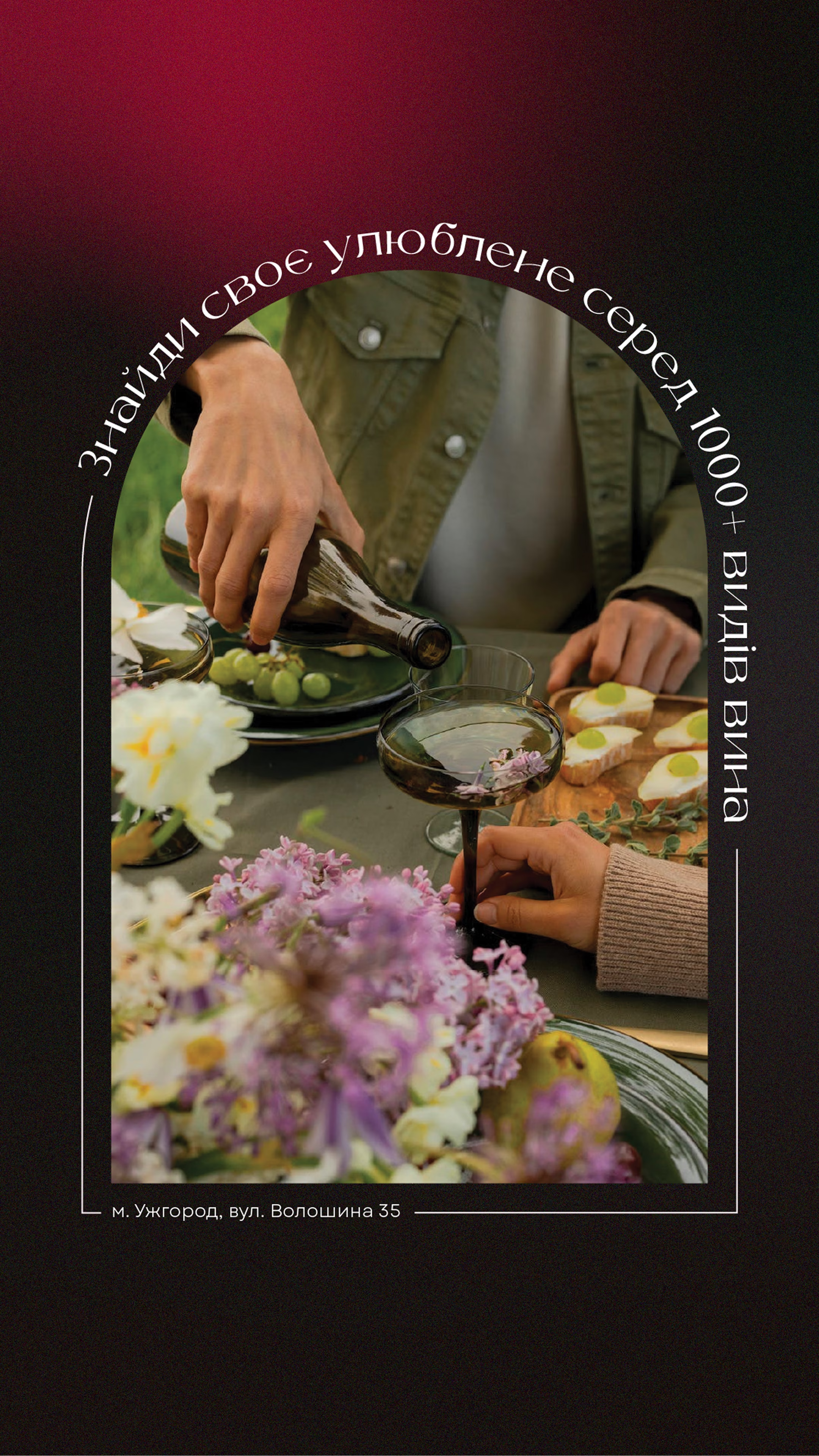
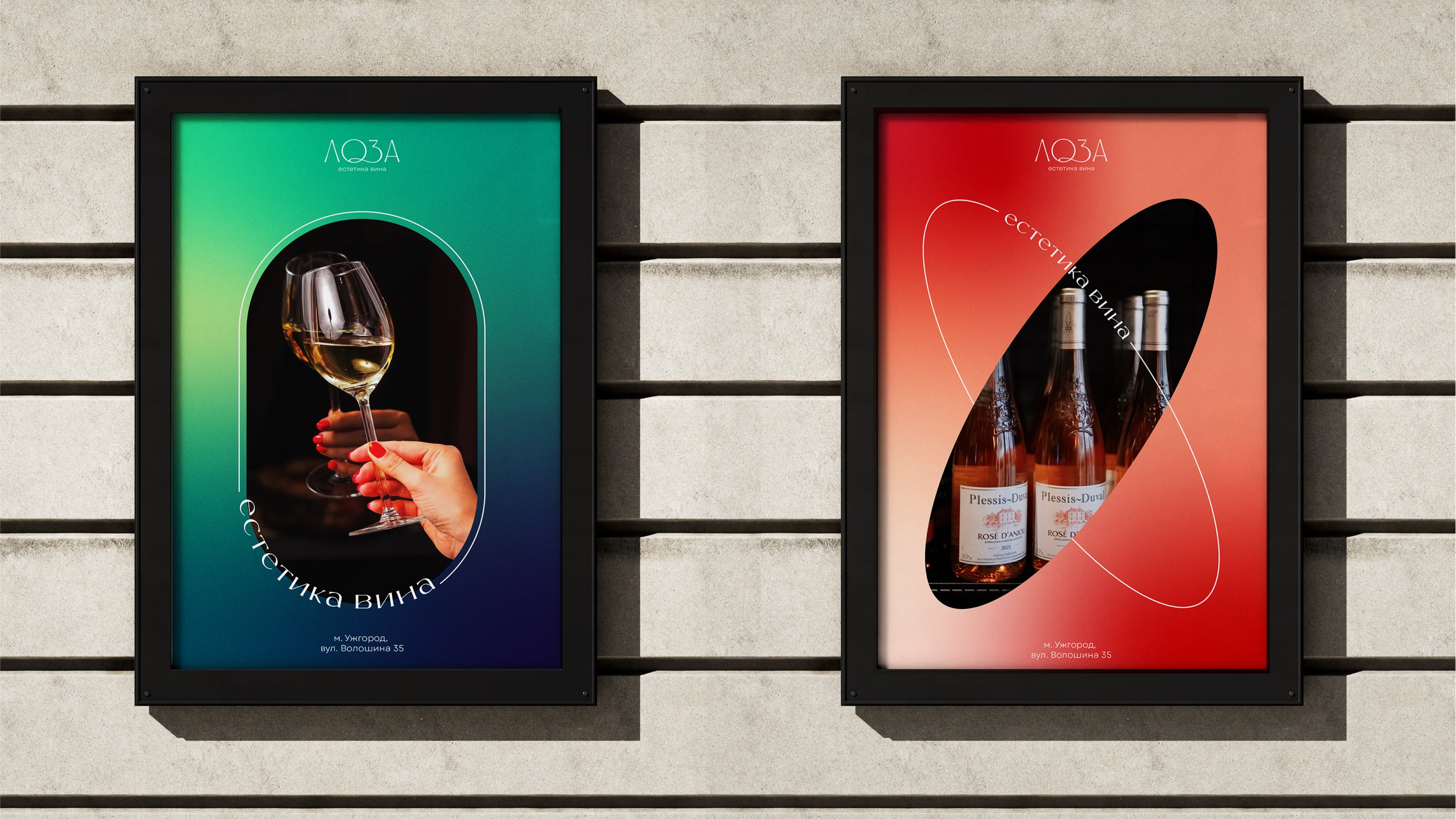
The brand balances on a line that is rarely held at once: refinement without cold distance, exclusivity without a barrier to entry. This is the strategic core of the positioning: a “private club” that is in fact open to everyone. The palette holds the same balance: the shades of wine itself, from bright pink to deep burgundy and almost black, with a soft gradient and grain instead of artificial gloss, color as part of the product.
‍

More cases

Back to all cases

Suprasoul hands illustration

Shall we talk about your 👤 project?

Thank you. Your message is with us, and we'll reply soon.
The message didn't go through. Please try again a little later.